In my Selection Dependent Inputs article in UXmatters last year, I outlined a number of interaction design solutions for Web forms that require people to answer follow-up questions based on their answer to an initial question -usually without having to go to another Web page.
Because many Web forms have this type of “follow-up” questioning, it’s not uncommon to stumble across different design solutions online that address this use case. When booking a flight on Southwest Airlines recently, I did just that.
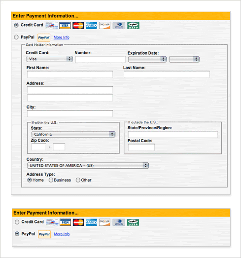
When I got to the Payment Information portion of Southwest’s checkout form, I had to pause. There’s two radio buttons: one for credit card payments and one for payments using Paypal. Directly below the PayPal link is a set of input fields. It took me a while to realize they related to the credit card selection. If fact, selecting the PayPal option is a bit disconcerting because this entire section disappears!
The problem is there is no clear association between the initial selection (are you paying with credit card or PayPal?) and the follow-on questions related to that choice. Additionally, the quantity of follow-up questions isn’t well suited to this particular design solution. There’s a lot of selection dependent input fields and they take focus away from the top level choice. Southwest’s only saving grace may be that most people probably skip over the PayPal choice and just jump to filling in the credit card questions without knowing there is an higher level selection made for them.

For my upcoming book on Web form design, London-based reseach company, Etre, and I ran a usabilty and eye tracking study on a number of selection dependent input design solutions. The full results will be published in the book but there are several best practices that apply to the Southwest example ilustrated here.
Displaying initial options and their selection-dependent inputs in close proximity to one another seems to leads to high satisfaction ratings. In the Southwest form there is a disassociation between the Credit Card selection and follow-up questions for that choice –the PayPal field is in between.
Clearly associate selection-dependent inputs with their trigger. Don’t let people lose sight of their initial top-level choice. Southwest should consider using a visual cue to create a clearer association between the initial credit card selection and its follow-on questions.
Overall, hiding irrelevant form controls from people until they need them results in forms that are easy on the eyes and completed quite quickly. Southwest shows input fields for people within the United States and outside of the United States instead of showing only the inputs relevant to each individual. The section-level labels for these inputs are also not as visible as they could be especially when someone is simply tabbing through the form to complete it quickly. The situation is even more confusing because of the Country input field directly below these choices!