People need to parse every question a Web form asks them, formulate their response to that question then enter their response into the space the form has provided. The best way to speed up that process -of course- is to not ask the question at all.
For example, if you want to provide geo-location targeted information to customers of your Web site in the United States, chances are you only need their ZIP code and not their full mailing address. That’s four less questions people need to answer: Address line one and two, city, and state.
However, when you actually need to ship an item to someone a ZIP code by itself won’t suffice. Although many retailers in the US use directories to retrieve home addresses when they have only a ZIP code and credit card number, I’ve never seen an e-commerce checkout form that uses this method. So removing the address fields won’t work. Instead, you might want to consider how the question is being asked or how people are prompted to provide a response.
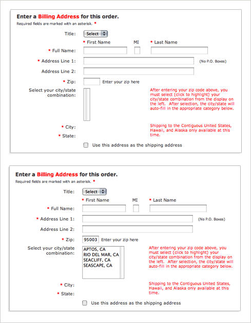
On the Weber checkout form, people are asked for their ZIP code first and then given a set of choices for their city and state. (Thanks to Victor for sending in this example.)

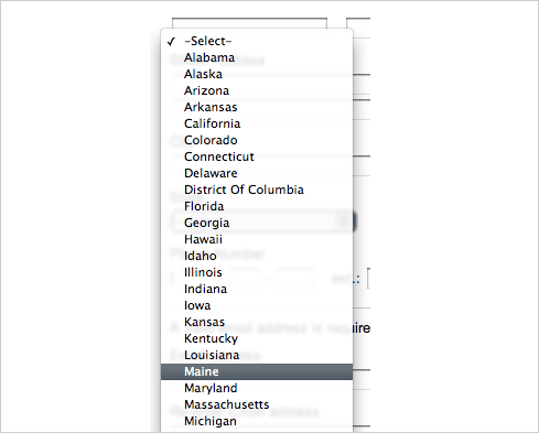
On the plus side, this interaction design removes some awkward ways of answering questions. Specifically: drop-down menus for states that run 50 entries high.

On the negative side, the way a simple question is asked has been made potentially more complicated. When faced with a set of inputs that match the structure of a mailing address, people often skip over labels as they fill in the pieces. The components and layout of an address are familiar to just about everyone in the US. The Weber site breaks this structure by asking for ZIP code out of order.
International customers are also out of luck because Weber does not ship overseas. If they did, clearly this interaction would not work when specifying international addresses that do not utilize the United States ZIP code system.
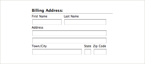
Another indicator that the question being asked has gotten more complicated is the extensive help text (rendered in red text) near the city and state selection. Odds are Weber had to add this to help people understand what to expect from the form. A potentially simpler solution, like this one found on the Apple store, asks the question in a familiar way and also provides a simple way to answer.

So though Weber removes some unnecessary inputs, I think the jury is still out on whether this simplifies the form or not.