When arranging a flight on British Airways, I was struck by how much the airline wanted me to abandon my process. As anyone that's booked a flight online knows, finding the right combination of price and travel times takes a fair bit of work.
When I finally found the right combination on British Airways, I was perplexed at how buried the "buy" button was. The first call to action in my flight summary suggested I "Empty shopping basket and try again". Then a stream of promotions and legal banter dragged on for two full page lengths.
Web form design tip: illuminate a clear path to completion. British Airways makes it hard to determine how I can complete this form and get tickets I want.
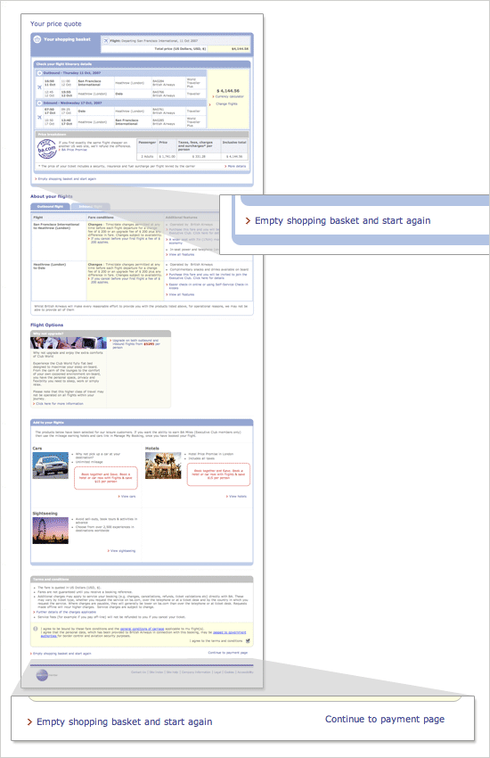
Once I made my way to the bottom, I encountered another call to action to abandon my efforts. The left placement and red arrow led me to wonder if they considered this a primary call to action? Finally the "buy" button showed itself in the bottom right hand corner. Only it wasn't a button at all. Arguably, the most important item on this page was a single line of text sandwiched between two blocks of color. Could they have hidden it any more?
Web form design tip: Remove secondary actions whenever possible. Is there really a need for people to start over at this stage of buying a plane ticket? So much that the form needs two "reset" links?
Web form design tip: Emphasize calls to action that lead to success (form completion) over those that let people start over or abandon a form.