There was a large amount of interest in last month’s Web Application Form Design article, so I decided to provide some additional details and a few examples for the following concepts.
Uniting Input Fields and Labels
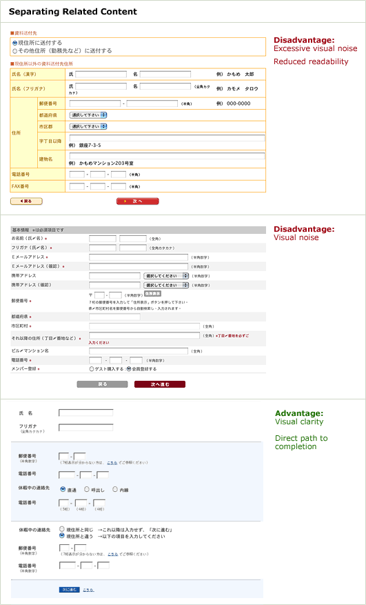
A number of readers were interested in how the limitations of a “left-justified horizontal label” layout (primarily the separation of input fields and their respective labels) could be solved. Though excessive visual elements (even when they are quite subtle) in a form will increase visual noise substantially, a few carefully selected elements can help users connect input fields and their respective labels.

Visually separating related groups of content with a horizontal rule or background color makes it easier to associate left-aligned labels to fields. However, these groupings cannot be arbitrary (there must be a reason the fields are considered a group i.e. related content) and should not exceed 5-6 items (otherwise the adjacency problem will reemerge).
Primary & Secondary Actions
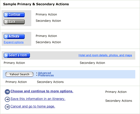
When a form has both primary and secondary actions such as “Continue” (primary) and “Go Back” (secondary) it may be wise to reduce the visual weight of the secondary action. This minimizes the risk for potential errors and directs users to completion. The following examples illustrate this concept in action on Orbitz, Yahoo, and Expedia. Though the visual treatments vary, primary actions are consistently heavier (bold fonts, button-shapes, bright background colors, etc.) than secondary actions.

Label & Input Field Lengths
The length of input fields can be used to communicate important information to users. For instance, an input field for a five-digit zip code should not be 40 characters in length as this sets an incorrect expectation for users (what kind of zip code is this long?). When there isn’t a specific length associated with an input, maintaining a consistent input field length can ease the visual complexity of a form by reducing the rag caused by input fields of varying length.
Because input field labels can vary in length (especially when a layout will be localized), it’s a good idea to build a flexible layout that adjusts not only to various screen resolutions and browser window sizes but to different line lengths as well.