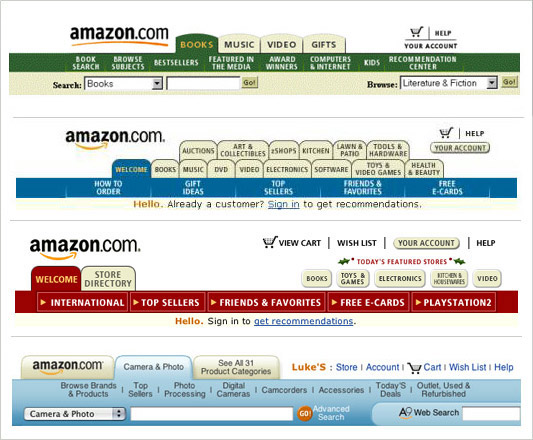
About two years ago, I chronicled the multitude of interface design solutions Amazon.com had either tested or launched to help their customers navigate an ever growing catalog of products.
From a simple two-tab system in 1998 to an overloaded two rows of tabs in 2000, to the dynamic tab system in use on the site today, Amazon has tried a myriad of header navigation designs (see The History of Amazon’s Tab Navigation for complete details).

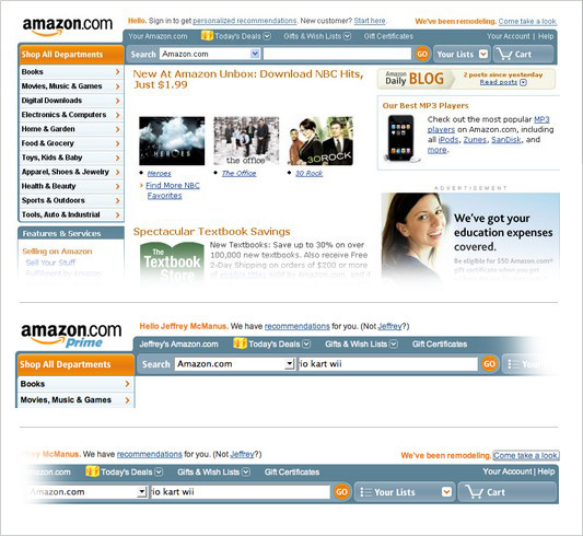
Recently, Amazon began testing a design that brought back a prominent listing of their most popular categories. However, access to these links is now in the form of a left-side navigation menu instead of tabs at the top of the page. The new header features a prominently displayed search box and access to your shopping cart and lists. While I don’t know the full context behind the redesign, I’m assuming the company needed a better way to expose the breadth of their inventory as the dynamic “all product categories” tab (used on the site today) required an explicit action to activate.

It also feels like Amazon is hoping to capitalize on their recent investments in search (namely A9) by emphasizing searching as a primary navigation mode. No doubt, people are searching more on the site today than they were a few years ago. Yet when people are motivated to shop, prompts like product categories and current deals are almost equally important. This may be why Google’s single search box shopping experience (formerly known as Froogle) never registered with consumers: they weren’t ever told what they could/should shop for.