Amazon.com popularized the tab navigation metaphor online. Through the years they explored multiple interface design solutions to make their growing product inventory accessible to Web users. As a result, some interesting lessons emerge when one looks at how the site's top-level navigation has changed over the years.
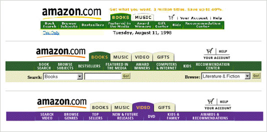
In 1998, the site had two top-level categories: books and music. As additional categories were added (such as video and gifts), the horizontal tab system scaled quite well and created a nice opportunity for differentiating product categories through color.
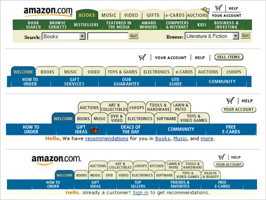
In 1999 and 2000, the site continued to expand- adding more categories and stretching the tab system to its limit. When Z-shops, Toys & Games, Electronics, and e-Cards were added, there was no longer any room for the amazon logo in the header (it was placed in the center of the home page) and the font size had to be reduced. (The site at this time was still designed to work well for 800 by 600 screen resolutions.) It was not until the navigation tabs spread out into two rows that the logo again had a place on top. Clearly the tab system was being stretched to its limit and was poised to grow out of control.
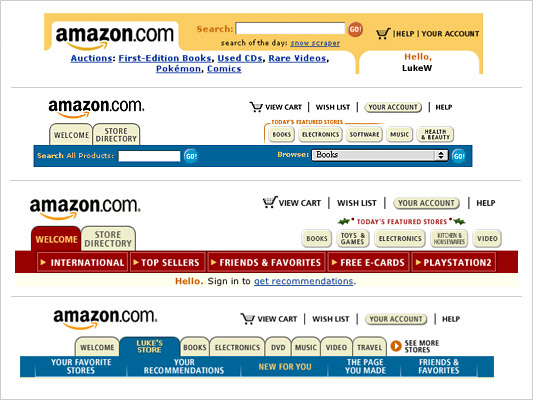
In 2000, Amazon ran a live test that did away with tabs altogether, but opted instead for a Store Directory/Featured Stores layout in 2001. This redesign addressed the growth of categories by highlighting certain "stores" and providing an easy means for users to access the rest. When the personal stores concept was introduced, the site again went to a single row of tabs, adding a "see more stores" link to keep the number of tabs in check.
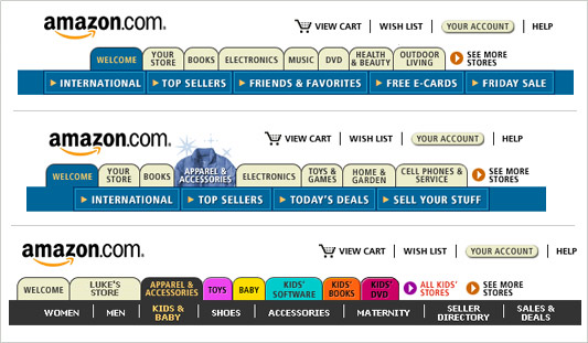
This system began to fall short when the company continued adding categories and needed to promote the addition of new ones. Tabs moved in and out of the top-level navigation based on company promotions and user behavior. Few tabs remained consistent (“Welcome” and “Your Store” being notable exceptions). Graphical tabs were introduced to promote certain categories and changing colors between sections began to seem random.
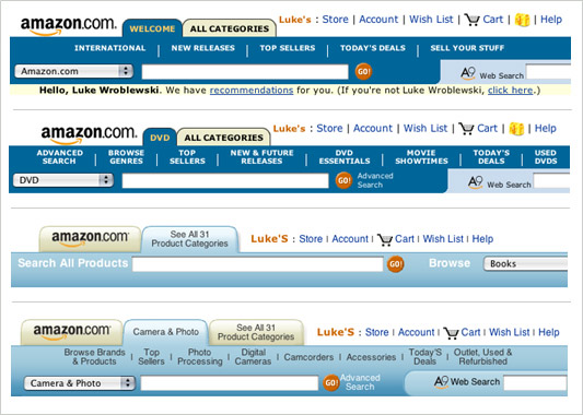
To account for the confusing appearance and disappearance of product categories, amazon has been experimenting with alternatives to the single row of dynamic tabs (PPT). A live test in 2004 reduced the number of tabs to two (like the 1998 design). The first tab was dynamic (it changed based on the category you were in) and the second was “All Categories”. In a 2005 version, the navigation began with two tabs and inserted the current category as a new tab rather than changing any already present tabs.
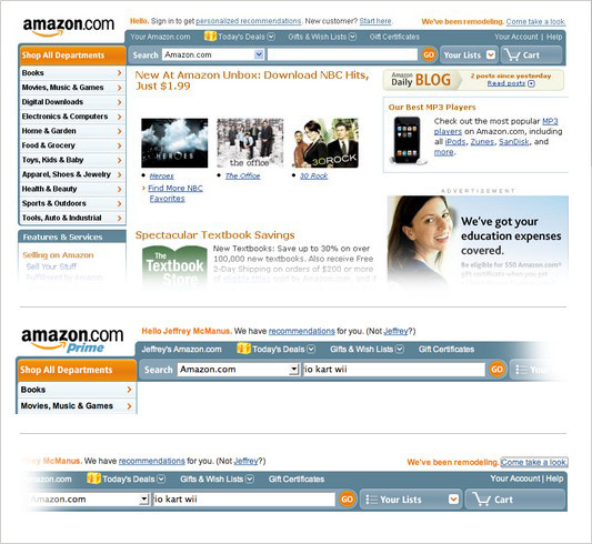
In 2007 Amazon began testing a design that brought back a prominent listing of their most popular categories. However, access to these links was now in the form of a left-side navigation menu instead of tabs at the top of the page. The new header featured a prominently displayed search box and access to your shopping cart and lists. While I don’t know the full context behind the redesign, I’m assuming the company needed a better way to expose the breadth of their inventory as the dynamic “all product categories” tab (described above) required an explicit action to activate.
It also feels like Amazon is hoping to capitalize on their investments in search (namely A9) by emphasizing searching as a primary navigation mode. No doubt, people are searching more on the site now than they were a few years ago. Yet when people are motivated to shop, prompts like product categories and current deals are almost equally important. This may be why Google’s single search box shopping experience (formerly known as Froogle) never registered with consumers: they weren’t ever told what they could/should shop for.