Lesson three from the 9 Lessons from 9 Years of Interface Design retrospective: Less is More…
“The ability to simplify means to eliminate the unnecessary so that the necessary may speak.” —Hans Hofmann
When I started out doing Web design in 1995, the Web had begun to expand beyond the simple sharing of text-based information between researchers to a communication medium for designers.
“Corporations, entrepreneurs, and early devotees all rushed to put up Web sites of their own. They brought in graphic designers to take full advantage of the layout possibilities now available online. While these designers knew a great deal about communicating through text and image, very few knew the vocabulary of the Web: a new and unique communication medium.” –Site Seeing
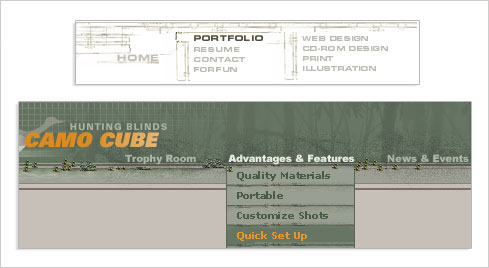
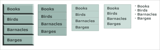
To account for a lack of interaction and organizational design skills, I and other Web designers at the time began to overcompensate with visual design. We knew how to communicate visually, so we did: a lot. As an example, contrast the over-designed navigation systems (above -notice the little trees in each menu item?) with the progression of distilling a navigation system to its core elements I prescribed in Site Seeing several years later (below).
Gradually moving away from a “more is more” approach to “less is more” is not unique to Web design. As most professional musicians mature, they no longer try to play as many notes as possible and instead focus on playing the right notes.
“Making the simple complicated is commonplace; making the complicated simple, awesomely simple, that's creativity.” —Charles Mingus
For Web designers, the right “notes” amount to the minimum amount of visual and interaction elements required to effectively communicate content and actions to end-users. Of course, the principle of “less is more” applies to all aspects of an interface: visual design, interaction design, organizational structure, and content.
That said, there are plenty of cases where more is more…