In Web forms, selection-dependent inputs require users to provide additional information related to an initial selection before they can complete (and submit) a form. In my previous Selection-Dependent Inputs article, I outlined a number of ways to address this interface design issue.
In each of these solutions, the visual presentation is crucial for helping users understand how their initial selection relates to the subsequent questions they must answer. When this visual communication goes missing, forms can be quite confusing.
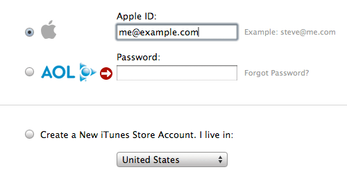
Consider an example from Apple (sent to me by Jed Wood). The first answer someone must provide in this sign-in form is "do you want to sign in with an Apple ID or an AOL ID"? Once that initial selection is made, the specific ID and password needs to be provided. The problem is that this relationship is not visually represented. As a result, you can encounter situations like the one shown below. Where the form is asking you to provide a password but the visual presentation makes it seem like there is an error associated with the AOL selection.

Contrast this implementation with the example from Stumble Upon shown below. Here, the visual design makes the dependency between inputs clear.

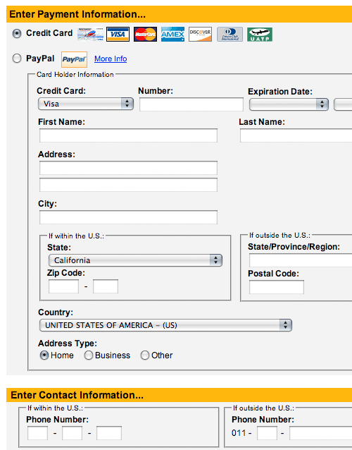
Another example of confusing selection dependent inputs can be found on the Southwest airlines form below. Here the selection between credit card and PayPal payments is a selection dependent input using the exposed below design pattern. Once again the lack of clear visuals creates the potential for errors. In this case, it is not clear that the fields below the PayPal option are selection dependent inputs for the credit card choice.

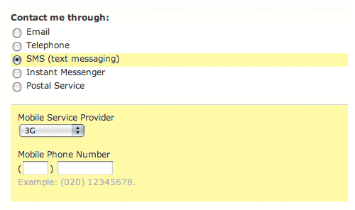
Visual communication can help remedy some of this by associating the top (initial selection of credit card) with the dependent fields below. A possible approach is shown below, but given the quantity of dependent inputs, a different design solution altogether is probably a better fit.
