Lesson four from the 9 Lessons from 9 Years of Interface Design retrospective: …Except When More is More.
Previously I made the case that, in interface design, less is more. But as with all design principles, the real answer is “it depends”. It depends on the context and type of information you are presenting to users as well as their goals and actions.
All information and interaction rich interfaces need to strike an appropriate balance between visual simplicity and information density. Visual simplicity keeps things clear and focused. Information density provides choices to match different user needs and behavioral patterns.
But many designers mistakenly associate visual simplicity with increased usability. For example, John Maeda recently compared the evolution of Yahoo’s home page to Google’s. He noted that over the years, Yahoo’s home page became more complex while Google essentially stayed the same. The catch, however, is that Google’s home page was and still is a search engine. Yahoo, on the other hand, always was a directory of online information (of which search was one part). As a result, the user goals for Yahoo’s home page and Google’s home page differ substantially and their relative ease of use cannot be judged based on visual simplicity alone.
“People will complain about a visually complex page at the sight of it. But they will also complain if the information they need isn't immediately available to them when they start using the site.” - How visual simplicity can harm usability (GUUI)
To further illustrate this point, the image below highlights the before and after of a local government management Web application. The original version utilized a condensed set of navigation options in the left-most column that were the primary means of accessing actions and information. The argument for this expanding tree menu was that it contributed to a simpler interface by not exposing all the navigation options to users at once: visual simplicity.
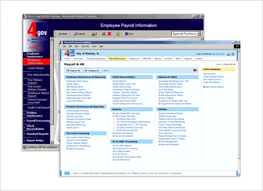
In my redesign, “destination pages” were created that exposed all the options within the menu system at once. Because these pages were intended for navigation, the visibility of all the available choices actually increased usability and efficiency. Users are able to quickly scan the page and find the information they needed without having to expand and collapse multiple menu options. In this case, more was more.
“There is a dynamic tension between simplicity and insight which must be dealt with... The danger is over simplification will sacrifice insight into the situation.” -Exploring Visual Information Design (Design Crux)
Cultural context can also favor information density over visual simplicity. Cultures that align with Collectivism (integration within strong, cohesive groups) over Individualism (loose cultural ties) are more likely to respond favorably to dense content and interaction-rich layouts that represent the high levels of activity on the site. Likewise, favoritism toward Long-Term Orientation over Short-Term Orientation enhances a culture’s “desire for immediate results and achievement of goals”. Immediate results, are more easily achieved when a fuller set of options is exposed to users.