The design of web-published direction maps has a direct influence on the first physical interaction between small and medium-sized businesses and their guests.
A poor map will preclude even carefully choreographed first impressions, with sweaty circling, frantic phone calls, and apologies. If business is theater, these maps could alternately be a courteous, silent usher or an endlessly spiraling staircase to the back row. This article discusses what these maps should look like and how cultural context drives some design decisions.
After 3 1/2 years living in Tokyo, wayfinding at the mercy of these maps can still be frustrating. It is surprising then how little scrutiny these maps often receive. Many suffer from fundamental contrast and legibility problems. Other sites avoid the task altogether by means of map services like Yahoo! Maps. While these services offer valuable features like zooming, they often lack the detailed landmarks needed for the complex neighborhoods of Tokyo. I have included Tokyo-specific considerations that have arisen in my own work, and encourage you to examine the conventions and characteristics of your client’s area.
As with all map design, the goal is an optimized information resolution, with as much detail as necessary to get the user to their destination with confidence and without incident, and not a bit more. While there are no guidelines applicable to all map designs, hopefully some of the approaches presented here will help.
Context
Direction maps, like all visual design systems, are communicative in nature. Their design should begin with all the same questions.
- What is its function/goal? -In most cases, these maps lead users from undefined starting points along suggested paths to a single destination.
- Who is the audience? -Are they drivers? Pedestrians? Are they residents or tourists? Is there more than one user type? How will each navigate the space differently?
- What is the sequential context? -Where are visitors coming from? Where might they be headed?
- What is the physical context? -How do locals mentally organize the space? What language do they use to describe it? Also, how will time affect this context? Will it look different in morning rush hour than after dusk? Do area storefronts have a high turnover rate?
- What is the medium? -In this case web and desktop printing. What type of design will survive the possible degradations of each medium?
The answers to these essential questions may be elusive at first, or may change as the project progresses. Revisit them throughout the design process, especially when you encounter difficult design decisions.
Research
- Interview your client. Ask how visitors get to the location, how successfully they are, and if there are any common mistakes that visitors make in their journey. Don’t rely on your client’s perspective too much, since they are experts in how to get there, and may gloss over essential details.
- Visit the actual location if possible. Trace a few likely paths, noting potential landmarks. Look for prominently displayed, well-used maps. If any exist, consider matching your map’s orientation to it so users can make confirmations en route.
- Online map services like Yahoo! make great references, yet they are fundamentally different in their function and design. Do not rely on them as your only reference. They often lack the most memorable landmarks.
- Discuss target device and accessibility requirements with your project manager or client. A high-contrast grayscale map for printing and accessibility and a smaller map for mobile-devices are smart alternatives, both especially popular with Tokyoites.
Tokyo and Landmarks
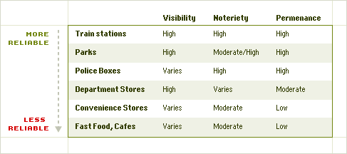
The Tokyo street system is a tangle of unnamed capillaries branching off a handful of well-known avenues. In places, even these avenues are difficult to identify due to lack of signage. Directional maps must therefore make greater use of landmarks. Landmarks are used in three ways: general orientation (e.g. stay to the left of the park), turning, and as milestones (e.g. 4th streetlight). The appropriateness of a landmark for one of these three uses is based on its visibility, notoriety, and permanence.
Choosing Landmarks
- Use the spelling and characters that are most well-known. For example, if Matsuya department store is written in a Latin sans-serif most of the time, don’t show it in a Japanese Mincho.
- Include more than one station exit. Stations are always under construction.
- If using omnipresent landmarks like convenience stores, be sure there aren’t others in the area that could misguide lead users.
The Trains
Tokyoites enjoy a comprehensive, reliable railway system extending well into the surrounding prefectures, with some commuters traveling 5 hours a day. The popular train system acts as a geographically distortive, yet functional skeleton around which its passengers flesh out mental navigation models of the city. The experience of climbing out of the cavernous station can distort these models, shattering the up-equals-North convention, and over-emphasizing the facing direction of the exit.
The degree to which train-goers’ mental model can be mirrored in map design is dependent on the diversity of the target audience and the diversity of paths by which they reach the destination. For example, a map for a cafe popular with junior high students situated close to a single station exit, can take more liberties than a map for a municipal building situated on a major highway halfway between two train stations.
Scale and Detail
Among a map’s many possible primary functions are the accurate documentation of geographic space and the delivery of users to their destination. The two are not mutually exclusive, but require different design approaches. For web-published, single-destination, directional maps, it is neither practical nor advisable to maintain accurate scale or intricate detail.
At AQ, we begin the process with a proportionally accurate reference. We then analyze anomalous shapes and relationships to determine if these details will distract or aid the user’s comprehension of the space.
Birds-eye accuracy of complex shapes like Shinjuku station bear little relevance to most Tokyoites’ mental models, in which lengths are compressed and expanded, corners righted, and lines simplified.
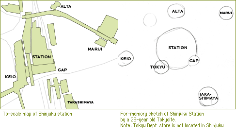
However, when asked to draw Shinjuku from memory in an admittedly unscientific experiment, our Tokyoite friends shared many successes in placing landmarks on the correct side of the station. The accurate placement of these landmarks and station exits on maps will orient the user on one side of the station far better than an intricate detailing of the station itself.
Streets can also be simplified. It is rarely necessary to use more than four line weights and often two is sufficient. Road contours should retain their general shape, but longer stretches containing no important landmarks, can be compressed so long as they remain discernibly longer than other stretches.
Distort scale as needed, except when it would impede understanding. Confronted with space constraints in web and small-format printing, legible label sizes and the inclusion of key landmarks take precedence over accurate scale. However, one user’s distractor may be another’s clue. Scientific studies continue to reveal innate, fundamental differences in how different groups navigate. Some rely more heavily on landmarks, while others rely on distance and the points of the compass.
It is also impossible to predict a visitor’s route with complete certainty. They may arrive by way of another nearby destination, choose a different train station exit, or miss a turn and need to recalculate their route. Every detail must therefore be evaluated to determine whether its elimination or simplification would reduce comprehension by part of the target audience.
Common Pitfalls
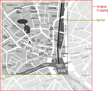
Problem: The scope is too wide. It’s important to show enough surrounding details to reorient any users who make a few wrong turns, but excessive context will slow down en-route referencing, and crowd out generous font sizes and proper emphases.
Solution: Crop maps down to a size just large enough to show major streets and landmarks. But keep in mind that users may not always be coming from the nearest station or highway.
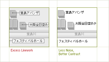
Problem: Line and box-work compete with landmarks and text.
Solution: After increasing contrast, and bringing labels closer to their landmarks, the boxes are no longer unnecessary. When adding line-work or 3D detailing, continuously reassess whether the detailing is adding clarity or clutter. Limit the use of line-work on labels to the most crowded areas of the composition, and place labels close to landmarks.
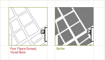
Problem: Heavy outlines of city blocks reduce figure-ground clarity and add visual noise. Thin, dark lines also make it difficult to overlay type. Solution: By replacing unnecessary line-work with solid color, each block is reduced to a single piece of information with an unambiguous figure-ground relationship.
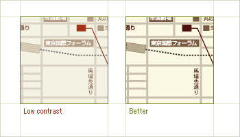
Problem: Low contrast will present legibility problems for some visually impaired users. When printed, some details may become indiscernible. Solution: If an increase in contrast causes a departure from the site’s overall color aesthetic, there may be legibility problems elsewhere as well. Try to keep “squinting” out of your style guides.
Additional Suggestions
- Support grayscale printing by avoiding color as a differentiating device. Also, don’t overlap colors that are close in value.
- Logos make poor landmark icons They may be too intricate or have low recognition with the very users for whom the map is most crucial: first time visitors.
- Alternate style sheets are still unsupported by some browsers. Printer-friendly pages are the best match for current user expectations.
- Include the business name, address, phone number, and directions in the html that contain your map. Sometimes adding this information into the map graphic itself is tempting, but doing so robs the visually impaired of control over how they view or hear information that should serve as a supplement or even alternative to the map itself.
Contrast
Many layers of information compete within these small maps, making the management of contrast challenging. It is crucial to understand the maps internal hierarchy, assigning an appropriate level of contrast to each type of information. For a Tokyo map the hierarchy could be as follows:
- Destination and Destination Label
- Train Stations
- Road and Landmark Text labels
- Walking path from station to destination
- Landmark shapes
- Road shapes
- Traffic flow arrows
Think of each type of information as one layer in your composition. Build modular scales of font sizes, colors, and stroke weights, applying one “note” from the scale to each layer of information.
Keep these information layers organized as such in your design software. This will help you maintain consistent font sizes and graphic treatments, and allow for quicker, more accurate global adjustments to each layer. Though this may seem obvious, file discipline is a telling indicator of design discipline, and file organization is one of the first casualties when deadlines tighten.
The Skillful Management of Exceptions
Information designers rely on rules to classify data, impose order, and transform data into information.
However, at certain points in the design process we encounter content that doesn’t fit within our classification structures. So we make exceptions, or we make more rules. But if the rule-to-content or exception-to-rule ratios get too high, our design loses coherency. The skillful management of these exceptions is a key determinant of success for any designed system.
This balancing skill is well tested by map design, in which the whims of city planners, nature, and countless other influences on the landscape must be filtered and clarified into a device that fosters success, while accommodating failure.
Related Links
- Gay men read maps like women | New Scientist
- You are Here: Maps 101 | Boxes and Arrows
- Construction of spatial database from old maps and documents | University of Tokyo
Guest author Chris Palmieri is a partner at AQ, a bilingual design and consulting firm in Tokyo, Japan.