In Part One of this series, I discussed basic Japanese typeface classification and white-space characteristics, explained some of the options and limitations of web-based Japanese typography, and made a few suggestions for creating attractive, legible type. In Part Two, I will address the use and design of English text in Japanese design, a sometimes perilous, frustrating endeavor. I will also survey the deep cache of analphabetic glyphs available in Japanese fonts.
The increasingly liberal use of English in Japanese communication is a modern reality that often invokes amusement and derision by English native-speakers, and which is part of a wider, ongoing international dialogue as the popularity of English continues to grow. Some feel that the replacement of words such as the native-Japanese “kaiketsu” by the English import “solution” is diluting the historically rich language. Others argue that language is incapable of improvement or degradation, only evolution, and thus any attempt to influence usage will prove futile.
An understanding of how the Japanese learn English, and how and why they communicate with it, is prerequisite to any attempt to produce or localize content for Japanese consumption. The Japanese school system currently requires at least seven years of English study through junior high school and high school, but the bulk of study time is spent memorizing vocabulary and grammatical structures, while very little is spent on building practical verbal proficiency. Most Japanese adults, therefore, have impressive recognition skills of written English, despite poor pronunciation and listening comprehension skills.
This makes the massive and increasing amount of English found in Japanese visual media seem a little more reasonable. English text can be found in soft drink packaging, logotypes, greeting cards, building names, tv commercials, and website navigations to name a few. English use often seems indiscriminate, but is largely determined by the age of the target audience, and information type. There are of course plenty of Japanese designers and copywriters who employ it recklessly, alienating their audience, but those abuses do not justify a complete dismissal of “Engrish” as it is often called.
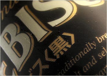
English is most often used to create “image”, the elusive combination of “funiki” (atmosphere), emotion and sensation. The use of English as a beer logotype, may allude to international prestige or historical depth. In longer texts, such as promotional language, it adds a layer of obscuration between visual representation and literal meaning. Japanese audiences will classify any English longer than a few words as decoration, to be felt, rather than read, especially if there is the equivalent Japanese nearby. This may offend the champions of minimalism and clarity, but it’s a widely accepted component of the Japanese visual lexicon.
This reappropriation of the English language as pseudo-copy/pseudo decoration presents a precarious, sensitive scenario for Western-trained designers. Unless editorial roles and processes are clearly defined, designers may find themselves distracted from design by any number of advisorship roles, solicited or otherwise. While it may seem impossible to restrain the English advocate inside, battles are hard won, the potential causalities, workplace harmony and design time, grave. Moreover, any righteousness based in grammatical accuracy rather than content strategy is dubious at best. And so I submit the following guidelines for managing such delicate situations:
Before offering unsolicited advice ask yourself:
- Is the text intended to be read by English-speaking audiences?
- Will errors result in serious damage to the client's reputation?
- Will errors cause crucial usability or safety hazards?
- Is it possible to submit this advice respectfully and constructively?
- Without committing to any undesirable duties?
- Without sacrificing my design responsibilities?
- Am I prepared for a polite declination?
- Are there any strategic advantages to the copy in question that trump usage concerns?
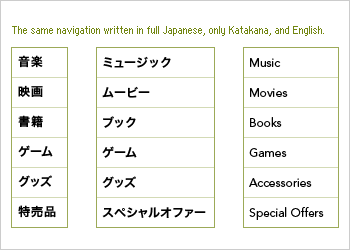
Language and navigation systems
Site navigations can be displayed in standard, full Japanese, English in Katakana, or standard English. Standard Japanese is chosen for general audiences. It is generally more space efficient than Katakana or English. Text sizes should be generous, but less generous than you may think. Stroke-dense characters are read by their shape and pairings (much like we read English word shapes, not letters), thus every stroke need not be entirely legible.
Katakana only navigations are rare, but may be used when specialized terms are in the majority, or when a smooth texture is desired. It is more accessible to general audiences than English, but can cause copy-fitting headaches, since Katakanaized English is usually longer than English or the native Japanese written in Kanji. As with all Katakana and Hiragana, heavy kerning is necessary to achieve a plesant visual rhythm, but avoid horizontal compression of overlapping of the letters.
English navigations are only appropriate for early teen to middle aged audiences, and even then must be vetted at length for usability concerns. Word choice must be scrutinized and tested to ensure transparency and comprehension. High-recognition vocabulary is fairly well defined, though meaning often differs slightly from the native English. Commonly understood words include contact, access, information, profile, map, news, recruit, feature, mail, shopping, links, products, and campaign among others.
Choosing Latin typefaces
Unless Latin typography is a central device in your design, Latin typeface decisions should be left until after the Japanese face is chosen. I doubt you'll have any trouble choosing an appopriate Latin companion face from the thousands available. But while weighing the intricacies of your favorite blackletter against the pedestrian charm of, say Hobo, try to remember who your designing for. Though there is no reason to abandon careful process, many historical and cultural subtleties will be lost on Japanese audiences. Avoid any wankery that involves "challenging legibility"; the appearance of English presents enough of a challenge for the Japanese reader.
- For single English words or phrases embedded in Japanese body text, choose a font that resembles the Japanese in stroke width and modulation, letterform proportion and overall color. Predictably sans-serifs pair well with Gothics, serifs with Minchos.
- Consider capitals. Since Japanese has neither ascenders nor descenders, lowercase letters may cause a visual break in the line.
- For longer quotations and blockquotes a contrasting typeface may be appropriate. Since Gothics are common body-text choices for the web, a serif set slightly smaller with a line-height variation is one plausable companion.
Specifying font styles using CSS
Since the language attribute remains unsupported by popular browsers like Internet Explorer, language-specific styling ability will be determined by how the two languages are integrated and whether the content is dynamically generated. If English appears inline and is dynamically generated the possibilities will be limited. Start by specifying Latin fonts first in your CSS font list, followed by Japanese. Since Japanese fonts contain Latin subsets, any Japanese font specified before the Latin font will override it.
- If logistics allows you to wrap English in a tag, experiment with horizontal margins to give the English any needed breathing room.
- Language tags remain unsupported by popular browsers including IE.
- For inline English elements, specify English fonts first, followed by Japanese. Since Japanese fonts contain English subsets, any Japanese fonts specified before the Latin font will override it.
- IE Mac in OS 9 will ignore your Latin font specs if there is Japanese on the page.
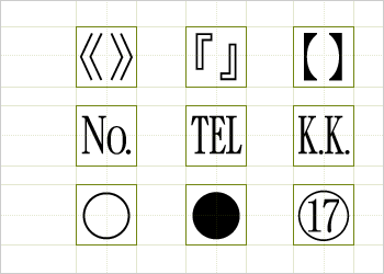
Analphabetic characters
Though there are few reliably available Japanese typefaces available for HTML text, each contains a hidden cache of typographic treasure. Analphabetic glyphs are more abundant and varied than in Latin typefaces, including a variety of parentheses, bullet-like circles, stylized digits, and other specialized symbols. Some copywriters may use these with great enthusiasm or not at all.
Usage chart of common Analphabetic characters
As a designer it's your responsibility to redress the text as needed, but be sure to reconfirm with the author that your typographic decisions do not distort the meaning of the text. Also be sure the symbols you choose are included in the character set specified in the head of your document. If not included in the set, some symbols may render as something completely different, or not at all. The unicode set utf-8 is more inclusive than the more popular shift_JIS.
Related Resources
- Japanese Typography on the Web and Beyond : Part One (LukeW)
- My boss is a 48-year-old housewife from Niigata Prefecture (v-2 Organisation)
- Styling Using the Language Attribute (W3C)
Chris Palmieri is a partner at AQ in Tokyo, Japan.