I've heard foreigners compare their first experience in Japan to everything from Disneyworld to The Planet of the Apes. Neither is particularly flattering or accurate, but they reflect the disorienting and uncanny similarities and differences with their own culture that provide years of surprise for even the most jaded expatriate.
Japanese typography, especially for the web, can induce a similar experience for Western-trained designers. Many of the typographic rules we've learned and broken must be restated or discarded as irrelevant. Some typographic parameters that we've manipulated to great effect are no longer available, but are replaced by exciting new ones.
This two-part series offers a primer on Japanese typography for Western-trained designers. In this first installment, I will discuss basic typeface classification and white-space characteristics, explain some of the options and limitations of web-based Japanese typography, and make a few suggestions for creating attractive, legible type. In Part 2 of this series, I will address additional type issues, including analphabetic glyphs and the role of English in Japanese design. While by no means comprehensive, this primer should help Western designers avoid stealing too many Japanese sheep.
Take time to understand the text before you design it.
While this may not always be possible, any effort made to understand the content you are designing will pay exponential returns. If you foresee yourself designing in Japanese for more than a project or two, make a place for Japanese language study in your life. Handwriting practice of even the basic letterforms may be humbling at first, but will eventually give you a sense for the rhythm and balance of the glyphs.
If language study is not possible, try to find a surrogate to read and explain the text to you. For titles and headers, find out what each character means individually, so that you can make informed decisions about size and breaking points.
The texture of Japanese type
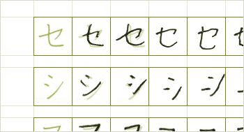
There are very few similarities among the textures of Japanese and English typography, and the differences often enable designers to achieve a smooth, creamy grey much faster with English than with Japanese. The most dedicated Japanese typographers kern every character, including the body text of long magazine articles. Fortunately that’s not possible on the web, though it’s important to understanding the conditions that led to this scourge of sleep-deprivation.
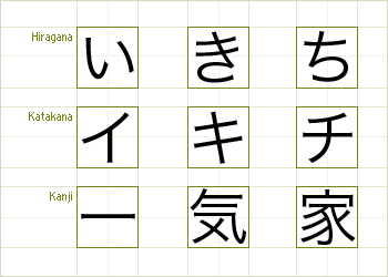
First, the Japanese language is composed of three character sets, Hiragana, Katakana, and Kanji. Each has a distinctive rhythm and density, yet the three sets work together grammatically on the same line. Hiragana and Katakana, both phonetic sets like the Latin alphabet, are composed of only a few strokes. Though a few Hiragana and Katakana are similar in appearance, Hiragana is more curvilinear, Katakana more angular. Kanji glyphs, each with multiple meanings and pronunciations, have stroke counts that range from one to at least the late teens.
Despite the variety of stroke density, each character fits neatly in an invisible, perfect square. There are no capitals, ascenders or descenders, and no predictable starting character for words or sentences. Lists, especially with longer list items, must therefore be treated with special care. Without a substantial change in leading, indentation, and sometimes a leading marker, lists may be difficult to distinguish from body text.
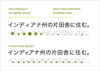
Since most Japanese fonts have poor kerning tables, hand kerning, when possible, is also crucial to the quality of your work. Because the letterforms are so varied in construction, it will take time to retrain your eyes, but the basic premise should be familiar: balance the white space within letterforms with the white space between letterforms. This usually means tightening Hiragana and Katakana and loosening Kanji, but each pair, which could meet in complementary curves or solid vertical walls, should be analyzed independently and in the context of the line.
Japanese typeface classification
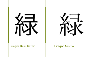
Japanese type is largely dominated by two genres of typefaces which share a relationship of contrasting form and usage, much like that of serif and sans-serif.Mincho typefaces, which are based on brushstrokes, have a highly modulated stroke-width and serif-like terminals. Like most serif faces designed before 1985, Mincho faces are difficult to use well on the web. Their delicate curves are shredded and blotted by screen resolution at small sizes.
Gothic typefaces are even closer in form to Latin sans-serifs than Mincho are to serifs. They have even stroke-widths, blunt terminals, and come in a wider range of weights. For all these reasons, they are often the better choice for web text.
Due in part to their construction, Mincho and Gothic are used differently off the web as well. Mincho faces are used more often for general-audience publications such as newspapers. Mincho is also used for most book-length texts. Gothics are used more often in technical, explanatory documents, magazines, and text intended for a younger audience. Gothics are also used for captions since they can be set legibly at smaller sizes.
HTML fonts
While you may feel limited by the Chocolate, Strawberry, Vanilla selection of fonts available for English body text on the web, you will soon be pining away about the finer points of Verdana and Georgia.
To start, you can forget about italics and boldfaces. Italics are not a natural part of the Japanese language, and any attempt to italicize Japanese will be neither attractive nor legible. Bold faces, while not improper, do not display as bold on some systems. This becomes especially problematic when Latin type is mixed in the line, since that will display bold, adding unintended emphasis.
There are also only a few reliably available Japanese system fonts available, and not a single are shared by Windows and Macintosh. The most common choices for body text are MS Gothic for Windows and Osaka for pre-10.x Macintosh. Windows also includes MS Mincho, though the stroke width is rendered evenly at all but the largest sizes because of pixelization. OS X and Windows XP include other options and the luxury of anti-aliasing, but penetration of these operating systems is still modest.
Comparison Chart of Japanese HTML fonts and sizes.
If you set font sizes with keywords, anything below “small” should be used with caution. If you set font sizes with pixels, odd font sizes are rounded down to the nearest even number in Windows, though with wider tracking. This phenomenon is friendly to Kanji, which sometimes touch at even sizes, and unfriendly to Hiragana and Katakana, which begins to resemble an old boxer’s smile. I've found 12-13 pixels to be a kind body text size for general audiences, while 10 pixels, though still legible by younger readers, works better in tighter spaces such as navigation and sidebars.
Rendering Japanese type as graphic
Given the stylistic limitations of Japanese HTML, text as graphic, though increasingly controversial in this age of accessibility and device-independent content, is often an unavoidable solution to some branding objectives.
When rendering text as graphic, the rules and techniques remain largely the same as with Latin type:
- Avoid rendering anything longer than a few lines.
- Provide alternate content whenever possible.
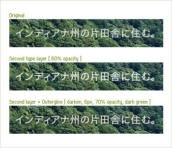
- Experiment with a second layer of identical type, set at reduced opacity, especially with Mincho typefaces. This will bulk up thinner strokes and terminals. Do this last to avoid having to edit two layers each time.
- When setting type on top of a busy photo, consider a low-opacity drop shadow or outer glow, set to an analogous color (multiply/darken for light on dark, lighten/screen for dark on light). If done with care, the shadow will increase legibility without drawing attention to itself.
- If you are unsatisfied with your software's anti-aliasing, use the pencil and erase tools to sharpen blurry strokes.
There are also an array of new image replacement techniques, which although not always practical, offer the promise of more type options, if not now, soon. While Fahrner Image Replacement and its variants present no problems for Japanese text, Shaun Inman’s IFR, which involves embedding fonts into Flash files, would create a hefty download with Japanese fonts containing thousands of glyphs.
Though the limitations of Japanese web typography may be discouraging, and the unfamiliar textures and shapes a bit daunting, hopefully you will be emboldened to find new ways to breathe life into the page. To this end, white space, contrast, an understanding of the tools, and a respect for content will serve you well in any language.
Related Resources
- Explanation of the Japanese Writing System (Wikipedia)
- A complete introduction to Japanese character encodings
- Multibyte String Functions (php.net)
- Rikai.com (Perl-based inline website translation tool)
Guest author Chris Palmieri is a partner at AQ in Tokyo, Japan.