If there was ever a reason for Western designers to sharpen their Eastern sensibilities, tomorrow’s global business market is it. As Chris Palmieri has demonstrated in loving detail, the nuances of Asian typography (and design contexts) introduce unique considerations for global product interfaces.
“More firms will become global, and those operating in the global arena will be more diverse, both in size and origin, more Asian and less Western in orientation. Such corporations, encompassing the current, large multinationals, will be increasingly outside the control of any one state and will be key agents of change in dispersing technology widely, further integrating the world economy, and promoting economic progress in the developing world.” –Mapping the Global Future, Report of the National Intelligence Council's 2020 Project
- A lack of typographic choices reduces the effectiveness of common Western design “crutches” (such as bold or italics) for organizing information visually. Instead background colors, horizontal rules, and bullets are useful for creating rhythm and contrast in content.
- The density and complexity of Asian characters makes default link color choices (bright blue, purple, and red) somewhat impractical. The intensity of these hues may create excessive visual noise in large blocks of Asian text.
- Reduced line lengths (a few English words can sometimes be represented by just a character or two) require some thinking about how an interface will flex when localized.
- To ensure legibility of Asian text, line heights may need to be increased.
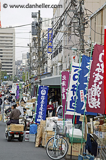
- Information density is interpreted quite differently when the physical landscape resembles something like this.
Of course, typography is but one cultural consideration for globalization. Socio-economic infrastructures, technology adoption, and usage patterns also can vary quite a bit.