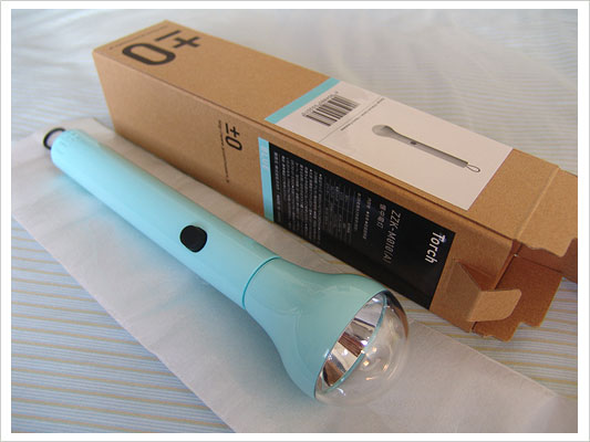
Not too long ago, I received a gift from a friend in Japan that echoed several themes I’ve discussed on Functioning Form. The gift was a flashlight from ±0 in Japan and (though I love the light bulb like design of the product) I was really struck by the packaging.

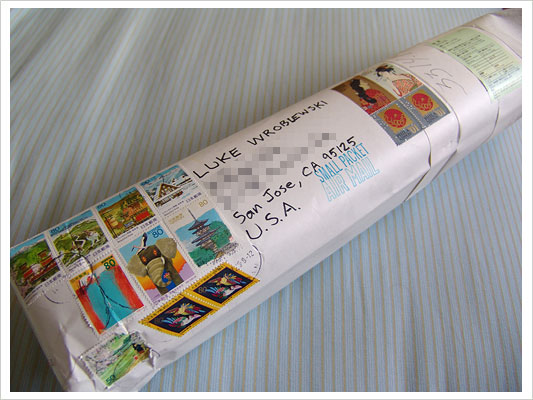
There was an ornate collection of unique stamps on the package that immediately caught my eye.

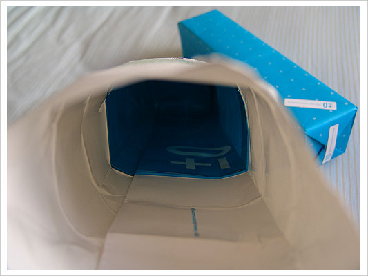
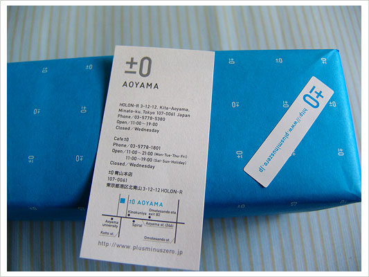
The interior of the package was lined with the ±0 logo, as was the wrapping paper.

There was no visible tape on the box. It was all below the paper’s surface and/or covered by ±0 stickers. A location card was included in the package that detailed where the gift was purchased.

The simple design of the flashlight’s box matched the minimalist aesthetic of the product to a tee.
When product designers take the time to package their designs with this much attention to detail, their customers enjoy the experience of receiving the product that much more. This principle also holds true for interface designs since they tend to be accessed repeatedly by returning users. Delighting users in many small ways is a great way to build an overall experience they’ll want to return to.
The ±0 flashlight is also a great reminder that due to “super-styling” of even common objects, the point of entry (aesthetically) for products in Japan tends to be much higher.