In the context of a software interface, things that work the same should mostly look the same. This isn't to say consistency always wins in UI design but common visual treatments teach people how to get things done in software. So designers need to be intentional when applying them.
People make sense of what they see in an interface by recognizing the similarities and differences between visual elements. Those big white labels in a menu? Because they all look the same, we assume they work the same as well. When one label opens a dropdown menu, another links to a different page, and a third reveals a video on hover, we no longer know what to expect. Consequently our ability to use the software to accomplish things degrades along with our confidence.
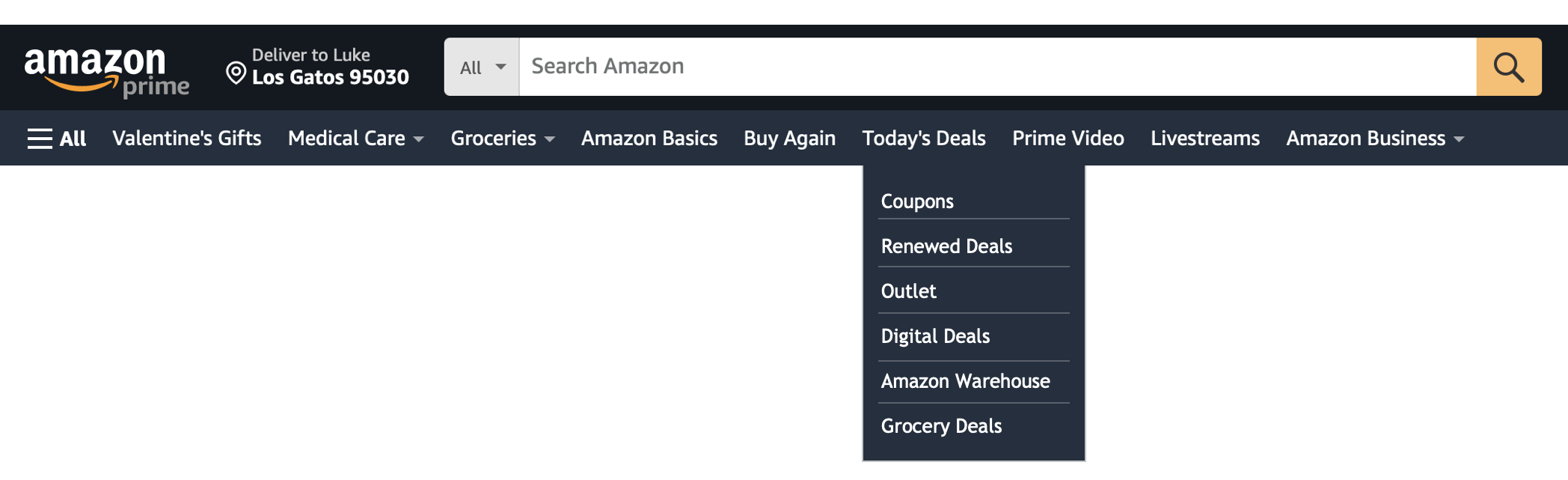
Though Amazon's header has lots of options, there's a common visual representation for the elements in it that reinforces how things work. A white label on the dark blue background is a link to a distinct section of the site. If there's a light gray triangle to the right of the label, you'll get a set of choices that appear when you hover over it. And last, but not least, the white label with a menu icon to the left of it, reveals a side panel on top of the current page when you click. Here's a simplified image of this:
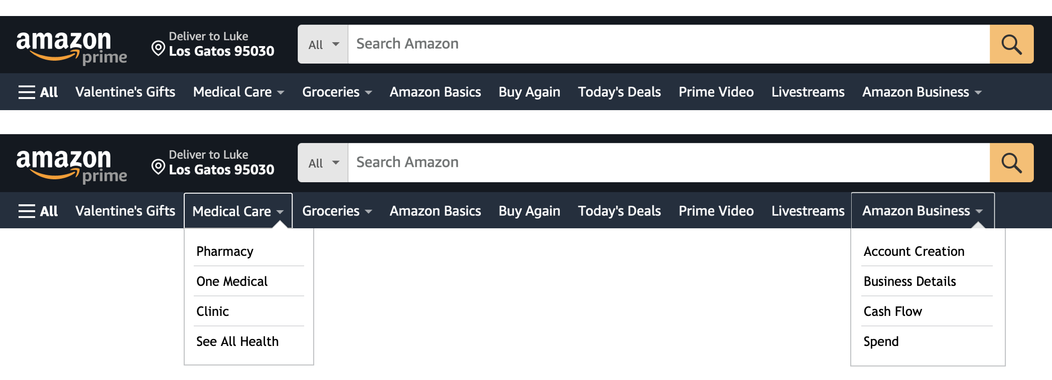
Each distinct visual representation (white label, white label with arrow to right, white label with icon to left) is consistently matched with a distinct action (link to a section, reveal choices on hover, open side panel). The end result is that once people interact with a distinct visual element, they know what to expect from all the elements that look the same.
If one of the white labels in Amazon's header that lacked a light gray triangle also revealed a menu but did it on click instead of on hover, people's prior experience wouldn't line up with this behavior and they'd have to reset their understanding of how navigation on Amazon works.
While one such instance doesn't seem like a big deal... I mean it's only a little gray triangle... do this enough times in an interface design and people will increasingly get confused and feel like it's harder and harder to get what they need done.