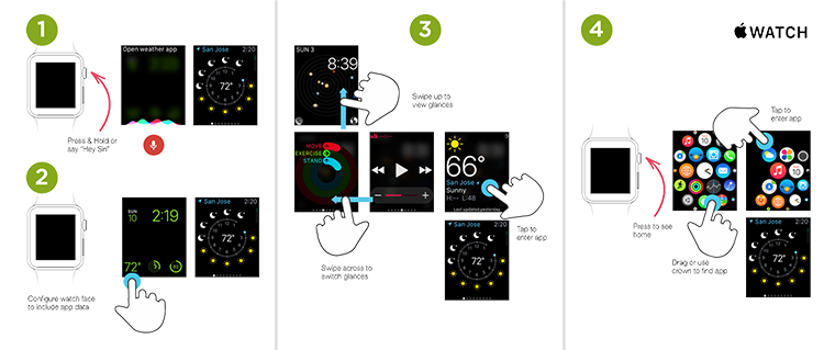
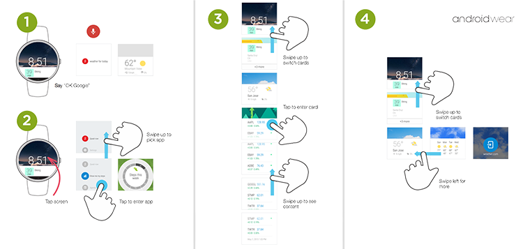
On PCs (or smartphones, or TVs) computer operating systems have a lot of user interface elements and conventions in common. So it's really the differences in each OS that define their unique personalities. Wearables are no different as my recent companions between Android Wear and Apple Watch help illustrate.
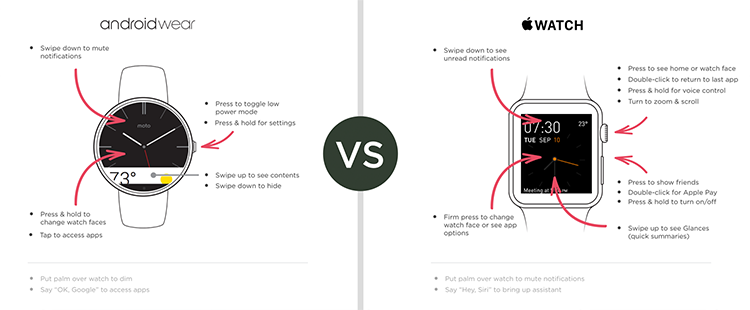
Both operating systems contain an extensive but "hidden" interface layer. That is, there's lots of controls and features available but they require knowledge of touch gestures, audio commands, or hardware to operate. In practice I've personally found it hard to keep all these invisible interface commands memorized (especially across devices).
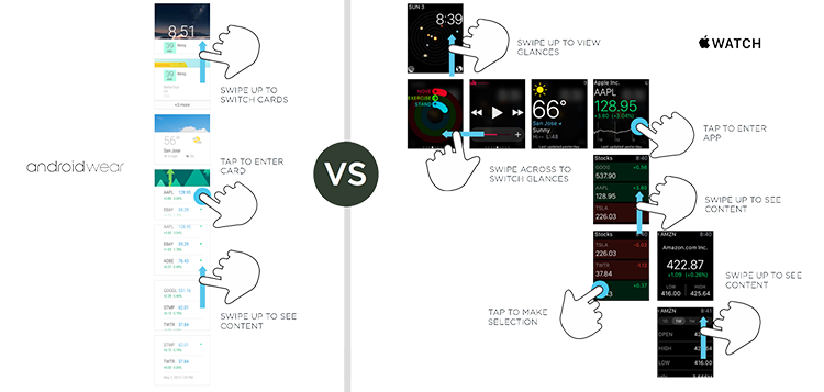
When starting from a watch face with touch, Android Wear mostly maintains a continuous vertical scroll path. Apple Watch's scroll flow, on the other hand, varies between vertical and horizontal swipe interactions.
When I first began designing touch interfaces, I'd make UIs that required people to switch between vertical and horizontal scrolling often —sometimes even in the same task. Over the years I've come to appreciate the importance of scroll flow: a singular, simple gesture that makes an app's core value easily accessible. Which may be why it took me a while to get used to Apple's multi-directional model.
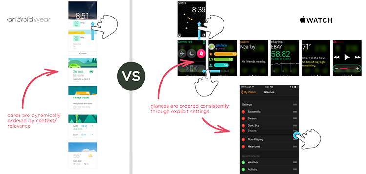
Another key difference between Apple Watch and Android Wear is how useful information is organized. Apple allows you to set a specific order for these "glances". Once set, that order stays consistent whenever you access them. Android Wear, instead, displays these "cards" based on which are most relevant at any given time or place. Clearly both approaches (consistency and context) have benefits and both seem to reflect the strengths of each of the companies behind their OS.
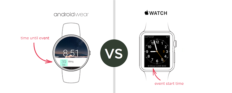
Android Wear's focus on context is also reflected in the display of information on the watch face. Rather than showing when a meeting on your calendar will begin, Wear displays the time left until the meeting starts. A small but useful difference in making "timely, glance-able information" work.
Both operating systems offer multiple ways to access apps and information including touch gestures, voice commands, and hardware controls. In practice, however, I find myself relying on heads-up glance-able information frequently and voice or touch activated actions much more rarely.
On the wrist, awareness (glance-able, contextually relevant updates/info) and triage (lightweight actions in response) work well. Initiating tasks happens a lot less often and usually requires more time focusing on the watch than necessary.
In other words, actions, not apps seem to make for better wrist-based experiences. At least for now...
