The World Wide Web is awash with sterile design solutions. Hewlett-Packard, IBM, Dell, Microsoft, and countless others are virtually indistinguishable from each other (similar layout, similar color scheme). Though one might say that this uniformity makes web browsing easier by virtue of a standardized interface, the reality is such sites create mundane experiences for their users and fail to make a positive connection with their audience.

“Perhaps no other design element has as much influence on how we feel in a space (a website, a home, etc.) as color.”
One easily remedied cause of such drab design is color. Perhaps no other design element has as much influence on how we feel in a space (a website, a home, etc.) as color. Colors can instantaneously change our moods and alter our opinions. They can make us comfortable, put us in a state of awe, or get us excited. In the case of interface design, color combinations found in nature are especially useful. From complex web applications to informative “brochure-ware” sites, naturally occurring color combinations have the potential to distinguish (by helping create a more memorable website), guide (by allowing users to focus on interactions), engage (by making page layouts comfortable and more inviting), and inspire (by offering new ideas for color selection).
Distinguish
As we go through our lives, we quickly forget about events that are routine and mundane. We tend to save our memories for unique experiences or events with which we had an emotional attachment. It’s no different as we go through the web. When all websites look the same, it’s quite easy to drop them into the “been there, seen that” bin. And once you consider how fast we move through websites, it’s probably even easier.
Therefore, any opportunities websites have to be distinct shouldn’t be squandered. If your site stands out, chances are web users might give it more time or thought when they arrive. They might even remember it and come back. There’s probablybly no better opportunity to make a favorable impression than with color. People have an immediate response to color: they get excited, they get happy, or they get bored.
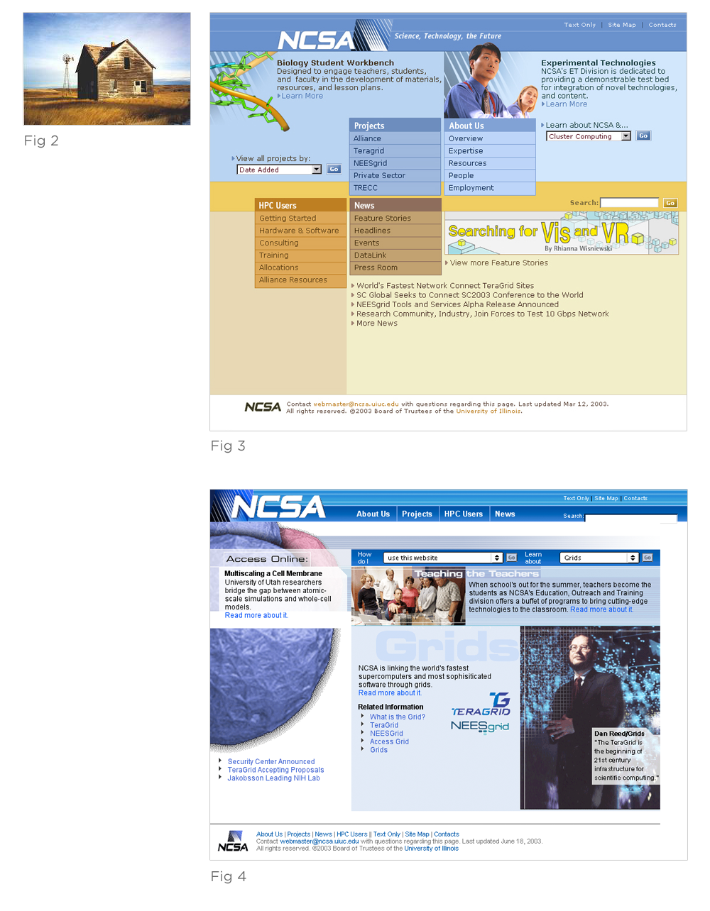
A unique palette based on colors found in nature can get you out of the World Wide Web color rut (Fig 1) and help create a more memorable website. For example, the naturally occurring color combination (Fig 2) used in this website mock-up (Fig 3) is a stark contrast to the more “standard” version (Fig 4) of the same site. The soft colors are subtle enough to work as background, yet distinct enough to separate the four main information areas of the site.

But before you go applying “prairie tones” to your design, remember your color selections need to be appropriate for your audience. Because color communicates so effectively, it’s important to make sure that it says the right thing.
“Form follows function—that has been misunderstood. Form and function should be one, joined in a spiritual union.”—Frank Lloyd Wright
Guide
Colors found in nature are often less saturated and more pleasing to the eye than their artificial counterparts. As a result, they allow users to focus on interactions, and not be distracted by overly bright hues. When you attempt to focus on the information in a layout with very saturated hues (Fig 4), your eye consistently returns to the bright colors (in this example, to the blue bar at the top).
In contrast, the blues and yellows in the alternate layout (Fig 3) create a balance that allows the images, navigation, and content to come forward. (This is especially useful for pages that have lots of content.) The strongest visual elements are the most useful ones: navigation menus and featured content, not background colors. Perhaps this occurs because of our familiarity with nature’s color combinations. We are used to backdrops composed of blues, yellows, and grays because we see them every day.
This phenomenon becomes especially important in web-based applications where users can interact with an online service for hours or days at a time. Having a palette that does not fight for a user’s attention allows them to focus on their work and on important information. Of course, color isn’t all you need to create a great web experience; structure, interaction, layout, and more need to work together to create usable and useful websites and applications. But color is an important part of the equation and shouldn’t be ignored.
“Nature’s colors are familiar and have a widely accepted harmony.” —Edward Tufte, 1989
Engage
Color combinations found in nature are especially useful for addressing another design consideration: emotional response. Usability is vital for easily getting users from Point A to Point B, but it takes personality to create enjoyable experiences that people want to repeat and share.
Consider the following two versions of a transaction form. One (Fig 5) uses a palette that is bleak and intimidating. The other makes use of a naturally occurring color palette and is more approachable because of its warmer, more inviting colors. For the clericals who must repeatedly use this online program, a less intimidating interface can engage them and provide a more comfortable setting within which they can work.

Inspire
Color combinations found in nature also provide a wealth of inspiration. The diversity of the natural world continually offers new ideas and approaches to color selection. For instance, the colors used to encourage tourism in the city of Dublin are not the orange, green, and white of the Irish flag you might expect. Instead, they come from a naturally occurring color combination on the Irish coast. This combination is both lively and attractive, making Dublin seem fun and expansive. It’s a shame this color scheme was not carried through to the Dublin website, which is much less vibrant and engaging.

All that said, naturally occurring color combinations are not a silver bullet. Sometimes, you might want to inspire “shock and awe” in your audience. In which case, colors that never occur together in nature (and therefore seem uncomfortable) could be your best bet. Other times, your favorite shade of corporate blue could be just what your audience is looking for. But when it comes to extended or complex interactions and unique ideas, color combinations found in nature are a valuable weapon to have in your arsenal.