Outside of Hollywood blockbusters, getting in the way of a speeding freight train usually doesn’t end well. It takes a lot of effort to shift the course of something with that much momentum. So instead of trying, just hop on board.
Believe it or not, this little lesson applies to mobile app design as well. Rather than forcing people to divert their attention from their primary task, come to where they are.
Let me illustrate with an example from our app, Polar. Polar is a fun way to collect and share opinions by making and voting on lots of photo polls. This is our freight train. We get over 40 votes per user on any given day. It’s where people spend the most time in the app and get immersed in the Polar experience.
We knew this experience could be even better if the list contained polls from people you know. So we added a prominent action in the header that allowed you to find your friends on Polar when you tapped it.
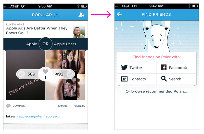
But very few people did. As it turned out, we were trying to divert the train by requiring people to go to a different part of the application to do things like find and invite friends.
So we decided to use the forward momentum of our “train” instead of fighting it. Now when someone is voting, voting, voting... the 20th poll we show them asks “Would you like to find your friends on Polar?” If they say yes, we connect them to their Address Book, Facebook, and so on.
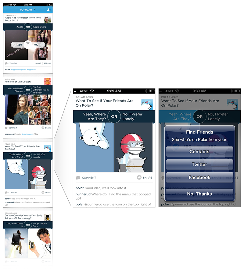
When we made this change, use of the Find Friends feature shot up dramatically. Since then, we’ve redesigned a number of other features this way including setting preferences, requests to rate the app, and more. Treating these actions as part of the main activity of our app, in our case voting on polls, instead of as separate interface elements made a huge difference in their use.