Last month I compiled an overview of why software designers were turning to Apple's presentation software, Keynote, to design application interfaces. Several of you asked for more so... here's additional reasons to design in Keynote and lots of tips for getting the most out of it.
Detailing Interactions
Personally, I (LukeW) use Keynote for two reasons: detailing interactions and integrating a product overview within a broader presentation. While Keynote does not have a robust set of tools for working through interaction details, the basic animation controls the program provides can get you 90% of the way there. When combined with image masking and simulated taps/clicks, these animation controls allow a designer to illustrate a wide range of user interface transitions, feedback, and states.The process of animating user interface changes in Keynote forces you to think through how the actual interface will work. For instance:
- How quickly should this item fade?
- Will moving this control disrupt a user's workflow?
- What's the best transition to bring certain elements into focus?
- And so on...
Having a running simulation of your application in Keynote means you can illustrate scenarios and key points with a broader presentation using actual application UI. So when presenting a company strategy -you can show how it comes to life in the product (without leaving Keynote). Since Keynote is presentation software, key points can be illustrated in sequential narratives or user stories -a great way to communicate the value or purpose of an application.

Some tips for detailing interactions using Keynote:
- Divide interface changes/sequences across multiple slides. When designing in Keynote, you can quickly get to more than ten animations on a single slide. If you do, stop and continue the sequence on the next slide by starting the first animation right when the slide loads. This will make updates much more manageable.
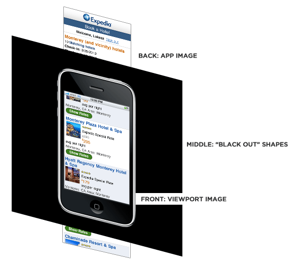
- Mask elements behind a simulated viewport by creating a layer of rectangles (or other shapes) that sits in front of your UI. See illustration above.
- Use image masks to separate images into their components rather than trying to manage many images of each component. Aligning elements is much easier when they come from the same image.
- Align with opacity. Set opacity to 50% on a newly added element to align it properly. When the alignment is right, set opacity back to 100%.
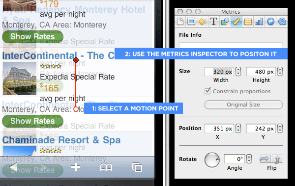
- Pro tip: To align move actions, click on the red diamond representing the staring point of the movement, then navigate to the Metrics Inspector to enter pixel values. You sometimes need to go back and forth between the Build Inspector and Metrics Inspector to get the position to update. See illustration below.

Travis Isaacs uses Keynote to quickly describe interactive details in a narrative manner and has developed the Keynote Wireframe Toolkit to help you do the same. In his own words...
With Keynote, I solve design problems faster because I can capture, iterate, and communicate ideas faster and more efficiently than any other tool out there.
Interactivity is so important in how your product feels. I used to jump into HTML/CSS/JavaScript early on just to iron out interaction details because I couldn't capture them in a static medium like a wireframe or visual comp. Keynote can simulate these interaction details with transitions/animations really effectively.
Like many designers, I used to go from sketches to creating visual comps in Photoshop. Almost by accident, I discovered that with Keynote I could design interfaces with the fidelity between a wireframe and a comp two or three times faster than Photoshop. Because the investment to capture an idea is so low in Keynote, I don't become attached to it, freeing me to try more permutations until I get it right.
Some designers categorically oppose showing wireframes to clients for various reasons. Mainly, they are confusing. In my opinion, it takes a lot of imagination for a client to understand "traditional" wireframes. My Keynote wireframes have enough character and polish that it’s engaging to the customer and a lot easier to digest. I can interactively describe the details in a story-like manner.
Using Keynote well:
- Always design in master slides: This gives you a base layer to store all of your non-interactive elements. This base layer can be applied to any number of regular slides. This is handy for showing layers or menus.
- Keep you slide size reasonable: Embrace the constraint of the default 1024x768 slide size, as it represents a reasonable "view port" for a desktop or web interface. Tools with infinite canvases can deceive you.
- Don't repeat yourself: Along the same lines as "always design in master slides" - you should reuse as often as possible in Keynote. Use the copy/paste style to copy style attributes from one element to another. Use master slides to avoid duplicating common interface elements. Keep a library (or ahem, a toolkit) of common reusable interface elements that you can drop in when you need them.
Amir Khella uses Keynote to spec out complete application interactions. To speed up the process, he's developed Web, iPhone, and iPad Keynote prototyping libraries. In his own words...
Keynote is a great prototyping tool disguised as a presentation app. It's got the right amount of features to keep me in the flow, without distracting me with more than I care for. I like its powerful layout engine, multiple slide masters, and hyper-linking screens to add interactivity. I no longer need to write long requirement documents - I just annotate my prototypes and let developers interact with them.
If you want to use Keynote for your next prototype, here are a couple of tips:
- Create master slides for main screens first, then normal slides for pop-ups, and add hyperlinks last.
- Use PDF export to send your presentation to the iPhone or iPad, then you can tap through it as if it were a working prototype.
- Create or buy a good interface library that you can use in your projects, and work with two monitors: one for your library, and one for your prototype.
Joshua Porter compares using Keynote to another popular design tool: Adobe Fireworks
- Speed to high fidelity. I can create something high-fidelity faster in Keynote. It's fast enough that I can often skip low-fidelity (or simply sketch quickly and then go into Keynote)
- Quickly make changes.
- Show sequences super easily (even if it's just manually clicking to the next slide) This is very powerful for presenting to others.
- Can easily add comments that help explain what's going on.
- Copying styles with command-D. This is a huge time-saver...I can do it in Fireworks but it's not as fast.
- Easily work with images/screenshots/videos.
- Master pages work as templates...can get something up really fast (pages is something that Fireworks only recently added)