In recent months, I’ve been working on refining the design recommendations in my upcoming book, Web Form Design Best Practices, through actual usage data. To that end, I’ve had the pleasure of working with London-based usability firm Etre on several eye-tracking and usability studies focused on specific aspects of Web form design. One of these tests focused on the distinction between primary and secondary actions.
Primary & Secondary Actions
A typical Web form usually enables several “final” actions. Actions like “Submit”, “Save”, or “Continue” are intended to enable form completion –the primary goal of just about anyone who has started filling in a form. Because they enable the most important action on the form (completion), they are often referred to as primary actions.
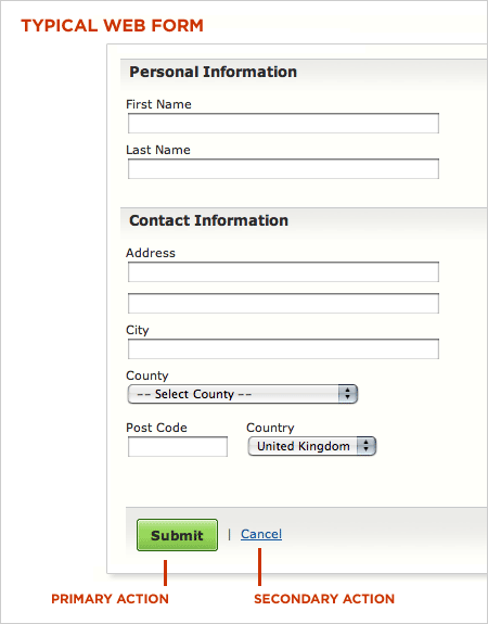
Secondary actions, on the other hand, tend to be less utilized and most often allow people to retract the data they’ve entered. Options like “Cancel”, “Reset”, or “Go Back” represent secondary actions that are counter to most people’s primary goal of completing the form they started.
Because secondary actions can have negative consequences, especially when used unintentionally, I’ve often argued they should be absent from forms. Imagine filling in a long form online only to hit the “Reset” button and have all your data erased.
That said there are situations where secondary actions make sense (“Save for later”, “Export”, etc.). In these conditions, the best practice I’ve advocated has been to visually distinguish primary and secondary actions so people have an clear path illuminating their primary goal: completing a form.
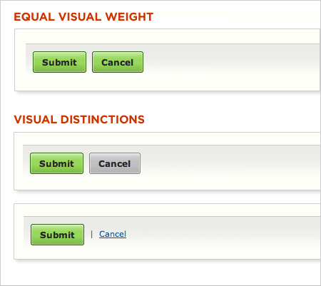
Reducing the visual prominence of secondary actions minimizes the risk for potential errors and further directs people toward a successful outcome. But what’s the best way to accomplish this distinction? How different should primary and secondary actions be and where should they be placed? To answers these questions, Etre and I ran a few tests.
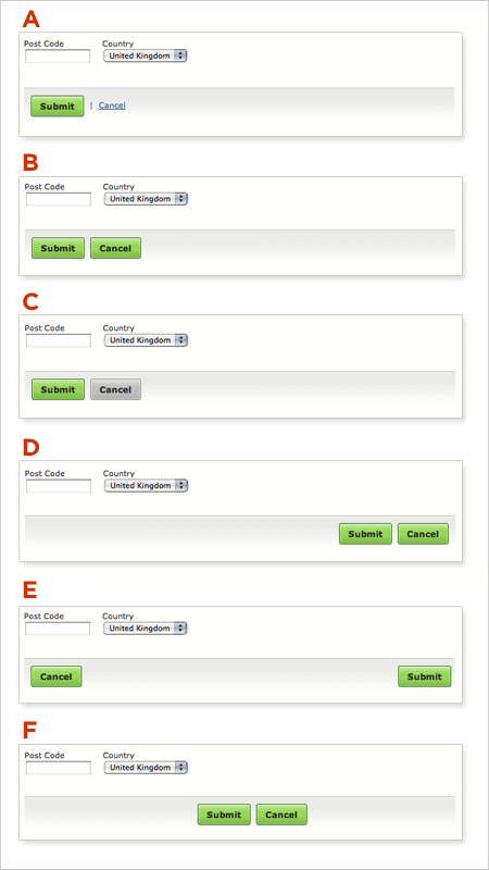
In order to assess which presentation of primary and secondary actions might work best, we tested six variations on 23 people using eye-tracking and usability metrics. Participants were presented each of six designs in random order (to minimize familiarity biases) and asked to “Please complete the form fully and accurately”.
Visual Distinctions
People accomplished their task perfectly when using five of the six designs. Option A, B, C, D and F achieved success rates of 100%, without causing users to make a single error. They also saw comparable task completion times and received similarly high satisfaction ratings.
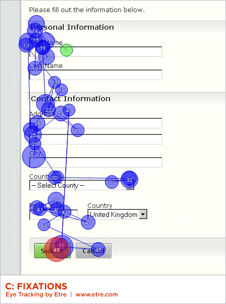
Option B performed best of all. Fixations were shorter and fewer in number when using this design. And people were also able to complete the task more quickly and efficiently than they did when using the others.
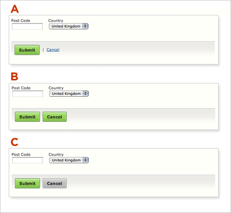
However, when commenting on Option A, several people said that displaying the “Cancel” option as a link was helpful. One person mentioned that, while such a recessive presentation made this option harder to find, it helped prevent accidental (and catastrophic) cancellations. Another felt that “Submit” was the most important option and thus thought it was logical that “Cancel” wasn’t given equal status in the user interface.
Several people also made positive comments about Option C’s grey “Cancel” button. One participant said that its coloring made it easier to spot “the right button” (i.e. “Submit”), while another said that the different colored buttons “slow you down [and] make you check that you are hitting on the right thing.”
Interestingly, people required around eight more fixations to process Option C than they did to process Option B – a design that presented both options as near-identical green left-aligned buttons. It seems that, while users liked they fact that the grey made Option C’s “Cancel” button easier to spot, it did make the design less efficient in terms of its ability to be processed quickly. That said, when using Option B, a number of users expressed concern that they “could quite easily click the wrong one.”
Overall, it seems that people responded well to designs that made “Cancel” stand out in some way – even if these designs slowed them down a little. This suggests that they were more concerned about avoiding losing their data, than they were about submitting it quickly.
Placement
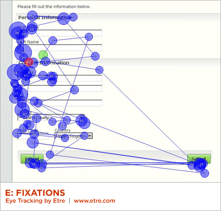
Only Option E performed poorly during our testing. Six people mistakenly clicked on the “Cancel” button when attempting the task with this design, while many more lingered over it before realizing that they were about to make a mistake. People, as a whole, were around six seconds slower when using this design than they were when using Option B (a considerable gap when you consider that the placement of the buttons was the only thing that differed between the two). They also required a higher than average number of fixations to complete the task (with a higher than average total fixation length and average fixation length).
According to the data we collected, Option A, B, and C were the three most effective designs. These prototypes shared a common characteristic: all presented their “Submit” and “Cancel” options on the left-hand side of the page. This suggests that left-alignment of these two options is the best design choice – especially when the form controls above are also left aligned. Placing the “Submit” and “Cancel” buttons on the left meant that people’s eyes had less distance to travel.
In terms of their eye movements, people were least efficient when using Option F. While all people performed the task successfully using this design, our eye tracking data shows that they were more efficient when using the others. People’s fixations were longest when using Option F; they fixated more often on this design than on most others too. We believe that this was because they expected the two buttons to be left-aligned (i.e. to appear directly below the last form field on the page) and upon finding that this wasn’t the case, had to search around to find them.
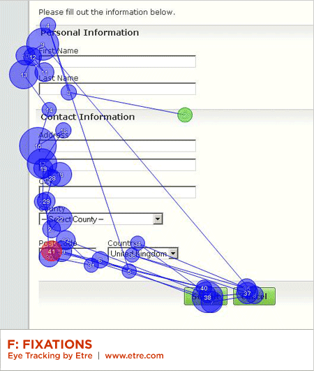
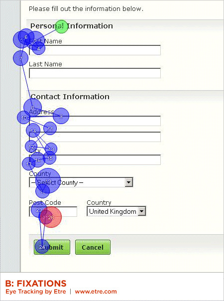
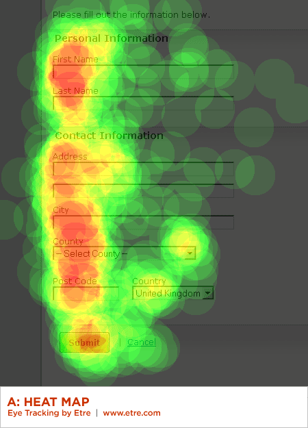
This finding maps well to a long-standing form design principle: illuminate a clear path to completion. Aligning inputs and actions with a strong vertical axis clearly communicates how to go about completing a form. This can be seen by the strong vertical axis formed by people’s gaze paths in the heat map below.
(Note: An element of preconditioning may also have had a bearing here as in all of the other designs we tested the “Submit” button was displayed to the left of the “Cancel” button.)
Summary
While the primary goal of most Web form designs is to get people through a form as quickly and painlessly as possible, there are situations where slowing people down is advisable. When choosing between primary and secondary actions, visual distinctions are a useful method for helping people make good choices.
Should this distinction be more prominent like the button vs. link in Option A or a bit more subtle like the two different colored buttons in Option C? Option A fared a bit better in time to completion, average number of fixations, and average total length of fixations indicating people completed the form faster but not by much.
The need for these distinctions becomes moot, of course, when no secondary actions are present. Make sure you really need each secondary action on a form and don’t add them indiscriminately.
Conversely, the alignment of actions with a form’s input elements provides a clear path to completion that helps people complete forms faster. Be conscious of where you place form actions as primary actions directly aligned with input fields tend to increase completion rates and the less time people have to spend on your forms, the happier they will be.