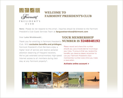
During a recent stay at a Fairmont Hotel, I was asked to join their frequent traveler program –the Fairmont President’s Club. Being convinced of the benefits of membership by the hotel’s clerk, I signed up and shortly thereafter received the following note in my email Inbox.
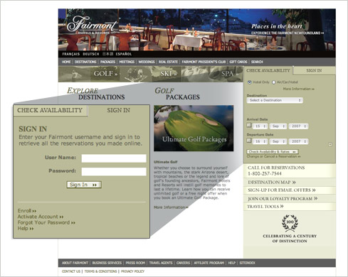
After reading the overview, I decided to take their recommendation and “Activate my online account”. Unfortunately, this didn’t take me to a page where I could do so. Instead, I was directed to the Fairmont Hotels home page and left to fend for myself. After a bit of digging I found the “activate account” link at the bottom of the Sign In section which required a click to expose. Form design tip one: don’t hide forms when you want people to complete them.
The “activate account” link took me to a page titled “Manage Your Fairmont Profile”. That’s great but I’m trying to activate my account am I in the right place? Form design tip two: be explicit about what each form is for.
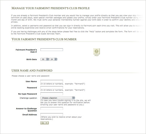
After slogging through the introductory text, I determined I was in the right place after all and dived into filling in the form. The first input was my President’s Club number. That was in my email right? Form design tip three: use smart defaults whenever possible. In this case, the link from my email could have easily populated this input field for me so I wouldn’t need to go back to my Inbox and dig up the number.
After that it was on to the obligatory User Name, Password, Re-type Password, Challenge question set of input fields. Form design problem four: don’t treat customers like records in a database. Though the Fairmont may need a user name and password to create a record of me in their systems, they can still treat me like a person and approach account activation as a conversation not as a dump of required fields from their database.
That this point, I filled in all the inputs on the form and I clicked “Go” hoping to finally activate my account. Instead of becoming part of the President’s Club, I instead seemed to have lost the form I just submitted.
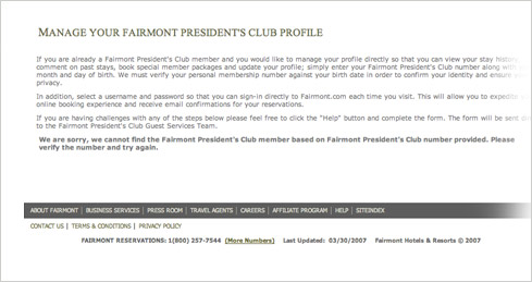
No wait… it actually turned out there was a message for me below the three paragraphs of instructions. I didn’t notice it at first because it was the same color as the rest of the text. The message read “cannot find the Fairmont President's Club member based on Fairmont President's Club number provided” and I was asked to “Please verify the number and try again”. Form design tips five & six: always message in context and make sure key messages are prioritized visually on the page. The error message on this form should have been shown where it was applicable (on the same page as the form) and not on its own. Since this message was blocking my progress, it was arguably the most important thing on the page: its visual design should have reflected that.
I decided I must have mistyped my membership number (though I copied it from my email directly) so I looked on the page for how I could try to enter it again and found nothing. Form design tip seven: always give people a way to easily recover from errors. On the Fairmont site, my only resort was to use my Web browser’s back button to go back to the form I just filled in.
I took the only option I had and clicked my Web browser’s back button, I returned to the form and found it empty! Now I needed to re-enter all my information again. Form design tip eight: be vigilant about keeping the data people enter into your forms. The Fairmont didn’t seem to have tried.
After repeating this process two times with the same result –guess if I am currently a Fairmont member? Let’s summarize what the Fairmont could have done better with the form design:
- Don’t hide forms when you want people to complete them.
- Be explicit about what each form is for.
- Use smart defaults whenever possible.
- Don’t treat customers like records in a database.
- Always present messages in context.
- Make sure key messages are prioritized visually on each form.
- Always give people a way to easily recover from errors.
- Be vigilant about keeping the data people enter into your forms.