In my overview of the Apple Store’s Checkout Redesign, I outlined how their solution for selection dependent inputs probably has some mutual exclusivity challenges. Let me explain that in English.
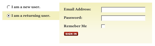
It’s not uncommon for a Web form to need some follow-up questions answered based on how people respond to an initial question. Consider the following example below from the Found Bin. People have two initial options: either they are a new user or a returning user. Depending on how they answer the question, a series of follow-up questions needs to be answered. Which input fields are shown depends on the initial selection they make—hence the name for this design pattern, selection dependent inputs.
While selection-dependent inputs may seem like a basic user interface design problem, there are many solutions to be found addressing this problem online. In fact, each solution for selection-dependent inputs tends to have both clear advantages and disadvantages.
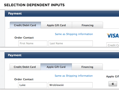
In Web Form Design, London-based usability firm Etre and I ran a series of studies testing a set of eight different selection-dependent input solutions. We found that horizontal tabs (what Apple is using) actually performed quite well in all-around usability, satisfaction, and eye-tracking metrics. But they came with the gnarly problem of mutual exclusivity.That is, people weren’t sure if the answers they provided in each tab would be processed or if only the answers they provided in the active tab would be processed. In Apple’s example, if I enter Credit Card information in one tab and a Gift Card in the other tab –will both modes of payment be used? Or only the one I leave open?
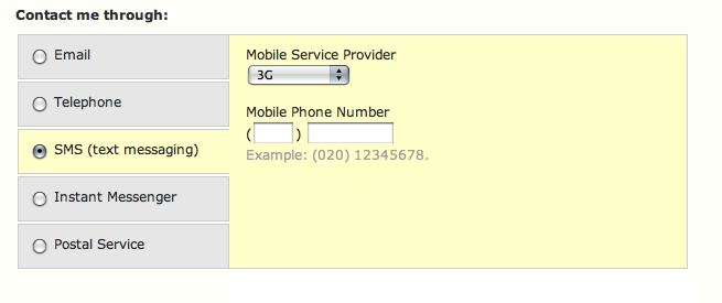
To get around this problem in one of the solutions we tested, Etre and I tried adding radio buttons to a set of vertical tabs in order to indicate that these choices were mutually exclusive. In our testing, however, a couple people were still confused as to whether the vertical tabs were mutually exclusive or not. So the inclusion of radio buttons didn’t seem to solve the issue.
Then perhaps a stronger indication of mutual exclusivity is needed? Looking at the Apple example, what if we included a set of images that very explicitly communicated to people that they had to choose only one of the options available.
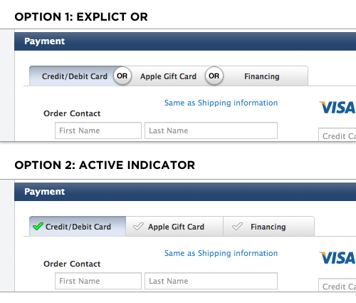
The first option uses an OR to separate each horizontal tab making it clearer that only one of the three can be utilized at any time. The second option uses an active checkmark to indicate which section will be processed. This format could also be used to highlight two or more sections with active data if they were all capable of being processed at once. But I don’t recommend going that route as it likely makes things more complex for users.
Frankly, I’m not sure either of these solutions will completely solve the mutual exclusivity problem, but it would be interesting to test and find out.