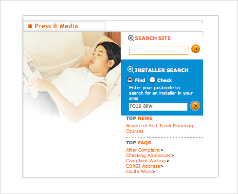
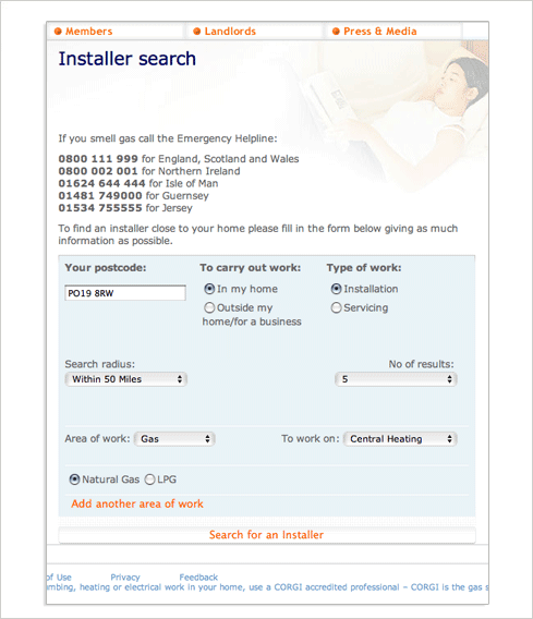
Not long ago, a frustrated user shared with me his experience trying to find a gas installer in the United Kingdom. The source of his confusion was a Web form on the Council for Registered Gas Installers (CORGI) Web site. It starts out rather innocuously –simply enter your postal code to find an installer near you.
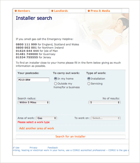
This leads to a form theoretically designed to allow you to filter your results. Unfortunately, no results are shown. So despite just having run an installer search, my first reaction was to make my way to the unjustifiably long button at the bottom of the form titled “search for installer”. I thought I just searched for an installer, but what the heck –I’ll try it again.

Well, still no results. But the form did update a bit –with an error. It turns out “area of work” is required. Considering I’m looking for a gas installer, let’s set that to “gas” and try again.
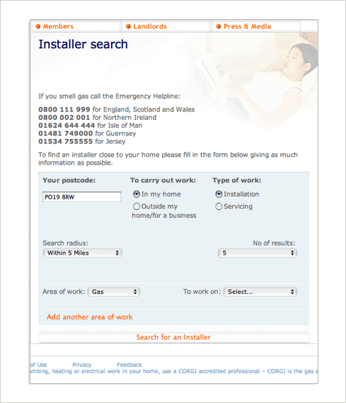
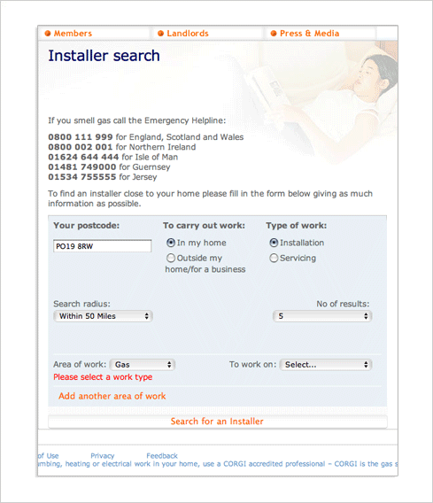
We’re back at the same form but this time with no errors. Perhaps I need to extend my search radius? Of course there’s nothing to help me determine why I still don’t see any results. But let’s go for “within 50 miles” and try again.
Back on the form this time with our friend the error. Maybe my selection of “gas” before wasn’t enough? Do I need to also provide an answer for “to work on”? It’s all guesswork at this point but let’s set this to “central heating” and try once more.
Again no results but I did manage to get some more input fields -a set of radio buttons for “natural gas” and “LPG”. Since I have no idea what LPG is I’ll leave the default selection in place and try for a sixth time to find some gas installer near me.
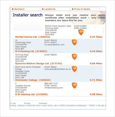
Finally –results! But it wasn’t easy. What did this skirmish teach us about Web form design?
Form design tip one: filtering works best when people have a sense of the results they are dealing with. Don’t force people to filter what they can’t see. The CORGI site could easily present these options next to a next of results instead of before them.
Form design tip two: primary actions should clearly look like actions –don’t make people guess how to complete a form. The “search for an installer” button on the CORGI site is styled to span the whole length of the form – not very button-like.
Form design tip three: clearly communicate when an error is preventing someone from completing a form with a top level message that is visually associated with the input field(s) responsible. In the CORGI form, the lack of a top-level error message forces people to scan the form in order to determine why they can’t complete it. The form also doesn’t mark all the input fields responsible for an error.
Form design tip four: Don’t send mixed messages about required input fields. The instructional text on the CORGI form asks people to “give as much information as possible” but some of the fields are required and not marked as such.
Form design tip five: Provide adequate feedback to people filling in your forms. The CORGI site prevents people form progressing without explaining why.
Form design tip six: Ensure people are aware of all the questions they have to answer before they attempt to submit a form. The CORGI site only surfaced additional inputs (natural gas, LPG) after a user submitted the form.
Form design tip seven: Use natural language so people know how to answer the questions on a form. What’s LPG?