In my So the Necessary May Speak article I walked through how to simplify a basic data table by eliminating unnecessary interface elements. Since then, a number of folks have offered alternative designs. I wrote up the pros and cons of four of these options from Deva Prasad in Redesigning A Simple Table and thought it might be useful to share some of the other ideas I’ve received as well.
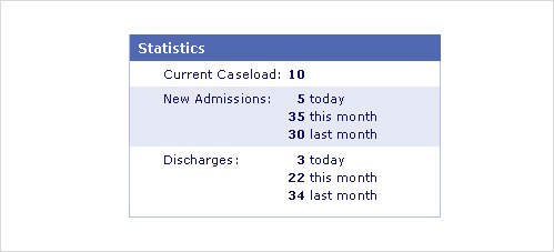
In my original redesign (above), a single column of bold text allows users to quickly see all the key data in the table with one downward motion. Labels for the data are in close proximity to the values. The content is scannable because there is contrast between the bold and non-bold elements.
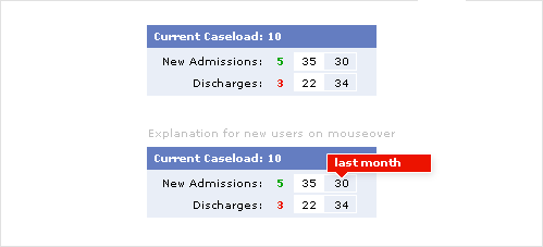
Andrey Smagin suggests a “simplified” solution that targets repeat users of this data set (people who interact with the application one or more times per day). He relies on frequent users to know the first column in this table is current day, the second current month, and the third previous month. For infrequent users, there’s a rollover to explain the significance of each value. Outside of obvious concerns of information legibility, there may be too much visual noise in this design. Are discharges bad because they are labeled in red? Does current and previous month need a unique visual style (background vs. border)?
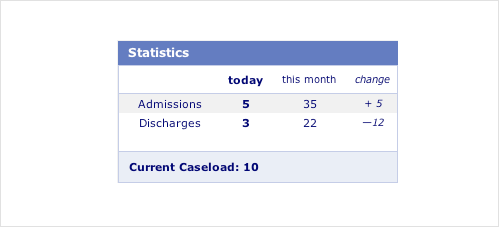
Robbin vanEijsden took a different approach and focused his presentation on the most current information in the table: today’s admissions, discharges, and caseload. He also used a table header and footer to put the focus of the table on the data rows instead of the labels, which now only appear in the table header. The previous month data has been replaced with “change”. To quote Robbin: “If the purpose of the "last month" data is to calculate the monthly mutation, the last column offers faster satisfaction.”
Assuming, today’s statistics are the most important values in the table, emphasizing these visually may be a good approach. However, once again it seems we have too many competing visual styles creating too much contrast in the table layout: bold, italics, borders, three different background colors. So this design can probably be further simplified.
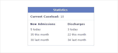
This redesign comes from the comments of Anton Vakunenko’s translation of my So the Necessary May Speak article. As a result I don’t have any author attribution or explanations behind the thinking. The layout appears to focus on the content groupings first and the data second. So if people generally only need one section of data at a time, this may be a good solve. However, the layout doesn’t allow for a rapid scan off all the information at once.
If you’re interested in more examples and explanations for this simple table redesign, take at look at: