In my So the Necessary May Speak article I walked through how to simplify a basic data table by eliminating unnecessary interface elements. Deva Prasad took the exercise a bit further and sent over a few well thought-out iterations on the final table design (below).
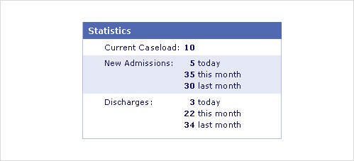
In this design, a single column of bold text allows users to quickly see all the key data in the table with one downward motion. Labels for the data are in close proximity to the values. The content is scannable because there is contrast between the bold and non-bold elements.
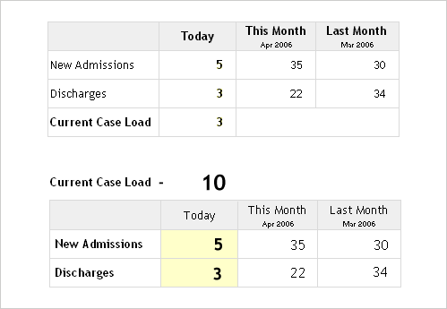
In Deva’s first two designs (above), the labels and their values have been divided into rows and columns, which requires horizontal and vertical movement. Users need to look across for one label and up for the second label. This is compounded by the increased separation of the data - the labels are further away from their values. While potentially better for looking up a particular value in the table, this design makes taking all the data in at once more difficult.
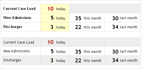
In Deva’s second two options (above), users can scan content horizontally as the bold text helps them move between values. Additionally, the increased font size emphasizes the data even more.
Ultimately, there are two pieces of context needed for us to determine which of these design options is "right".
- Are people looking for a specific value (i.e. discharges this month) OR do they simply need a sense of all the information at once. If the former, one of Deva’s layouts hit the mark. If the later, the original redesigned table makes scanning a bit easier for the reasons mentioned earlier.
- Is there a prioritization of the data OR is it everything equally important? If the former, again one of Deva’s layouts would hit the mark. If the later, introducing size and color variations might add visual noise instead of bringing extra attention to really important data.