I was recently pointed to an effort by the PayPal design team to address some of the limitations of left-aligned form labels that I outline in my Best Practices for Form Design compilation.
Left-aligned form fields have the disadvantage of separating input labels and input fields with potentially excessive space that requires more effort when associating labels with their respective fields. Left-aligned labels are also more partial to text-wrapping issues when label copy runs long or when they are translated into languages that require more characters.
To address these issues, PayPal launched an approach called “row highlight” that uses a background color to visually group form labels and their associated fields when the field is in focus (accessed by a user). While this approach may further clarify which label corresponds to which input field -especially when labels run longer than one line-, it might not significantly improve completion rates. (I have not seen any data that points one way or the other.)
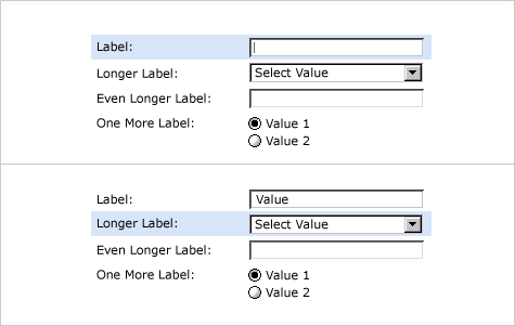
In my work I find that people don’t particularly like filling in forms. So I often try to get them through the process as fast as possible. However, the “row highlight” technique might not help in that regard because it doesn't seem to reduce the number of eye fixations required to parse the form.
![]()
As seen in the eye-tracking data above (compiled by Matteo Penzo), top aligned labels require only a single eye fixation to take in both label & field. Left-aligned labels require several more. This data also seems to indicate that people don't have trouble associating a left-aligned label to its respective input, it just takes them longer to do so.