On today’s multi-device Web, your audience might be using a mouse, keyboard, touchscreen, trackpad, or increasingly, more than one of these input types to interact with your service. Given all these possibilities, how do you let people know how they can get things done in your app?
A common way to provide relevant bits of guidance inside an application is through inline help. Inline help is positioned where it’s most useful in an interface and made visible by default so people don’t have to do anything to reveal it. This makes it an effective way to tell people how to use an interface. But what happens when those instructions vary by input type?
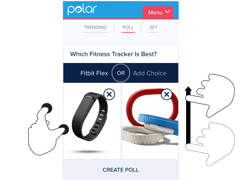
For instance, we recently built a fully responsive Web application that can be used on smartphones, tablets, desktops, and more. In this application, people can add and manipulate images by zooming, resizing, and moving these images around. Depending on the input type their device supports, however, they have different ways of accomplishing these tasks.
To position an image using touch, you simply drag it with your finger. Zooming-in and zooming-out is accomplished through pinch and spread gestures. Sizing an image to fit happens through a double-tap action.
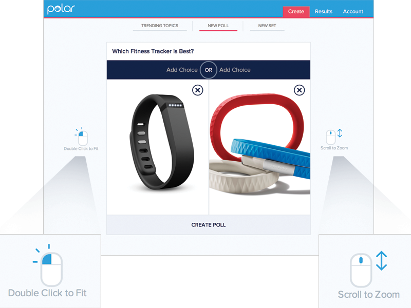
These same features are supported on mouse and keyboard devices as well. To move an image around, click and hold to drag it. Zooming in and out happens with the scroll wheel or a multi-touch gesture on the trackpad. Sizing an image to fit takes a double-click of the mouse.
As you can see, the touch and mouse actions are similar but not the same. We were also concerned that while touch users are quick to pinch and spread when trying to zoom an image, mouse users are less familiar with using scroll wheels and two-finger trackpad gestures to accomplish the same thing. So we wanted to let our mouse users know what’s possible with a few simple bits of inline help.
Easy, right? Just check if someone’s device has a mouse or trackpad attached and reveal the tip. Well, no.
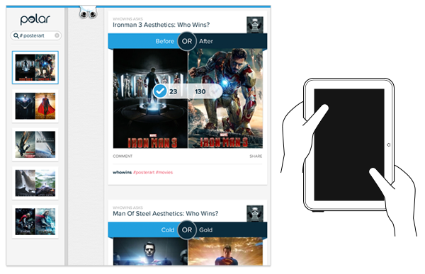
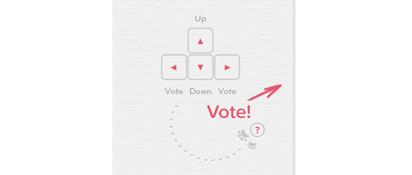
On an earlier project, we faced a similar situation. While our smartphone and tablet users could easily interact with our lists of polls by scrolling and voting with their thumbs, mouse and keyboard users had more work cut out for them. They couldn’t simply keep their fingers in one place and vote, scroll, vote.
So we developed a keyboard interaction that allowed people to vote with left/right keys and move through polls with up/down keys. While this made keyboard users much faster and effective, we again were faced with a hidden interface: people didn’t know keyboard voting was possible unless we told them.
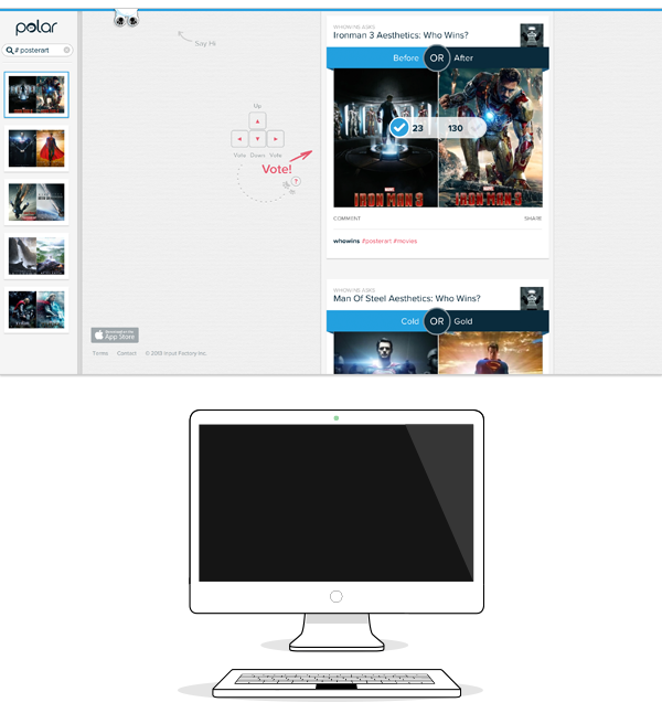
That meant we had to detect if a keyboard was present and surface a simple inline tip that explained the voting interface. After a few failed attempts at doing this, I reached out to friends on the Internet Explorer team at Microsoft. After all, if anyone would have a good handle on how to manage different input types on the Web, it would be the company with a Web browser that not only runs on phones, tablets, laptops, and desktops but hybrid devices and even game consoles as well.
Sadly, we learned there’s not a great way to do this in Web browsers today and browser makers are hesitant to reveal information like this in a navigator.hardware object because of concerns it could be used to fingerprint users. So instead, we opted to proxy the presence of a keyboard using screen width. That is, if the screen is wide we assume there’s a higher chance of a keyboard being present and show the keyboard interface tip by default.
This is the same solution we now have in our new publisher tool. When the screen crosses a certain width, we reveal two inline tips explaining how to zoom and fit an image using a mouse.
As I’ve written before, using screen width as a proxy for available input types is not ideal and increasingly unreliable in today’s constantly changing device landscape. But the alternative solutions don’t seem much better.
For instance, we could provide a help section that explains how to do things with every input type. But then we loose the immediacy and effectiveness of concise inline help. We could wait until someone interacts with the app to determine if they are a touch or mouse user, save that information and display device-appropriate tips from that point on. But even if we get this info up front it can change as people switch between touch screens and trackpads or their mouse.
While the need for input-appropriate help text in a Web application may seem like a small detail, it’s reflective of the broader challenge of creating interfaces that not only work across different screen sizes but across many different capabilities (like input type) as well. Inline help is just one of many components that need be rethought for today’s multi-device Web.