Most Web page layouts rely on design patterns created for laptop and desktop computers equipped with a mouse and keyboard. As the variety of devices being used to access the Web has grown, these patterns haven’t been keeping up. Designing for today’s Web means considering single-handed thumb use on smartphones, two handed touch interactions on tablets, mouse and keyboard input on traditional PCs, hybrid devices, and more. Web layouts have to evolve to support this new reality.
The New Reality
As device diversity increases, so does the number of ways people interact with the Web. To understand the impact of a specific device on interaction design and layout, we can look at three things: output as mostly defined by a screen, the input types available, and common postures or modes of use (strongly influenced by input and output capabilities). For example, consider the modern smartphone.
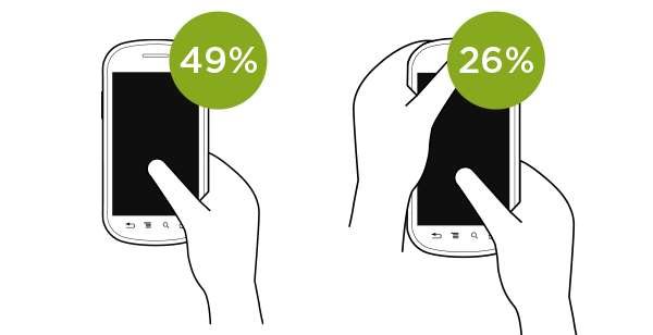
Todays’ smartphones are defined by palm-sized screens (usually 3-5 inches diagonally) of varying pixel density, multi-touch input, and predominately one-thumb use with the device about a half arm’s length away. A recent study of 1,333 people using smartphones on the street found that about 75% of smartphone use is one thumb. Web layouts need to take this reality into account.
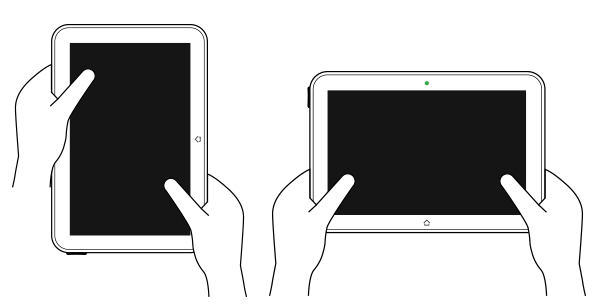
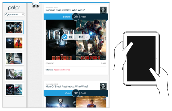
Tablets also feature multi-touch input but they have larger lap-sized screens (7-10 inches diagonally) that have an impact on how they get used. With a larger screen one-handed use is less comfortable so two-handed use is more common. With two-handed touch interactions, the sides of the screen are the easiest to access with simple finger gestures. As tablets continue to grow, Web layouts also need to take this reality into account.
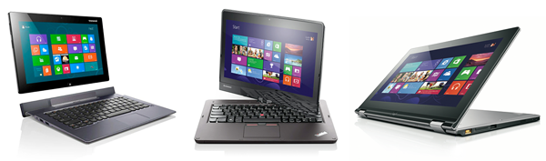
Hybrid devices that feature touch, mouse, and keyboard input are increasingly common as well. On these devices, touch interactions are more frequently used than most people assume. A study by Intel found 77% of interactions on these devices used the touch screen, 12% used the mouse, and 8% used the keyboard. Once again the size of the screen and people’s posture influences interaction design and layout. To avoid the fatigue that comes from holding your arm up in the air, people rest their arms or elbows on a surface and once again rely on the sides of the screen for touch input.
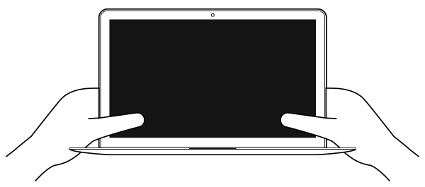
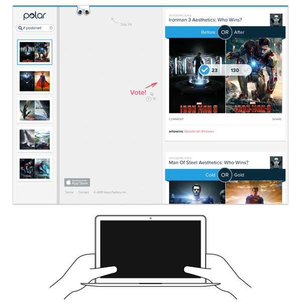
Alongside these diverse devices, we still have lots of laptops and desktops with traditional mouse and keyboard inputs and design considerations.
So how do Web layouts adapt to this new increasingly diverse reality? Here’s one attempt we just launched for Polar.
Multi Screen & Multi Input Design
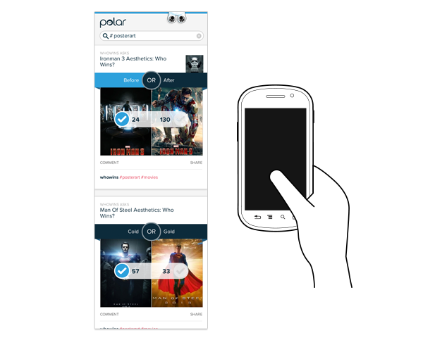
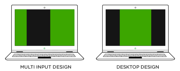
Topic pages on Polar were designed to adapt to not only different screen sizes but to different input types as well. The end result is a Web interface that aims to fit into the reality of Web use today. In particular, the human ergonomics of how people interact with different devices: one-thumb use on smartphones; two-handed use along the sides on tablets; and mouse scrolling, clicking, and keyboard shortcuts wherever they make sense.
On a smartphone, Polar topic pages focus on one-thumb use through large touch targets and a single scrolling column of content. We also aimed to minimize mobile download times by only loading more content when people ask for it. On other devices, we automatically load more content as you scroll.
On larger smartphone screens and small tablets (call them phablets if you must), we increase the size of the content and maintain an emphasis on touch input. However, we also include keyboard support for voting as well. But we’re not promoting it... not yet.
On tablet-sized screens, we introduce a browsing column on the left side of the screen for quickly exploring content and move the content column to the right side. This is an attempt to accommodate two-handed use of tablets where people’s hands sit comfortably on the sides of the device.
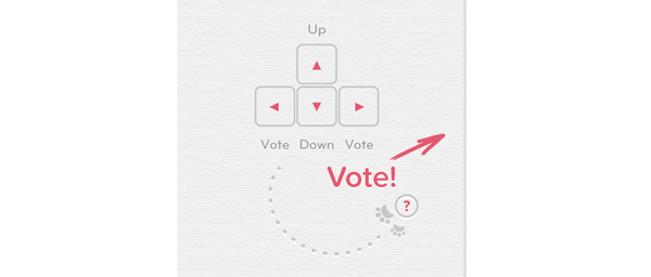
This arrangement carries over into landscape tablet views and the larger screens you’re more likely to find on laptop and hybrid devices. Once we cross a screen size more likely to be present on a laptop, we introduce an affordance that let’s people know they can use their keyboard to vote as well. The up, down, left, and right arrow keys allow you to move through the content list and take action.
Our initial goal was to provide a more significant promotion for keyboard voting if we detected a keyboard was present on a device. After going down this path for a while, however, we found no reliable way to detect if a keyboard was attached. So instead we downplayed the keyboard promotion and made it visible to everyone that fit within a screen size threshold. Using screen size as a proxy for keyboard presence is not ideal but sadly its all we have to work with today.
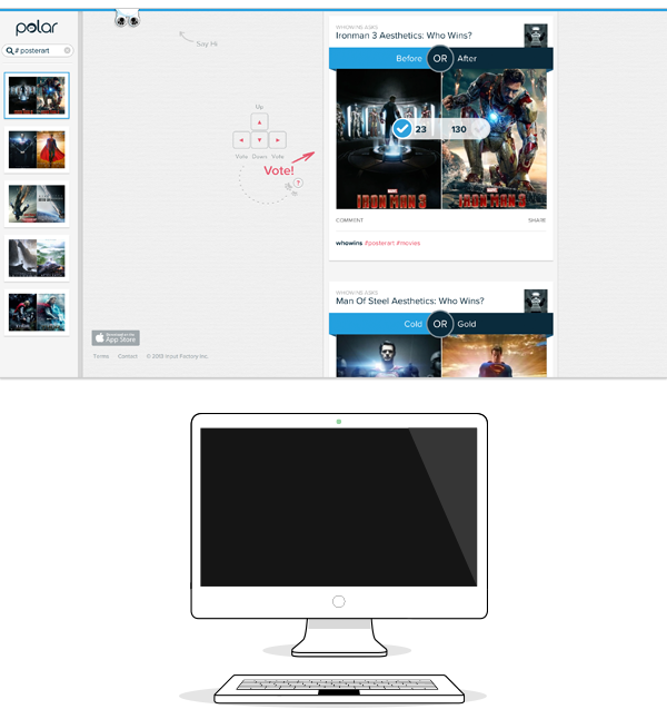
On very large screens, we actually do promote keyboard voting more aggressively. Even if touch is available on a desktop-sized screen, chances are the screen is a decent distance away from the viewer, whereas as the keyboard is right next to them, and thereby more comfortable to use. As a result, we feel more confident promoting the keyboard voting feature.
Comfortable to Use
Across all these devices from smartphone to desktop, our criteria for the Polar interface was “comfortable to use”. That is we emphasized human ergonomics over typical visual design conventions. We wanted a design that was comfortable for phone, phablet, tablet, hybrid, laptop, and desktop users and adapted the interface as needed to align with how people use these distinct devices.
The potential downside of this approach is that “comfortable to use” doesn’t come through unless you are actually using the application. Looking at the Polar interface on a laptop can be a bit disconcerting because we’ve essentially left the middle of the page “blank”. Just about every other Web page online centers their page layout and leaves the sides as empty columns.
But is this a desktop convention that needs to change? Are we better off adapting our interfaces to the way people actually use devices instead of clinging to “best practices” defined nearly twenty years ago? And just what is the difference between tablets and laptops in a world of hybrid devices? Time will tell. In the meantime we’ll keep experimenting on these devices and many more...
Examples
You can see our multi-input designs in action on these Polar topic pages: