Like many other companies building mobile applications, we’ve spent a lot of time recently redesigning our iPhone app, Polar, for Apple’s newest operating system. Through what turned out to be a rather lengthy process, we learned a lot about the good, the bad, and even the blurry parts of designing for iOS7.
As we began adapting existing elements of the Polar design to work with the overall aesthetic and design language of iOS7, one thing became really clear. We weren’t satisfied to just make things fit into iOS7, we wanted to ensure we were actually making the design better as a result of these changes. In some ways, iOS7 made it easy to improve our design. In other ways it made things a lot harder -which is where most of our time was spent.
iOS7 Design Pluses
The design language of iOS7 is inherently simpler than the one Apple used in iOS6. On the surface, that would seem to make designing for it simpler as well. But in reality you end up needing to do more with less, which is not easy.
"True simplicity is, well, you just keep on going and going until you get to the point where you go... Yeah, well, of course." -Jonathan Ive, 2013
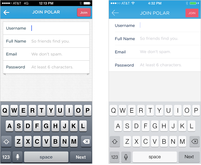
While we needed to use Ive’s process of continual iteration for several of our design elements (details later), the work done by Apple’s team also allowed us to quickly get to a better design with other elements. For instance, moving to the iOS7 style of input fields instantly made our forms feel simpler and fit in well with the rest of the operating system aesthetic.
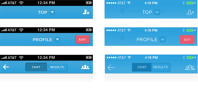
Headers, while requiring more work, also improved our existing design by forcing us to get down to the bare essentials. They also gave us an opportunity to take advantage of the translucency effects that define a lot of the iOS7 experience. By default, app headers are now transparent and can match up with the color of the OS system bar. This creates a single visual element at the top of an application and teases content below the header with transparency -both pluses. But these pluses also come with some new challenges.
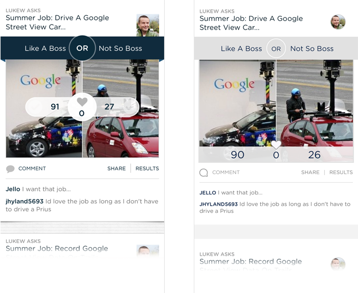
In order to create more screen space for content, Polar has always removed our headers when people scroll down through the list of polls. when they scroll up a certain amount, we bring the headers back so people can navigate around the app again. As you can see in the video below, the default transparency broke this behavior and we had to come up with a new solution.
We ended up sliding the header under a thin blue underlay we positioned below the system bar (see the video above for the full effect). When scrolling down with this implementation, just a thin blue system bar is left thereby maximizing screen space and retaining a bit of the app’s style after the header is gone. but we weren’t out of the woods yet... because of our custom pull to refresh elements.
Since the first version of Polar, we included a pull to refresh gesture that updated the content on our screens. With our new transparent iOS7 headers, these perviously hidden (below the header) UI elements showed through and made the text in our headers harder to read. We got around this issue with blur.
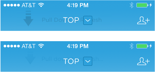
To ensure our pull to refresh elements below the header didn’t make things harder to parse, we blurred all the elements below the header. This created a sense of depth through translucency without negatively impacting readability. So win/win.
When it came to the forms and headers in Polar, the iOS7 design language made it easy to do the right thing. And I think we did end up with a better design instead of just an iOS7 design. With other elements of Polar, things weren’t that easy.
iOS7 Design Perils
The simplicity of iOS7’s design language comes at a cost: a reduction in the amount of visual elements designers can use to create hierarchy and thereby understanding.
To explain that a bit further, how people makes sense of what they see gives designers a set of attributes to play with to create meaning within a design. Elements like color, size, and texture can create similarity, differences, and hierarchy within a layout. When these elements are “flattened”, some of this vocabulary goes away. It’s like losing a set of words, you have to work harder to communicate with a more limited vocabulary.
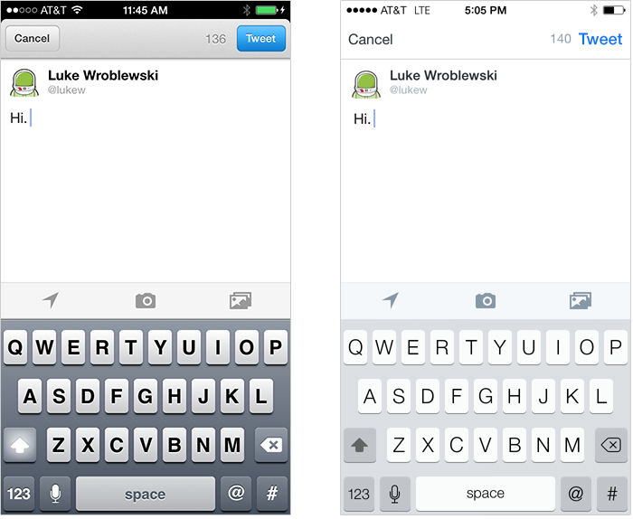
You can see a lot of places in iOS7 where the flat design style makes the hierarchy of actions less clear. For instance, compare Twitter’s compose screen on iOS6 to the one on iOS7, the lack of strong contrast between elements makes it less immediately apparent where the primary call to action (Tweet) is located.
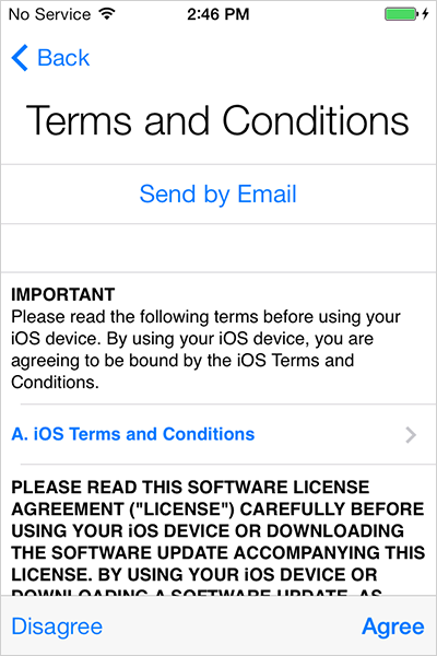
In parts of iOS7 it can be hard to determine what the primary call to action is because it is only distinguished through subtle visual relationship differences. For example, in the Terms and Conditions screen every iOS7 user sees, Agree is just a bit bigger and just a bit bolder than other elements on the screen despite being the primary action.
Of course, it’s still possible to create effective visual hierarchies with less contrast between visual elements but it’s often harder to do so. Which bring us back to Jony Ive’s quote at the start of this article: it’s all about iteration.
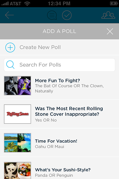
In some of our earliest explorations of an iOS7 design, flattening things out resulted in less hierarchy than we felt was needed to make actions distinct. You can see this situation in the example below. The Add, Search, and Create actions all seem to blend together as we’re relying on small visual changes to distinguish these actions.
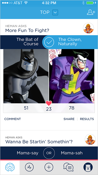
It was only after we started to remove visual elements from the poll list that the flatter, simpler look began to work well. We took out the elements that had been background textures, eliminated icons, and introduced a bit of color to separate out actions like Comment and Share.
Removing texture and depth forced the rest of the visual design to work harder to create meaningful distinctions between the various elements on screen. I think this is a key reason why designing for iOS7 is harder. It forces you to simplify in order to provide the same clear visual communication using less visual relationships.
Another area that required significant iteration was our Tab Bar. Thanks to Thanh’s amazing icon work, our Tab Bar not only provided quick access to key features in Polar but strongly reflected our personality as well. When we simply tried to adopt iOS7 styled outlines for our icons, two things went wrong.
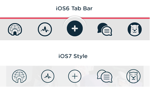
First, it made the icons harder to parse quickly. Aubrey Johnson recently pointed out hollow icons take more effort to process and we ran a series of polls that seemed to prove out his hypothesis. But even without these theories and data, it was clear the Tab Bar icons were communicating less effectively. Secondly, we lost a lot of our personality. So it was back to iterating until again we found a Tab Bar design that retained our personality and felt at home on iOS7.

The balance of your application’s personality and the personality of iOS7 is a great reason to not simply change over to an “iOS7 design”. Take the visual vocabulary iOS7 provides as a language but find your own voice.
We also encountered an over-abundance of “flatness” in another one of the key screens on Polar: create a poll. When we first adapted this screen to an iOS7 style, we lost the priority of actions that we counted on depth and texture to establish in our iOS6 design.
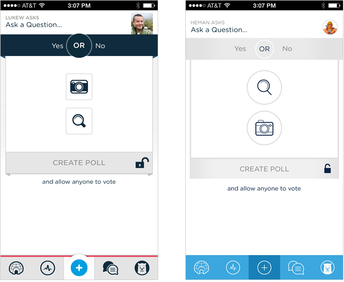
To create a clearer hierarchy of what to do first when creating a poll, I suggested blurring out the secondary elements and putting the focus on the things people need to do first. This was an attempt to use the translucency and blurring effects found in other parts of iOS7 to add some much needed hierarchy to a critical screen design.
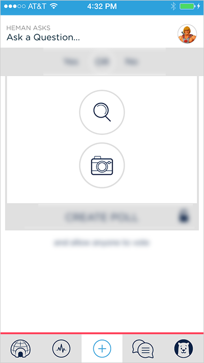
Ultimately, we backed away from this approach based on usability concerns and the time it would take to fully explore and build. But we’re still iterating, so this and few more iOS7-designed elements might make it into Polar soon. Install the app to see how our current iOS6 design morphs over to iOS7 in the coming days. We've certainly enjoyed the journey and think you will too.