There’s no shortage of discussion about the value of consistency in interface design. But ensuring things are consistent isn’t the goal. Presenting people with predictable and familiar interactions is. One way to get there is by echoing your primary interaction design throughout a product.
Echoing occurs when a specific interaction design is reused in various but appropriate contexts across a product experience. Since the same interaction model is reused, people can learn it in one place and apply their knowledge elsewhere. We used echoing a lot in our new mobile application, Polar. Let’s see it in action.

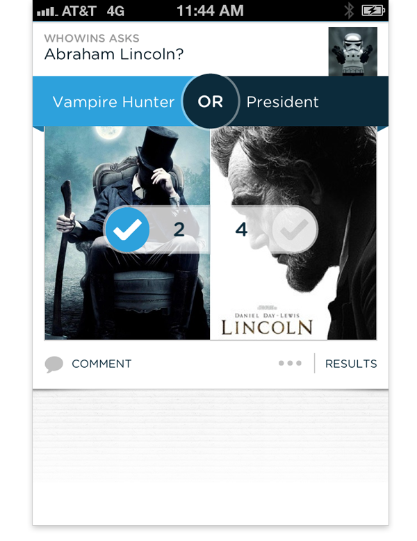
The core interaction in Polar is voting on polls that feature two options presented in a blue banner separated by the word OR. When someone opens the app for the first time, they are presented with a list of these polls and can start voting right away by tapping on the left or right side of the banner or images below it. When they do, they’ve learned the core interaction we echo across the app.

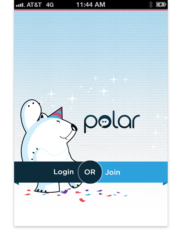
If someone wants to make a poll of their own, they’re presented with our Login/Join screen. This design echoes the core interaction of voting by presenting the Login and Join choices as a set of two options in a blue banner separated by the word OR -just like voting on polls.

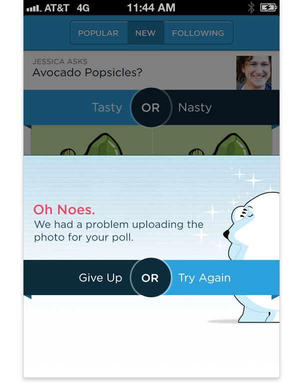
In the highly unfortunate situation where someone’s poll fails to upload (we take lots of precautions to prevent this), their options to Give Up or Try Again will be presented in a blue banner separated by the word OR -just like voting on polls.
At this point you get the idea. Echoing can not only re-enforce a core interaction across an experience, it can also unify the design of a product through familiar visual design elements and ideally make mundane interaction like Login fun.