Until recently, modern smartphones stopped short of six inch screens and small tablets began with seven inch screens. This left an odd gap at six inches in today's screen size continuum. Not anymore...
- Huawei's new Ascend Mate is a 6.1-inch Android-powered smartphone. (source)
- Samsung is set to release a 5.8-inch smartphone known as the Galaxy Fonblet in Europe. (source)
- Samsung's third-generation Galaxy Note device is rumored to have a 6.3-inch display. (source)
- Sony is working on a new Xperia smartphone with a 6.44-inch screen. (source)
Why do we care about a continuum of screen sizes? As more diverse devices make their way into people's hands, the need to consider a complete range of screen sizes and capabilities in Web design increases. When there is a seamless transition from 2 inch screens to thirty inch screens, where do you draw the lines for phones, tablets, laptops, and desktops?
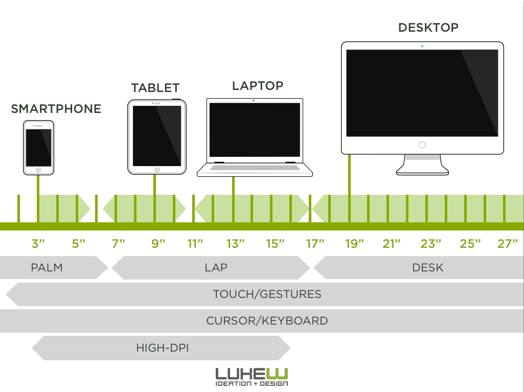
A complete continuum of screen sizes is actually a blessing for Web designers and developers. It forces us toward adaptive solutions that respond to diverse capabilities instead of being able to draw arbitrary cut-off points for separate mobile, tablet, and desktop sites.
So I for one, welcome our six inch fonblet/phablet friends and look forward to further diversity in screens that allow us to access the Web.