As more organizations realize they need to invest heavily in multi-device Web designs, the inevitable question of “how” comes up. Responsive Web design, separate sites, or something in between? Here’s how I’ve tried to simplify this decision:
Responsive Web Design
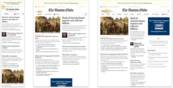
Responsive Web design is a combination of fluid grids and images with media queries to change layout based on the size of a device viewport. It uses feature detection (mostly on the client) to determine available device capabilities and adapt accordingly.
With responsive Web design one code-base, deployment, and URL provides you with access to many devices including future ones you haven’t encountered yet. But optimizing images, video, third party widgets and more using client-only solutions can be challenging.
Responsive Web design is for you IF:
- If you want layout adjustments across devices.
- You can live without complete optimization for specific devices.
- You don’t have access to server-side solutions.
- You really don’t trust device detection.
Further Information:
- Responsive Web Design: the book
- Multi-Device Web Design: An Evolution from desktop-down responsive design to mobile first responsive design and more
- Responsive Images- How they Almost Worked and What We Need: the challenge of optimizing images in responsive designs
- Other Mobile First Responsive Web Design Challenges: what besides images makes responsive design hard

Device Experiences
A device experience is defined by how a device is most commonly used and the technical capabilities or limitations it possesses. Device experiences are a way to classify the troves of connected devices available to consumers today so you can build and design separate and appropriate interfaces for each.
Device experiences require a unique set of front-end designs and development for each class of device you want to support. Delivering the right experience to the right device requires some level of device detection (usually server-side). However, each experience can be completely optimized. In other words, you send every client only what it needs and nothing more.
Device Experiences are for you IF:
- You want maximum optimization for each type of device.
- And the ability to serve completely different user experience & features to each class of device.
- You’re comfortable with device detection.
Further Information:
- Why Separate Mobile & Desktop Web Pages?: what kinds of things can be optimized across devices?
- Device Experiences & Responsive Design: for some organizations, classifying device experiences is all that’s needed to cope with designing for lots of devices
- Networked Consumer Device Platforms: what kinds of device experiences are out there
- Multi-Device Design at Netflix: why Netflix opts for device experiences over progressive enhancement & responsive Web design
- Netflix Makes Content the UI: Netflix has started taking the lessons they learned on one device and applying it to others

RESS: Responsive Web Design with Server Side Components
Combining responsive Web design with server side component (not full page) optimization is a way to extend client-side only solutions. With this technique, a single set of templates define an entire Web site for all devices but key components within that site have device-class specific implementations that are rendered server side.
In other words, RESS (Responsive Web Design with Server Side Components) can deliver the best of both worlds without the challenges that can hamper each. That is one code-base, deployment, and URL that only delivers what each client needs. This optimization only requires device detection at a component level.
RESS is for you IF:
- If you want layout adjustments across devices.
- And optimization at the component level to increase performance or tune user experience.
- You trust server-side device detection with sensible defaults.
Further Information:
- RESS: Responsive Design + Server Side Components: an overview of the RESS technique with specific examples
- Server-Side Feature-Detection and the Evolution of Responsive Web Design: how we can deliver content to make responsive web designs better
- Adaptation: Why responsive design actually begins on the server
- Responsive Design + Server Side Components: how we can combine the best of two worlds