As use of mobile devices continues to skyrocket across the globe, we're seeing more ways to tackle the challenge of creating great Web experiences across multiple devices. But which approach is right for any given project? In an effort to help answer that question, I've compiled the reasons we opted to use a dual (separate mobile and desktop) template system to build our start-up, Bagcheck.
I'm a big proponent of Responsive Web Design so I often get asked why we built a "separate" mobile experience for Bagcheck instead of using fluid grids, flexible images, and media queries to deliver a responsive Web solution to our mobile audience.
For us site performance and speed of development were crucial. So many of the decisions we made were designed to make both of these as fast as possible. (We were a start-up after all!) As part of our focus on performance, we also had a philosophy of "just what's necessary". This meant sending things to devices (and people) that didn't actually need them made us squeamish. We liked to optimize. With a dual template system we felt we had more optimization of: source order, media, URL structure, and application design (more on each of these below).
We built Bagcheck as a command-line interface first. From there we created a mobile Web experience, then followed on with a desktop Web experience shortly after. This process probably influenced our development approach as well.
It's also worth noting that, while competent in code, I am primarily a designer. So I've focused on design considerations and tried to include ample links to folks more versed on the technical side of things in this article. If you have more resources or implementation ideas... send them my way!
Source Order
At its core, Responsive Web Design is about serving the same HTML to every device and adapting its presentation (mostly through CSS) based on the specific capabilities of the device being used to access it. HTML markup has a source order, which (mostly) defines how a Web page is rendered by a browser. While HTML elements can be repositioned using Javascript and CSS, doing so reliably across a wide range of devices can be challenging.
Consider the simple example of a site-wide navigation menu. On devices with large screens and mouse/keyboard input, it's quite common to position this type of menu at the top of a Web page because:
- There's enough screen space available so actual content isn't likely to be pushed off screen.
- There's often a need to communicate what's available on the site through a set of key categories or actions.
- It's potentially quicker to access these top-level categories or actions when they are aligned with the edge of the screen/browser.Since global navigation makes sense at the top of a Web page, it tends to come first in markup source order. On devices with small screens and touch input, however, it often makes sense to position the same global navigation at the bottom of a Web page because:
- There's not a lot of screen space so global navigation menus can quickly push actual content off-screen.
- Instant access to content usually trumps navigation tasks on devices with small screens and low bandwidth. (It probably does on all devices but mobile constraints emphasize the need most.)
- Ergonomic factors make it easier to hit touch targets at the bottom of the screen (especially with one handed use).
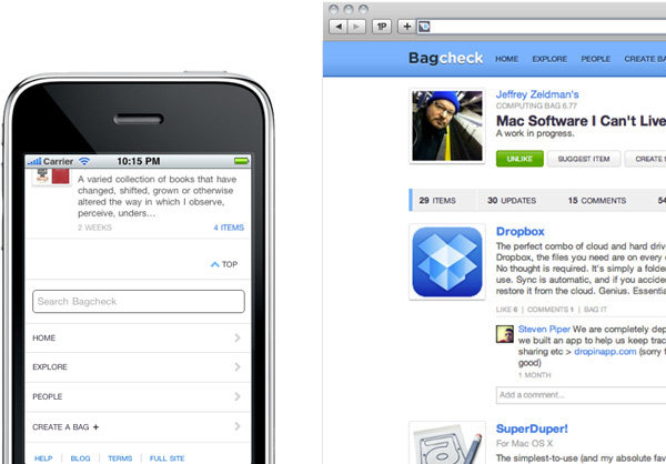
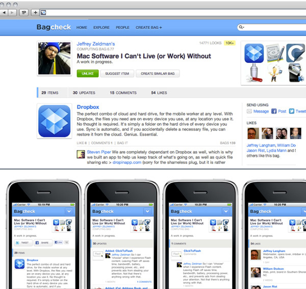
So on mobile devices, global navigation makes sense at the bottom of a Web page, which means the menu markup is likely to come last in source order. When you are serving the same HTML though, source order can't be changed.With the dual template approach we used when building Bagcheck we were able to serve different markup and thereby a different source order to mobile devices. Which, as you can see in the images below, easily generated a more optimal user interface for each experience: mobile and desktop.
There are also solutions that can achieve a similar effect without serving different HTML. Box-direction (part of the flexible boxes CSS specification) can reverse the order of an item list without affecting source markup order. You can also try to use display:table to reorder the display of content and navigation in response to screen real estate. These methods might be a better fit for you —depending on your needs.
Media
Another tenant of Responsive Web Design is flexible images (and videos). When set to expand to fill the size of their container, flexible images can resize themselves based on the space available within a browser's viewport.
In large viewports, a flexible image can fill more space by being displayed at its original (large) size. In small viewports, the same image can take up a lot less space by being displayed at a reduced size. In order to achieve this effect, the browser needs large images, which look good when scaled up or down.
The problem is large images have large file sizes. Though not every Web browser will display them at full size, they'll all download them at full size, which can quickly add up to poor performance unless:
- You use a combination of CSS Media Queries and background images to not display and not load images intended solely for larger viewports. This method does not work for any images specified with image tags only those specified with CSS image backgrounds, which can limit the utility of this approach.
- You employ a solution like Responsive Images that relies on Javascript to replace small (performance optimized) images in HTML mark-up with larger ones as viewport size increases. Browsers with Javascript or cookies turned off will just display the small images.
- You experiment with ideas like using the noscript tag to prevent unneeded images from loading.
- You use a server-side solution to detect the device accessing your site and only send down what's necessary.
Underlying each of these solutions is the same philosophy: give each device only what it needs using media queries and background images, JavaScript, or a server-side solution. This philosophy can dramatically cut down file size and increase performance.
For example, our mobile optimized template for category pages on Bagcheck used a single compressed 50x50 pixel image (averaging 3KB) for each item listed. The desktop optimized template used a 200x125 pixel image (averaging 15KB) and a second 50x50 image (averaging 3KB) for each item. On a page with 20 items that's a 300KB difference plus 20 less http requests, which has a big impact on performance. But because we had a separate mobile template, we went one step further and only displayed the first ten items in the list on mobile (with an easy option to see more) saving another 30KB.
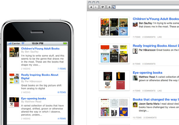
In total, a category page on the desktop had 360KB of images while the same page on mobile only had 30KB of images. That's a pretty big difference.
But optimized images aren't just about file size. Some images can be designed explicitly for small screens, not just scaled down to fit them. This is especially important when the details (or animations) in an image matter. Once again we can set our mobile-specific HTML templates to only reference the images explicitly designed for mobile devices.
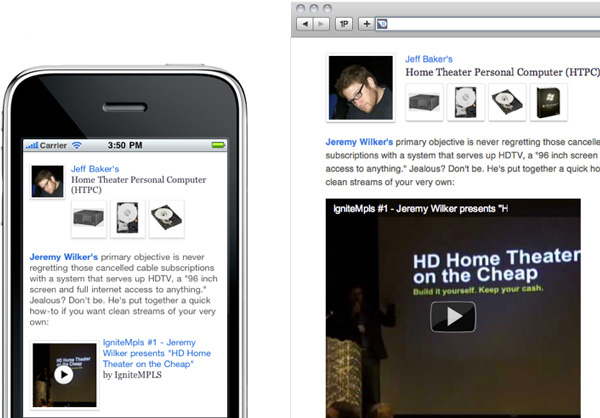
The same system can be used to optimize videos as well. On all devices, we wanted simple video playback that works with a single click/tap. So while our desktop template embeds video files directly on the page and our mobile template only displays a thumbnail, both start to play the video with a single action. Using just a thumbnail in the mobile experience, however, makes it faster to load and provides more control over layout/pixel size.
URL Structure
Source order and media aren't the only things we might want to optimize for mobile use. In some cases a distinct URL structure can have a significant impact on performance or usability on small screens and slow connections. (Seeing a theme yet?)
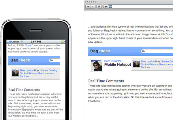
For example, the Bagcheck desktop experience has all the information about a list of content, its comments, updates, and likes at a single URL. We bundle all of these sections (or modules) into a single file then load each section dynamically (as people request them) without a page refresh. While this creates a smooth transition on the desktop, it adds up to a lot of bytes on mobile.
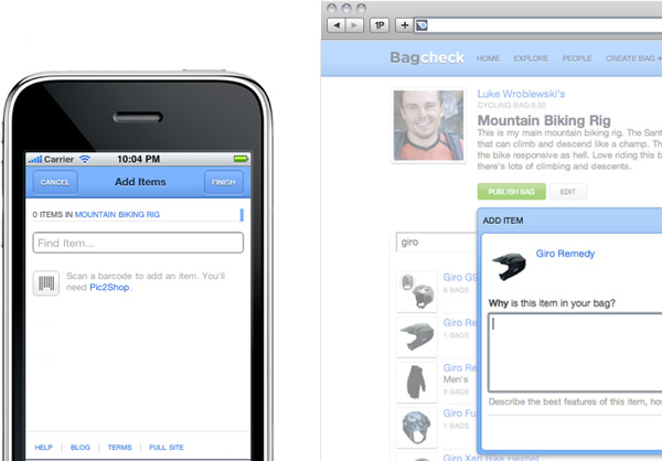
So the mobile Web experience uses a different URL structure. The same URL loads the same initial content but each sub-section (comments, updates, likes) is a separate page with a unique URL as visualized in the image below.
In this model
bagcheck.com/bag/7811
loads the same content on mobile and desktop but
bagcheck.com/mobile/bag/7811/updates
bagcheck.com/mobile/bag/7811/comments
bagcheck.com/mobile/bag/7811/likes
are mobile-only URLs. With this structure, we once again optimize for performance by breaking large files into smaller ones. It's also worth noting that we set these mobile-specific URLs to "nofollow" so search engines don't index them.
Application Design
URL structure can also help optimize extended interactions on mobile. Organizing lengthier tasks or multi-step/modal applications across several pages on mobile devices allows people to manage one aspect of an involved interaction at a time. Interactions that happen through modal dialogs or across modules/panels on large screens often make more sense as separate pages on smaller screens.
Device capabilities can also differ significantly between modern smartphones and desktop/laptop computers. For example, accurate (10-50m) location information is usually available on mobile devices but less so on desktops/laptops. The availability of this information can dramatically change the design of an application interface.
The dual template system we used to build Bagcheck allowed us to optimize lengthier interactions and take advantage of device capabilities within our application interfaces. We enabled barcode scanning in the mobile experience because it's easy for people to point their mobile's built-in camera at something. We also reorganized our rather non-linear list creation tool into a series of focused, shorter tasks on mobile.
Doing It Again
When we designed and built the Bagcheck mobile Web experience (about nine months ago), a desire to optimize source order, media, URL structure, and application designs made separate mobile and desktop templates a great fit for us. But we also learned a lot along the way including a few new ideas on how to tackle the same issues.
But I'll save that for another article...