Not all people require all the input fields within a Web form at all times. Instead, forms can provide additional input fields to the people that need them without getting in the way of people that don’t.
A common way to display these additional options is to use an overlay: a set of additional input fields that sits on top of a form like a dialog window on your computer’s desktop.
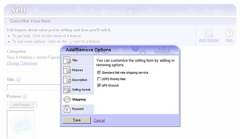
eBay’s selling form (above) shows this interaction in action. More savvy eBay sellers can choose to customize the form to include options they frequently use and remove the options they don’t. A modal dialog window provides these sellers with a way to pick the options they want to see on the form. The rest of eBay's users don't have to contend with these additional inputs unless they want to.
While an overlay can work for accessing options that only a few people need, it's generally not a good way to present all the questions everyone needs to answer in a form. I recently came across an example on Comcast's Web site that did just that.
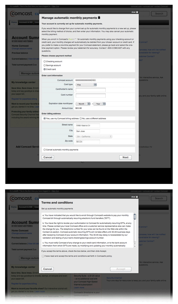
When trying to set up automatic payments for my account, I was presented with an overlay (above) that contained not only a full Web form, but one with multiple pages. I'm assuming Comcast opted for a modal overlay approach to these forms to keep people in context (on their Account Settings page). But it seems like they could simply have used the account page for confirmation/success messaging and given the forms a full page experience instead?