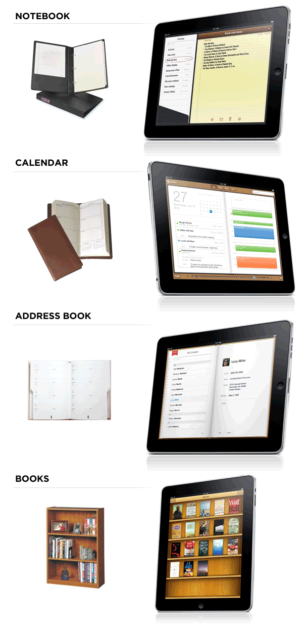
One of the more unique iPad User Experience Guidelines from Apple suggests that applications designed for the iPad should have a realistic, physical dimension.
"The more true to life your application looks and behaves, the easier it is for people to understand how it works and the more they enjoy using it." -Human Interface Guidelines for the iPad
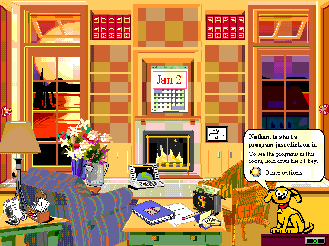
Yet it's no secret that physical metaphors can easily be overdone in application user interfaces. Just see Microsoft Bob for an example. So I wonder if this guideline from Apple is a deliberate recognition of (or push for) the digitalization of many of our common physical objects.
As Jeff Dachis put it "everything that can be digital will be because it would be better, faster, and cheaper." We've certainly seen a lot of iPhone apps that essentially turn hardware products into software products. Similarly, it seems likely the iPad will begin to replace people's planners, address books, books, atlases, and more in the home. After all, the digital versions of these tools are better, faster, and cheaper.
Apple's application designs may be trying to make that obvious to us through their presentation as we're not likely to let go of physical objects easily. As William Gibson once noted: "one of the things our grandchildren will find quaintest about us is that we distinguish the digital from the real."