While good Web form design can help minimize the potential for errors, sometimes people will misunderstand or rush through our forms and mistakes may happen. When they do, Web forms should be prepared to deal with these errors quickly and gracefully. These best practices can help:
- Clearly communicate when an error is blocking someone from completing a form. Error messages are arguably the most important element on a form when present. Make sure they appear that way!
- Display error messages in context so they can be resolved quickly.
- Provide actionable remedies that enable people to resolve errors easily.
- Top-level error messages should indicate an error has occurred and how it can be resolved. If multiple errors exist, they should be listed in the top-level message.
- If any input fields are responsible for an error, clearly mark them with a double visual emphasis to ensure they are noticeable.
- Visually associate any responsible form elements with a top-level error message to clearly communicate they need to be resolved in order to continue.
- Reserve red text and warning icons for error messages.
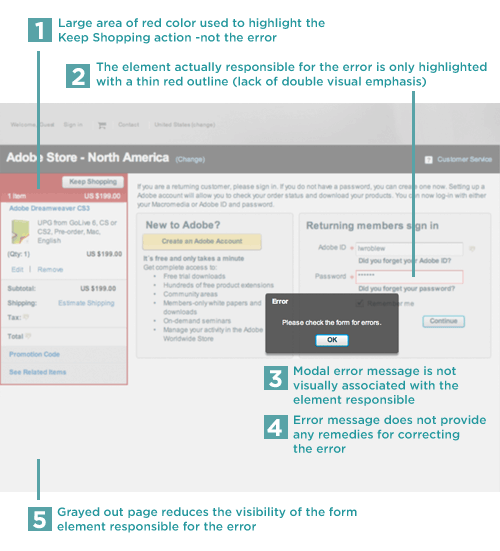
One of the best ways to see why these best practices matter is to look at examples where they aren't applied. Recently I came across such an example on the Adobe Store. Entering an incorrect password on the Sign In page produced a modal error window that grayed out the rest of the screen and prompted me to "Please check the form for errors."
When in this error state:
- The area that most looks like an error (due to a lot of red) is actually the shopping cart contents
- The element actually causing the error only has a thin red rule highlighting it, which gives it much less visual weight on the page than the shopping cart area. This single visual emphasis might not be enough to be noticed. It's better to double the visual emphasis using an icon and red text or a background color and instructions to highlight the input responsible for the error.
- The modal error message is not quickly associated with the responsible input field. Visual similarity (color, border, font) between the error message and responsible input field can create a clear connection between the two.
- There are no solutions for remedying the problem included in the error message.
- Graying out the rest of the page (other than the modal error message) further reduces the visibility of the form element responsible for the error.
Making these adjustments on this form can help move people from errors to success more quickly and easily.