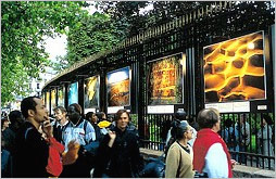
 The last time I was in Paris, Yann Arthus-Bertrand had an amazing outdoor aerial photography exhibition titled Earth from Above. His poster-sized prints lined park fences and featured thought-provoking subjects. But what really struck me was the exquisite color combinations that materialize when you view Earth from above.
Last year, I wrote an article for Boxes & Arrows about applying natural color schemes to interface designs: “…naturally occurring color combinations have the potential to distinguish (by helping create a more memorable website), guide (by allowing users to focus on interactions), engage (by making page layouts comfortable and more inviting), and inspire (by offering new ideas for color selection).”
Arthus-Bertrand’s images are the best kind of inspiration and his online gallery has recently been redesigned. There are hundreds of color combinations for designers to explore.