To continue our discussion about Defining the Problem, I spoke with Jamie Hoover, the first full-time designer hired at eBay and now the design lead at Amazon’s A9. During his tenure at eBay, Jamie helped establish a methodology (that as far as I know is still in use today) for reframing business “problems” through design -in particular through large-scale visual narratives. One of his first and biggest successes was the redesign of eBay’s registration system…
Q: As you know, I've been discussing how designers can help to define problems, not just solutions. One of the best examples that comes to mind is your work on the first significant redesign of eBay's registration process. Can you talk about how that initiative came about? What were you guys trying to achieve?
A: Originally, the business side of eBay was not supportive of a redesign of the registration flow. Why should they be? They had web site metrics that showed the overall number of registered users was going up and at a faster rate every day. From their perspective, registering as a user with eBay was not a problem and probably shouldn't be messed with. The product design side of eBay, however, felt that the registration flow was out of date and that many pages within the flow did not have a consistent style. So they created a very short project to “touch it up” without any major changes that might have adversely affected the numbers. They assigned a product manager, a usability engineer, and myself to this task.
Our team began meeting regularly and debating what to do. The product manager, Yulie Kim, had access to a wealth of web site tracking data that came from multiple sources but was very difficult to grok. The usability engineer, Michael Morgan, had conducted a few usability tests that included the registration process. He had observed users having great difficulty with various tasks throughout the registration flow and had collected these specific findings. At the time, however, folks inside eBay were not very tuned in to usability findings as valuable information.
When we looked at all this data together, we realized we had to convince all of eBay that a full redesign of registration was needed. We knew it would significantly improve the overall numbers for the company.
Q: Can you describe what you did to convince the rest of the company? Did you use a specific format?
A: I took a screen capture of every page in the current registration flow and combined them into a single page that I could bring to each of our discussions for reference. As I began making notes on the page of pages, it occurred to me that we could show the whole story of registering by overlaying all the data points of problems we had been gathering over pictures of the actual pages.
eBay has a plotter that allows large printing, so I envisioned a large museum-style presentation that ideally wouldn't even require a person to explain. I laid out the flow as a series of pages with a consistent visual language to differentiate and describe the types of data. The large diagram wrapped around the room and facilitated conversations, planned and spontaneous, that literally had people walking through each step of the flow, pointing at and discussing problems along the way.
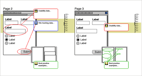
Figure: An outline of of the registration flow diagram. Customer support, usability findings, and site tracking data were used to illustrate major issues. The entire flow was mapped out page by page with site click through data that illustrated user drop off and best practice analysis.
Q: How did you decide what information to include in the diagram?
A: In our conversations, the team realized that the business problem of eBay's registration was actually the story of bidding or buying for the first time. Registration was right in the middle of that most important experience and was a major roadblock. We had our story and we had both quantitative and qualitative information to back it up.
Like the process of editing a movie, we cut information that didn't move the overall story along. We also cut information that was subjective. If you want to convince a person that lives by numbers that your visually engaging graphics have a point, better make sure to associate them with detailed information.
Q: What was the effect of this diagram on the direction of the project? Did anything change?
A: The business side was not only convinced that they had a huge problem to address, they decided it was urgently needed. I vividly remember the VP at the end of our presentation pounding his fist on the table and declaring that we needed a solution to this yesterday. Subsequently, I lost a ton of sleep working to radically redesign a far simpler experience on short order. The tremendous financial results for the company, which I unfortunately cannot disclose, made the effort very worthwhile.
Q: Sounds like the lack of sleep paid off! Besides insomnia, is there anything about designers or the design process that's particularly well suited for defining problems the way you did?
A: Designers have the ability to actually show the problem. Listening to someone drone on and on through the bullet points of yet another PowerPoint deck is hardly a compelling way to be convinced that change is in order. Actually designing the presentation of a problem will dramatically increase everyone's understanding and ability to work on that problem.
One of the key features of our diagram was a strong visual indication of drop-off rates behind each page of the registration flow. You could actually see users dropping off, which meant money being lost, and the problems that were causing the drop off. That’s a level of vividness that bullet points can’t attain easily.
Q: From my experience, defining problems has been a doorway for designers into the world of product and corporate strategy. Have you experienced similar results?
A: By having success at bringing an awareness and clear description of actual problems to others through visual narrative, I became viewed as able to analyze what was really the problem and communicate it. Communicators are who get invited back to the table when its time to shape direction. I think this worked for me because I was invited to be a part of many crucial projects at eBay after this point.
Personally, I found tremendous satisfaction in making a difference at multiple points of the design process. Changing minds starts inside a company long before taking on what consumers end up seeing.
Thanks Jamie!
For those interested in learning more about this project, check out the eBay team's CHI 2004 paper A process for creating the business case for user experience projects.