All too often mobile forms make use of dropdown menus for input when simpler or more appropriate controls would work better. Here's several alternatives to dropdowns to consider in your designs and why.
Expectations impact conversion
No one likes filling in forms. And the longer or more complicated a form seems, the less likely we are to jump in and start filling in the blanks -especially on small screens with imprecise inputs (like our fingers).
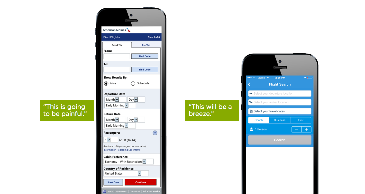
While there's two extra fields in the "painful" version above, the primary difference between these two flight booking forms is how they ask questions. One makes use of dropdown menus for nearly every question asked, the other uses the most appropriate input control for each question.
Interacting with dropdown menus on mobile and the desktop is a multi-step process often requiring more effort than necessary. First tap the control, then scroll (usually more than once), find & select your target, and finally move on. We can do better.
Steppers
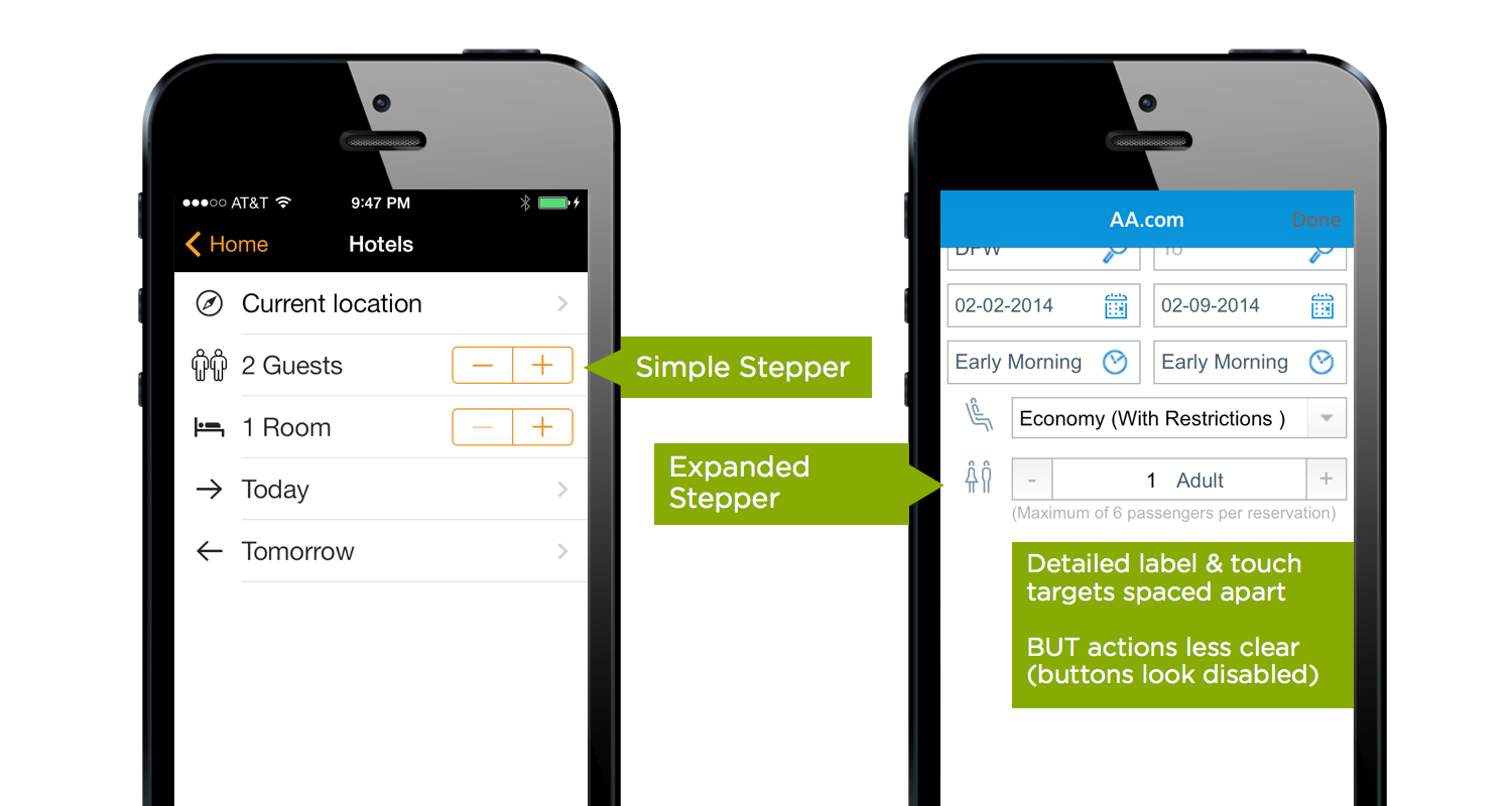
Stepper controls increase or decrease value by a constant amount and are great for making small adjustments. When testing mobile flight booking forms, we found people preferred steppers for selecting the number of passengers. No dropdown menu required, especially since there's a maximum of 8 travelers allowed and the vast majority select 1-2 travelers.

When working with steppers, generally simpler is better. Changing the basic design of a stepper control too much makes its function less clear. That's true of any input control, really.
Radio Groups
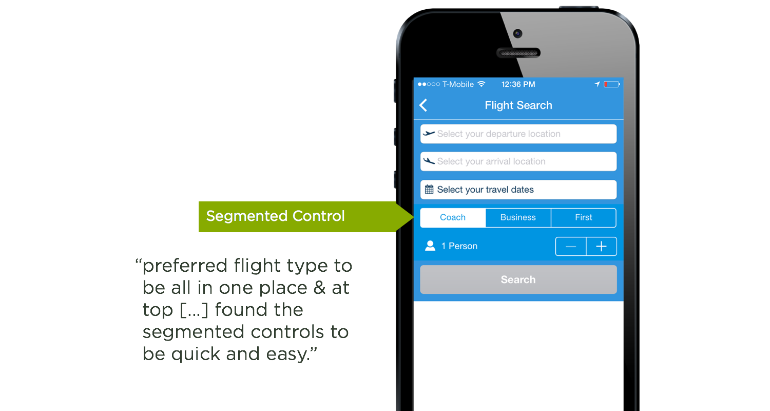
Radio groups, or segmented controls, are a set of closely related, but mutually exclusive choices. When comparing mobile flight booking forms, we found radio groups worked really well for selecting class of travel.
Additional Controls
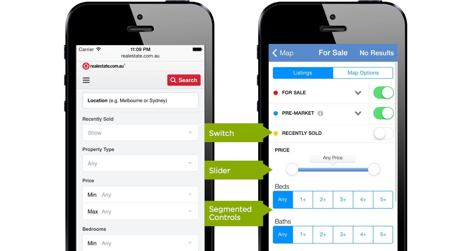
Steppers and radio groups aren't the only controls that can used in place of dropdown menus. Switches support two simple, diametrically opposed choices. Sliders allow you to select fine-grained values from an allowed range. When starting with a dropdown heavy form, look at each question and consider if any of these controls is a more appropriate way of getting an answer.
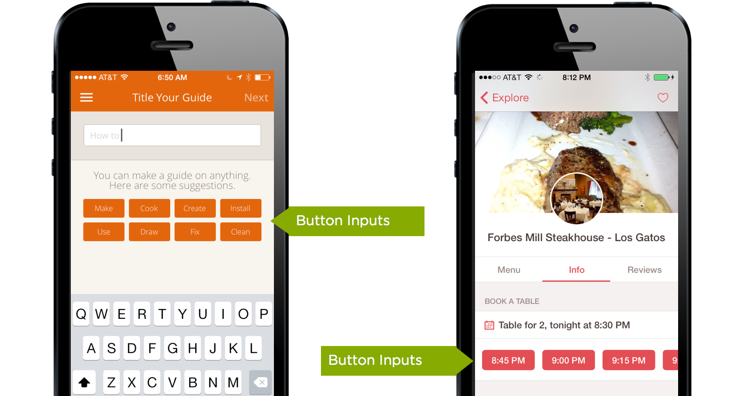
Button inputs expose the options that would otherwise be hidden in a dropdown and make selecting them a single-tap v.s multi-tap action.
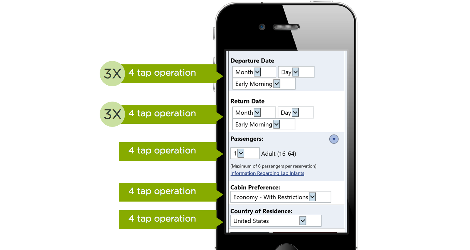
In some cases multiple dropdown menus can be condensed into one input control. The flight booking example I labeled "painful" above made use of six dropdowns to collect travel dates.
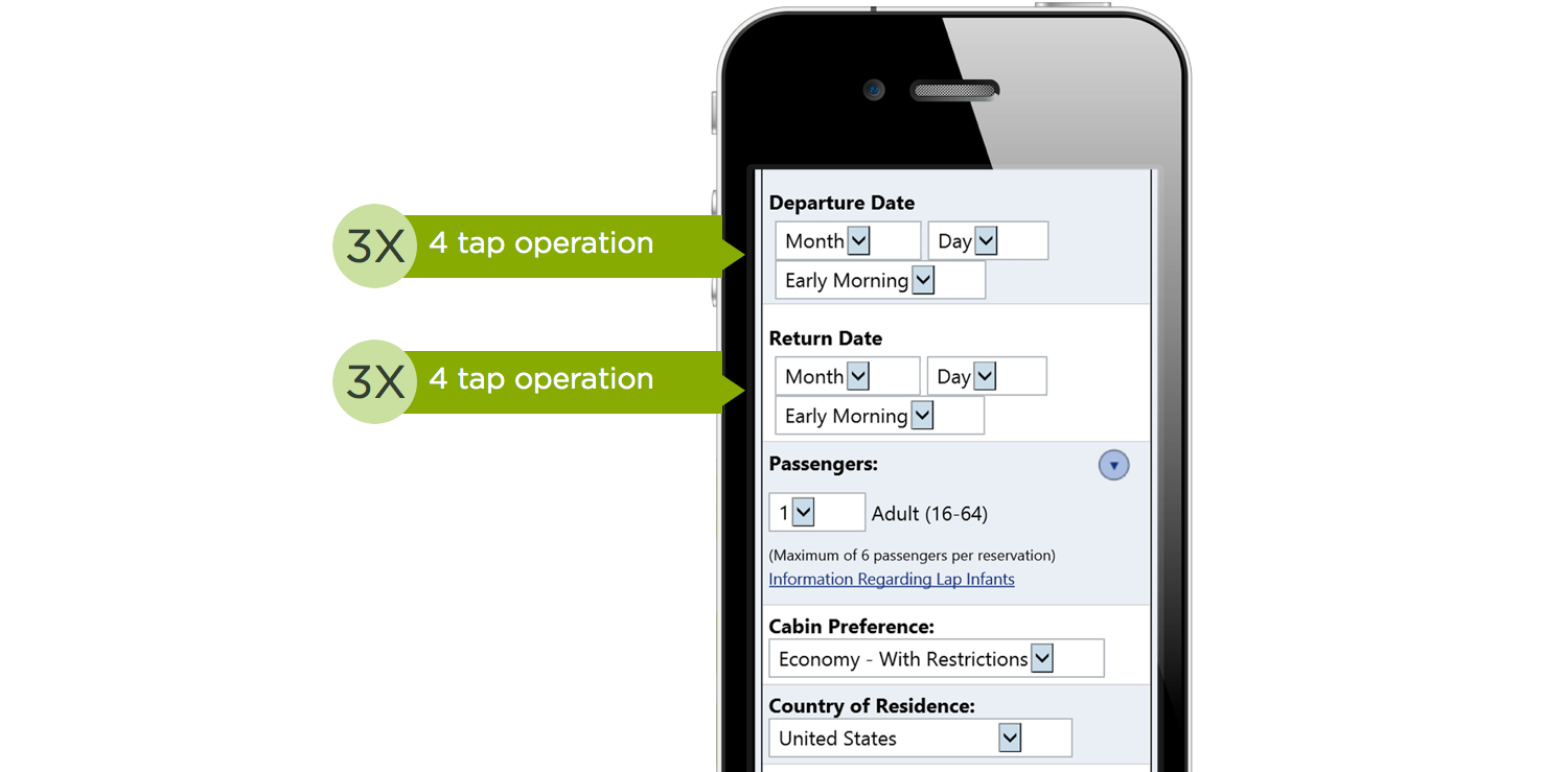
In our mobile flight booking research, we found a single input control for travel dates worked much better. From six drop-downs to a single date picker. Now that's progress.

As a Last Resort
All these alternatives to dropdown menus don't mean you should never use them in a user interface design. Well-designed forms make use of the most appropriate input control for each question they ask. Sometimes that's a stepper, a radio group, or even a dropdown menu.
But because they are hard to navigate, hide options by default, don't support hierarchies, and only enable selection not editing, dropdowns shouldn't be the first UI control you reach for. In today's software designs, they often are.
So instead consider other input controls first and save the dropdown as a last resort.
For More...
For a deeper look at this topic and lots more about mobile form design, check out my video presentation on Mobile Inputs.