In 2012 I outlined why we should let people see their password when logging in to an application -especially on mobile devices. Now two years later with many large scale implementations released, here’s a compendium of why and how to show passwords and what’s coming next.
Why Show Passwords?
Passwords have long been riddled with usability issues. Because of overly complex security requirements (a minimum number of characters, some punctuation, the birthdate of at least one French king) and difficult to use input fields, password entry often results in frustrated customers and lost business.
Around 82% of people have forgotten their passwords. Password recovery is the number one request to Intranet help desks and if people attempt to recover a password while checking out on a e-commerce site, 75% won’t complete their purchase. In other words, passwords are broken. And the situation is worse on mobile where small screens and imprecise fingers are the norm.
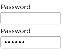
Masking passwords makes complex input even harder while doing little to improve security -especially on mobile where there’s a visible touch keyboard directly below every input field that highlights each key as you press it. These bits of feedback show the characters in your password at a larger size than most input fields. So in reality, masking characters isn’t really hiding your password from prying eyes. And if you do suspect an eavesdropper is peering at your screen, just move your mobile device out of their line of sight!
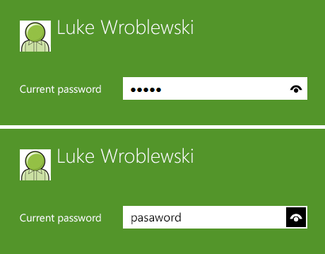
Hide/Show Passwords
For all these reasons and more we opted to display your password as readable text on Polar’s Log In screen. A simple Hide action was present right next to the password field so in situations where you might need to, you could instantly switch the password to a string of ••••’s instantly.
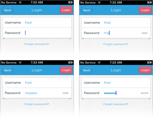
While I was confident we were doing the right thing for increased usability and ease of access, I nevertheless worried that people would respond negatively to seeing their password in clear text despite having the ability to mask it. After all, years of log-in forms had trained people that masked fields meant “secure” fields.
So I was pleasantly surprised when we instead heard from people who had not only launched software with visible passwords but been successful with it as well. Steven Hoober shared how he removed password masking for 20M Sprint customers -no issues, well-measured. Mike Lee told us how Yahoo! showed passwords by default and saw double digit improvements (among other changes) with no security issues.
Quite quickly I came to see password-masking as a rut. A design pattern that has been around so long that no one thinks about it much. We all just go through the motions when assembling a log-in screen and add password-masking by default. Lost business and usability issues just come along for the ride.
Design Solutions
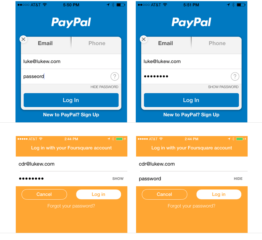
More recently many companies have started to take a critical look at the password-masking problem and launched several different solutions to address it. PayPal and Foursquare have implemented a hide/show text-based interaction similar to the one we employed at Polar.
LinkedIn, Adobe, and Twitter have opted to let people hide and show their passwords by tapping on an open/closed eye icon. While this type of visual symbol might be less obvious than written text, chances are it has localization advantages for companies that operate globally as it avoids variable lengths of translated copy.
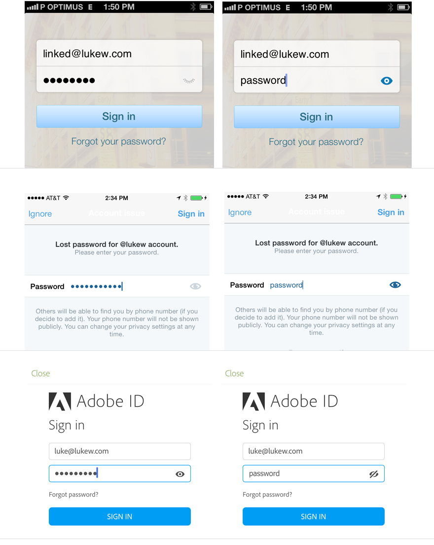
Microsoft may have the strangest implementation of the hide/show password pattern out there. In Windows 8, you have to press down on their eye icon in order to reveal your password. Once you remove your finger from the icon, the mask comes back and your password is no longer visible. Awkward.
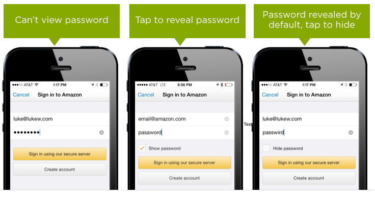
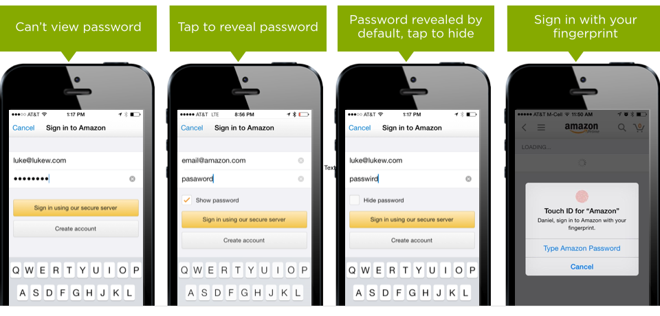
Amazon has been iterating on their log-in form repeatedly. Their progression went: from no ability to view your password; to allowing you to reveal your password with an explicit action (tapping a checkbox), to displaying your password by default and allowing you to hide it with a tap.
While there’s pros and cons to each of these design solutions, the more important take-away is Microsoft, Adobe, Twitter, LinkedIn, PayPal, Amazon, and more are recognizing the issues that exist on Log In screens and designing accordingly.
Design is in the Details
Ok, so many companies now let people see their passwords when they try to log in. That’s great but it doesn’t necessarily mean everyone should go and copy their interfaces. That kind of thinking is what got us masked passwords in the first place and probably lots of other questionable design “patterns” like security questions.
Instead, it’s worth spending time to develop the right solution. Especially when you consider even small design details can have a big impact. To illustrate, let’s look at a study Jack Holmes ran that analyzed the impact of removing password masking.
In Jack’s tests, when passwords were displayed as clear text by default in an e-commerce form, 60% of people surveyed said they became suspicious of the site, while only 45% identified not masking the password as a usability benefit. In contrast, when a simple checkbox was added that indicated a Show Password setting was on, 100% of participants noticed the checkbox and interpreted the clear text password as a feature.
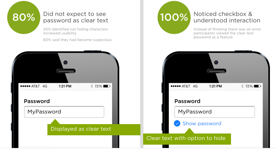
From 60% suspicious of the site to 100% viewing it as a usability feature with a single checkbox. Design really is in the details. And it’s no wonder Amazon’s included this checkbox on their Log In screen.
Web Vs. Native
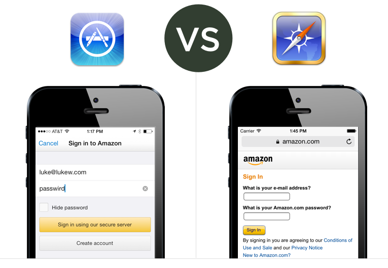
As we’ve seen through several examples, many companies now let people view their passwords when logging in to mobile apps. Yet few allow the same behavior on the Web. Why should people in native apps have an easier time logging in then those accessing the same services in a Web browser?
Once again the issue boils down to security. Specifically, if:
- You are able to get possession of my device
- And unlock it
- If you navigate to a Web site
- For which I auto-saved my password in the browser
- And that Web site allows you to view passwords on their Log In screen
- You can now see my password
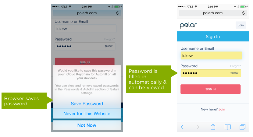
This intermingling of the Web browser’s password-saving and auto fill-in features with visible passwords on a site can cause real security problems. One way to potentially mitigate this issue is to hide the password field if you detect it was filled in by the browser. Then if someone tries to view it, remove the password field entry and force people to re-enter it.
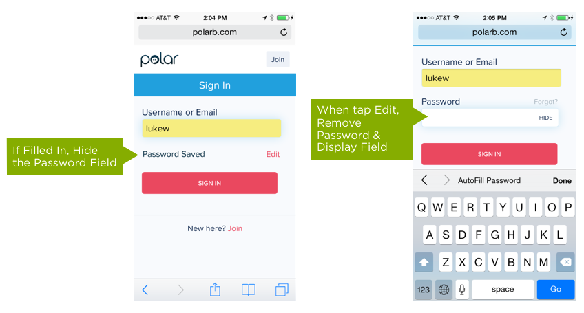
Sadly the design and development work required to implement this solution starts to outweigh potential benefits and it makes more sense to start looking beyond the password field entirely to ease Log In issues.
Beyond the Password
Amazon hasn't stopped iterating on their mobile Log In screen and in their latest iteration on iOS, they removed the need to enter a password altogether. To log in to your account, just touch your phone’s home button to verify your fingerprint using Apple’s Touch ID.
The car-ride service, Uber, has gone one step further. Instead of signing up for an account, creating a password, and entering your payment information to order and pay for a car, you simply need to place your finger on the phone’s Touch ID sensor. No forms and no passwords required.
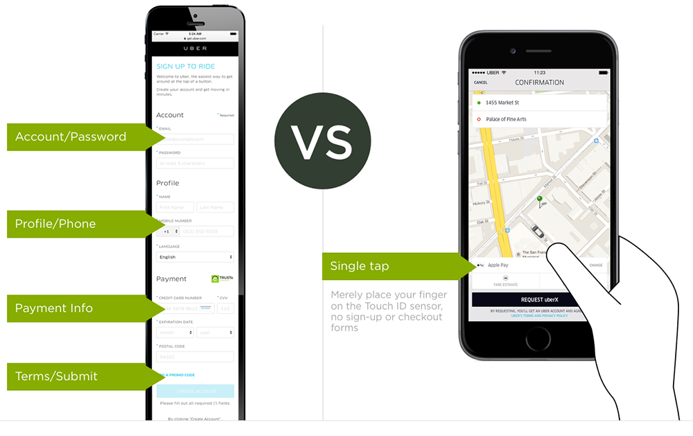
While it’s true Touch ID is a solution limited to Apple’s latest iOS devices, it’s a solution that sets a new bar for Log In by reducing the level of effort to a single touch. Given the choice, how will people decide to Log In or checkout? Through lengthy complicated forms and arduous password requirements and masks? Or with a single touch?
Looking at things from this perspective… the future of Log In forms and password fields is pretty clear.