As our mobile devices increase in size and complexity, an over reliance on tap gestures for key interactions may be preventing us from creating simple, frictionless interaction designs.
What's Wrong with Taps?
Interfaces with clearly marked tap targets have the benefit of obviousness. That means the core purpose of an interface and how to use it is communicated with visible actions on screen. That's good right? Yes, but not if we stop there.
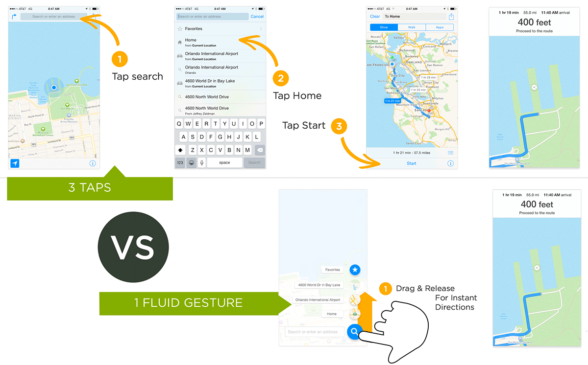
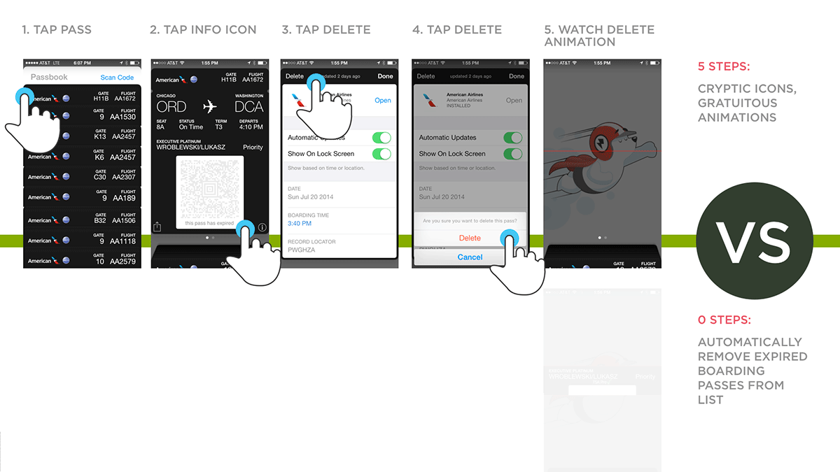
Too many taps (especially non-obvious ones) can make simple tasks needlessly span across a series of screens. Each screen has to be loaded, parsed, and ultimately understood by people before they can take the next action in a flow. We can do better. As these examples hopefully illustrate.
No Taps Required
Sometimes the best user interface, is no user interface.
Fluid Touch Gestures
Fluid touch gestures can enhance interactions with a shortcut gesture that dramatically cuts down on the number of taps required for common/important tasks.