As smartphones continue to get larger but our hands don’t, what kinds of design solutions can ensure mobile interactions remain comfortable, quick, and easy on our thumbs? Here's a few options to consider...
Designing for Thumbs
In his analysis of 1,333 observations of smartphones in use, Steven Hoober found about 75% of people rely on their thumb and 49% rely on a one-handed grip to get things done on their phones. On large screens (over four inches) those kinds of behaviors can stretch people’s thumbs well past their comfort zone as they try to reach controls positioned at the top of their device.
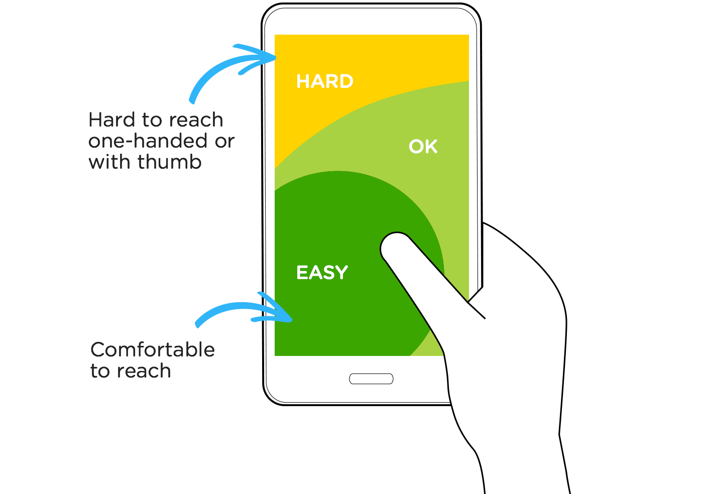
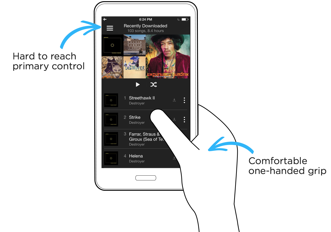
As an example, I personally encounter this issue daily when listening to Amazon’s Music app. The primary control for navigating through music (which I use frequently) is located in the upper left corner of the screen -arguably the worst place for one-handed use. To reach it on a larger smartphone, I need to reset my grip to the middle of the phone or switch to two-handed use. But it doesn’t have to be this way.
OS-Level Solutions
To account for existing applications designed like Amazon Music, mobile operating systems have created system-level features that make top-aligned controls reachable. Apple’s version of this solution is aptly called Reachability.
With Reachability, a quick double tap on the phone’s home button slides an application halfway down the screen. This makes previously unreachable controls accessible. While that’s great, a simple one-tap action has now been turned into three.
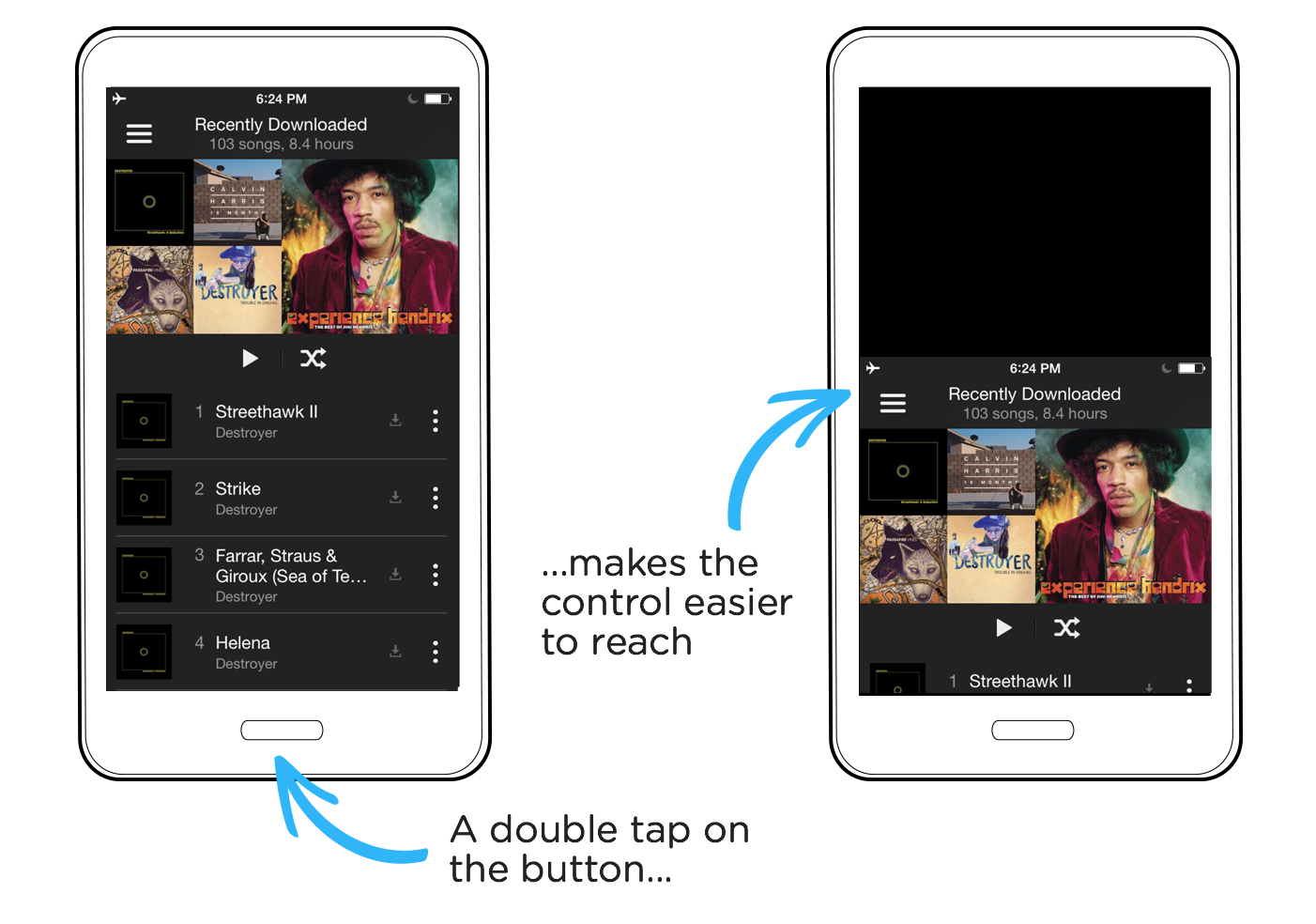
Reachability also has an automatic time-out. Double-tap to bring down controls, look to see what you need next, and the app has already moved back to the top, requiring you to double-tap the home button again. It’s an inelegant and (hopefully) unnecessary dance.
Edge Swipe Gestures
While maneuvering your thumb to the upper-left corner of a large mobile screen can be difficult, swiping from the edge of the screen along the bottom of your device is not. This “edge-swipe” gesture can serve as a simple, alternate way to access controls positioned far from the thumb-zone.
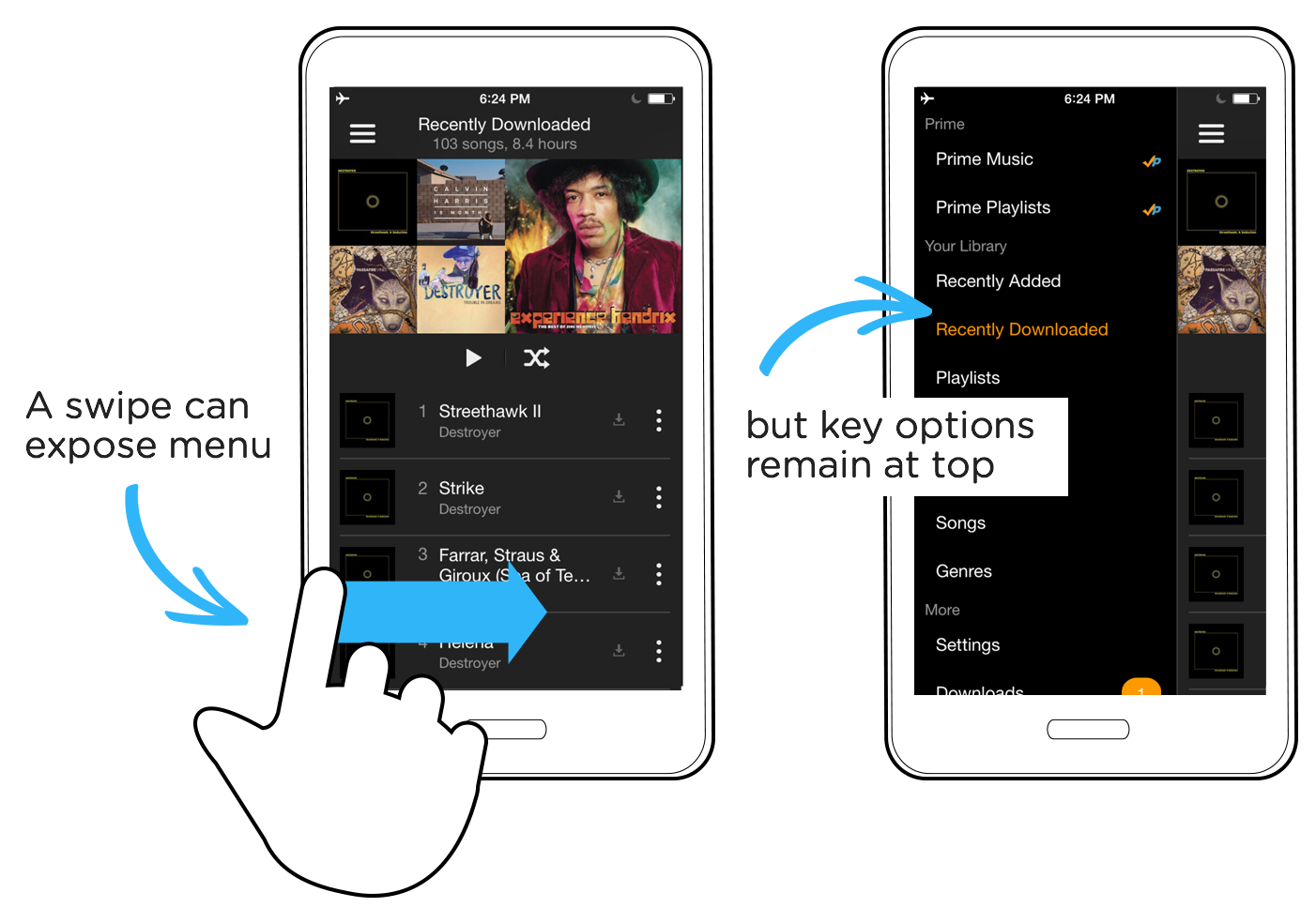
Like all gesture controls, however, this form of menu access is out of sight and thereby often out of mind. In other words, you have to know the gesture exists and remember to use it when the need arises. As a result, it usually can’t replace the visible menu control at the top but it can complement it.
Also, an edge swipe solution only makes access to the menu easier with one-handed use, not access to content within the menu.
Bottom Positioning
To ensure important frequently-used actions are comfortably reached with one-handed or one-thumb interactions, we need to consider repositioning controls at the bottom of the screen. This solution doesn’t just address reachability, it can also improve a variety of other important metrics. Facebook found in recent testing that a bottom tab bar solution in their iOS app also improved engagement, satisfaction, and even perception of speed.
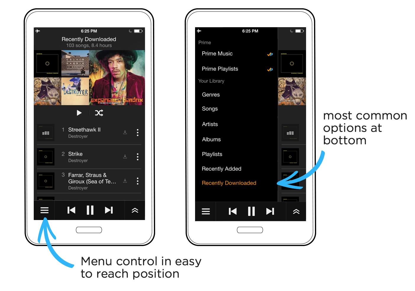
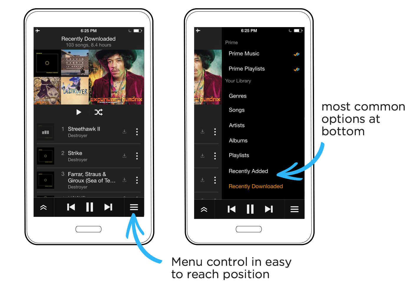
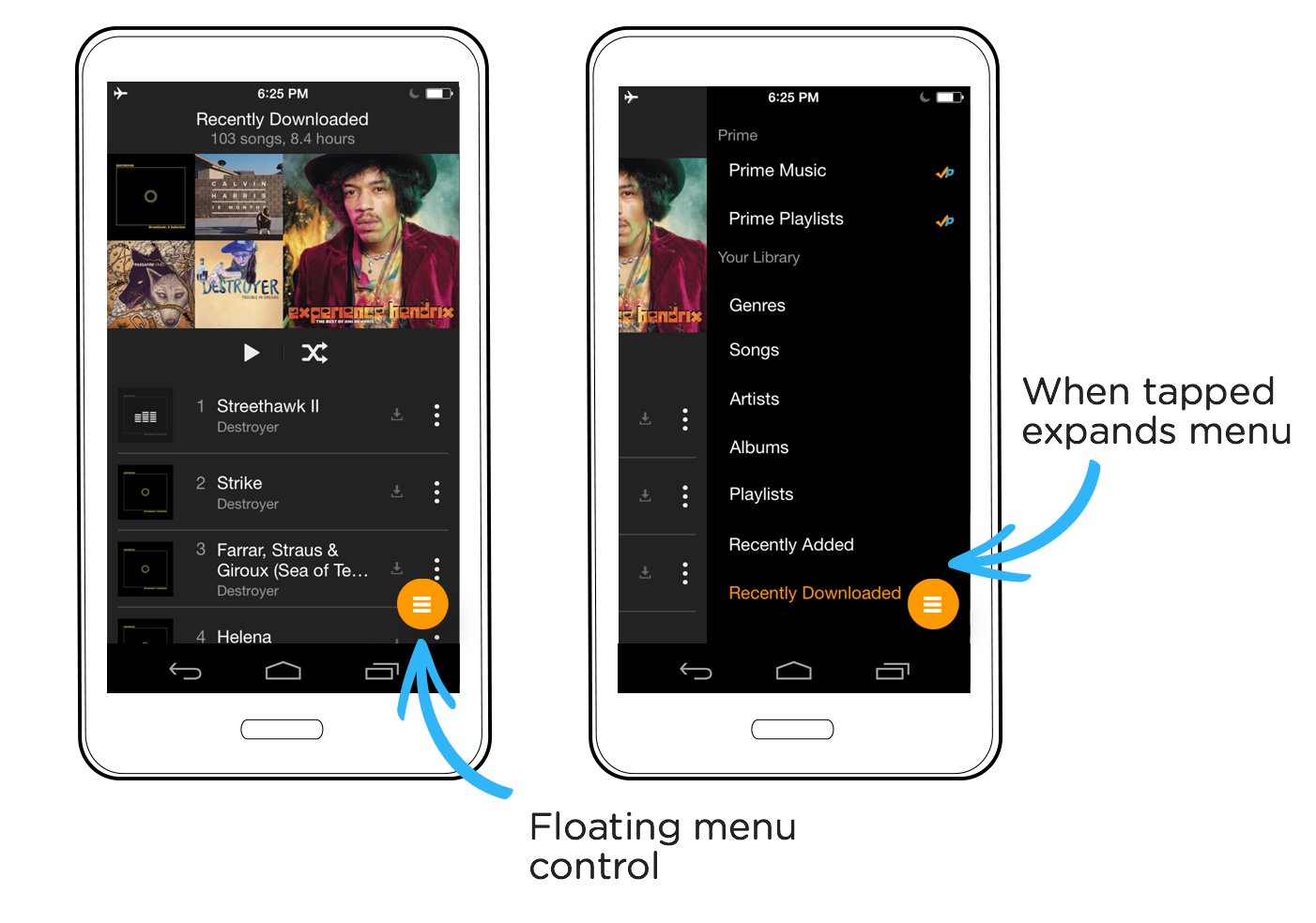
In the Amazon Music app, not only can we position the menu at the bottom of the screen but we can also reorder the options within it to ensure the most frequently used choices appear closer to the bottom of the screen. This allows quick access to the menu and its contents.
Floating Action Buttons
While many design solutions work well across multiple operating systems, there are times when we to take important differences into account in our designs.
For instance on Google’s Android OS the bottom of the screen is reserved for the system navigation bar. This means any controls placed at the bottom of the screen are in close proximity to system-wide actions and thereby prone to mis-taps. In fact, Android’s guidelines explicitly state “don't use bottom tab bars.”
In Google’s newer Material Design specifics, however, there’s an alternate solution in the form of floating action buttons. Floating action buttons are a special type of promoted action and stick out above the rest of the UI. Usually, these actions are not navigation controls but in the case of the Amazon Music app, the case could be made that navigation is an action worthy of promotion given how often it gets used.
More to Learn
These are some of the ways to make important actions in mobile applications more accessible to one-handed use on large smartphones. As screen sizes continue to increase, we’re likely to see even more approaches soon.