As more tech companies begin selling and marketing networked consumer devices, they inevitably need to design the physical packaging for these products. Looking at the packaging of recent tablets, smartphones, and beyond highlights some interesting differences in how companies are approaching packaging design.
Apple Device Packaging
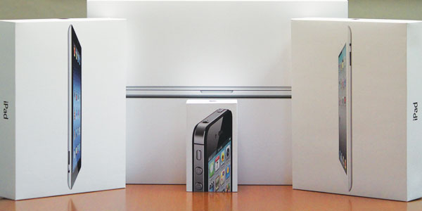
Apple's packaging is all about consistency. For years now, the company has used a single product photo on a white background on the packaging of their laptops, tablets, phones, and accessories. As you can see in the iPad 3, Macbook Pro Retina, iPhone 4S, and iPad 2 packaging below.
Apple "Inspired" Device Packaging
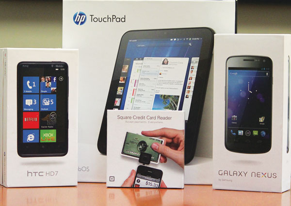
As more companies try to emulate the success of Apple's devices, they've also emulated it's product packaging. WebOS, Windows Phone, Android, and more have been heavily inspired by Apple's single product shot on white style. Some examples include the: HTC HD7 Windows 7 Phone, HP TouchPad, Square Card Reader, and Samsung Galaxy Nexus.
 .
.
Google Device Packaging
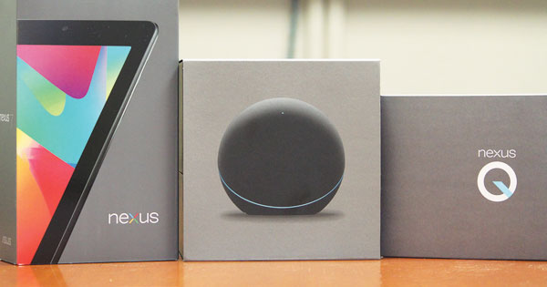
Google's current flagship Android phone (the Galaxy Nexus pictured above) went the Apple emulation route with its packaging design. However their Nexus tablet and streaming media device are starting to find their own voice: big product shots on a gray background as seen in the Nexus 7 and Nexus Q packaging below.
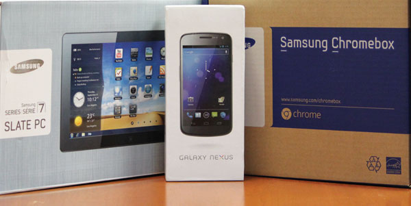
Samsung Device Packaging
The least consistent (and coherent) brand experience I encountered was Samsung. From emulating Apple with the Samsung Galaxy Nexus, to the ultra-cheap cardboard of the Samsung ChromeBox, Samsung's device packages lack a consistent voice. Look no further than the Samsung Series 7 Slate PC below.