Through fluid grids and media query adjustments, responsive design enables Web page layouts to adapt to a variety of screen sizes. As more designers embrace this technique, we're not only seeing a lot of innovation but the emergence of clear patterns as well. I cataloged what seem to be the most popular of these patterns for adaptable multi-device layouts.
To get a sense of emerging responsive design layout patterns, I combed through all the examples curated on the Media Queries gallery site several times. I looked for what high-level patterns showed up most frequently and tried to avoid defining separate patterns where there were only small differences.
Mostly Fluid
The most popular pattern was perhaps surprisingly simple: a multi-column layout that introduces larger margins on big screens, relies on fluid grids and images to scale from large screens down to small screen sizes, and stacks columns vertically in its narrowest incarnations (illustrated below).
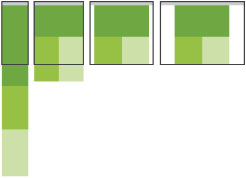
I dubbed this pattern "mostly fluid" because the core structure of the layout really doesn't change until the smallest screen width. Instead, the design mostly relies on fluid grids to adapt to a variety of screen sizes. Here's a number of examples of this pattern in action:
- Five Simple Steps
- Princess Elisabeth Antarctica. From the team: "Shifting the adaptiveness from the page layout to content modules used to compose the various pages is what we tried to do with the PEA website. We worked on building a set of 10 responsive content modules we then used to compose all pages of the site."
- Trent Walton
- Sifter
- ChoiceResponse
There are certainly some differences between these examples: different elements get moved around and how "small screens" are defined varies, but in general the pattern holds up across a lot of examples.
Column Drop
Another popular pattern starts with a multi-column layout and ends up with a single column layout, dropping columns along the way as screen sizes get narrower. Unlike the Mostly Fluid pattern, the overall size of elements in this layout tend to stay consistent. Adapting to various screen sizes instead relies on stacking columns (illustrated below).
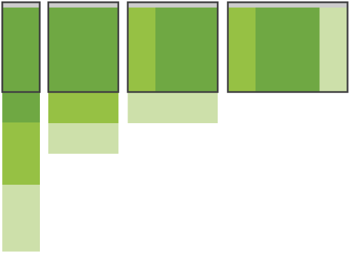
When and how is each column is stacked at different resolution breakpoints differs for each design, but generally either navigation or content is placed at the top of narrow screens. Here's a few examples of this pattern:
Layout Shifter
This pattern does the most to adapt across different screen sizes. That is, different layouts are used on large, medium, and small screens. Because this inherently requires more work, it seems to be less popular than the previous two patterns I outlined.
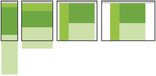
Though I've tried to generalize this pattern into a simple illustration (above) based on the most common implementations I saw, the truth is this is where a lot of innovative design is happening. As a result, there's not one formula that encompasses everything that falls under this pattern. Take a look at a few examples to get a feel for it:
- Food Sense
- Performance Marketing Awards
- Forefathers Group
- The Boston Globe
- Andersson-Wise Architects
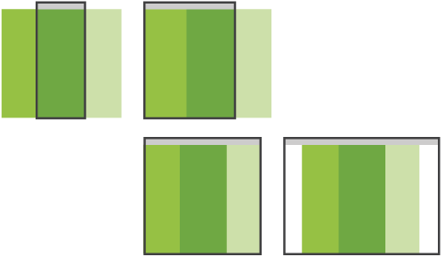
Tiny Tweaks
While the simplest form of adaptation, this pattern was also the least popular. Most likely because few companies have the luxury of brutally simple Web pages consisting of very few elements within a single column layout. For those blessed with such simplicity, multi-device adaptation can just be a few tiny tweaks to font sizes and image layout.
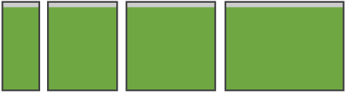
The illustration for this pattern (above) isn't very telling so instead look at the examples below to see it in action:
Off Canvas
While there's a lot of variety in the responsive design layout patterns listed above, there's also some common characteristics. They all tend to stack everything vertically on small screens resulting in long pages full of diverse components. Perhaps less obviously, they all also rely only on the screen space available to them to make layout adjustments.
But isn't that the point of adapting layout to multiple screen sizes -to make them fit? Only if we limit our options to what's currently visible. In fact, you might say there's always more space off-screen for layout adjustments than there is on-screen.
As illustrated above, the Off Canvas pattern for multi-device layout takes advantage of space off the screen to keep content or navigation hidden until either a larger screen size allows it to be visible or a user takes action to expose it. This pattern is showing up in a few separate mobile Web site designs and native mobile applications.
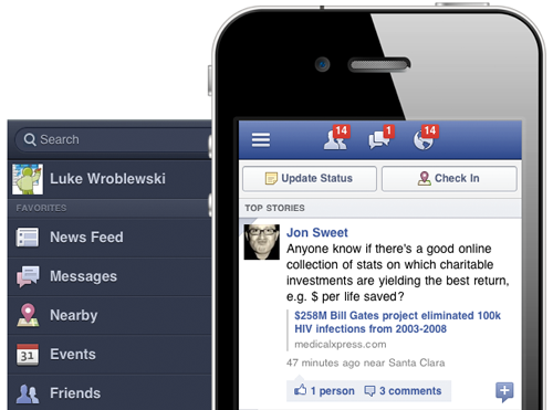
Facebook's mobile Web experience uses the space to the left of the visible window to hide navigation options until someone taps the link to expose them. At which point, the content off screen slides into view. There are a few responsive designs taking a similar approach (examples) below) but some run into problems being accessible across devices.
Path's native mobile application employs a layered technique to create an Off Canvas effect. Their app uses both the left and right sides of the screen to reveal navigation options when they are requested.
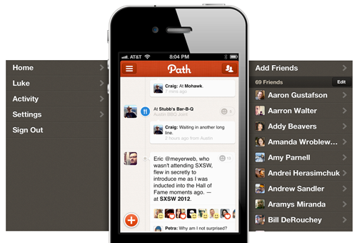
Torkil Johnsen created a proof-of-concept for the Web that mimics Path's design with fallbacks for non-touch and non-JS devices.
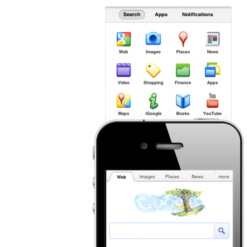
Google's mobile experience uses the area above the viewable screen to keep a set of navigation options off-screen. When someone taps "More", the these options slide into view from the top of the page.
The general idea behind the Off Canvas pattern is that on small screens, additional elements are a click away, and as screen size expands, they become visible until no clicks are required to access these components. If anyone is interested in building a complete example of this approach using responsive Web design techniques, let me know!
The Off Canvas pattern is a interesting one for me because it doesn't force people to scroll long pages of content and navigation on small screens.1 Instead sections can be separated, labeled, and accessed when needed.
On a related topic, Brad Frost recently did a nice job of cataloging responsive design navigation solutions.
1: and because I was really attached to a variant of it for the Yahoo! home page redesign back in 2008 :)