Having observed my eighteen month old son's interactions with touch based devices for several months now, I've noticed several recurring app design problems. In case anyone is working on a touch-based app for kids, here's some design considerations to mull over.
Splash screens try kid's patience
Back in 2002, I outlined the ills of splash screens on the Web. These pointless "intros" only serve to frustrate anyone trying to get to content or start an application. Especially young kids whose patience already runs thin.
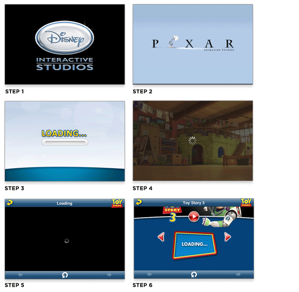
I do understand that sometimes loading screens are inevitable when applications start-up but consider the impact of the multiple splash and loading screens that kick off the Toy Story 3 app experience. Each one of these screens is displayed for several seconds. Which means kids have to wait and wait before they can see or interact with anything fun. Oh and waiting... is not fun.
GUI's not for kids
When kids interact with software they explore and engage with anything that looks interesting. Especially if it looks like content. Graphical user interface components don't.
Consider the example of Dr. Seuss's ABC book on the iPad. The intro screen uses colorful blobs to bring attention to large hit targets. But tap on one of these elements and up pops a standard modal menu asking you to select from one of three options. Modal menu dialogs and kids don't mix.
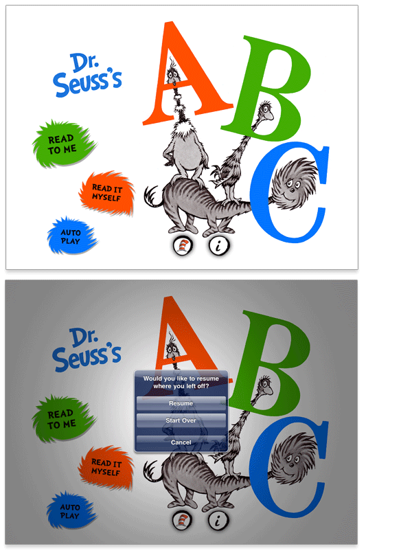
The contrast between these components and the rest of the app couldn't be more stark. Every other page of the book features large images kids can tap and and full pages they can swipe to turn like a book. In order words, the rest of the app makes content the UI -a first order principle of natural user interfaces (NUIs).
Press and hold to tap
Many touch-based applications for kids don't forgive errant fingers. So when a child is holding the corner of the screen with one finger and tapping with another -no action is taken. The app is waiting for a tap gesture and wouldn't take a press and hold gesture for an answer instead.
In order to better accommodate the dexterity of small children, applications designed for kids should consider treating press and tap gestures the same as tap gestures. Chances are a kid inadvertently has another finger touching the screen most of the time.
In fact, its a good idea to make your application as forgiving as possible if you want it to work well for toddlers.
Hold the encore
Kids are an enthusiastic bunch. If they see something they like, one tap won't do. Tap, tap, and tap again is often the norm. But just because an application element got some rapid fire tapping doesn't mean it should respond with rapid fire feedback -especially in the form of audio.
Many applications designed for kids don't check to see if an action is in progress before they start it anew. So when a child taps an image that plays a sounds then taps it again, the same sound will play over itself. Tap the image a few times and you have the same sound overlapping and echoing to the point of distortion.
If possible, apps should check to see if an action is already in progress rather than running multiple instances of the action at once. Another example of some forgiveness in the UI.