A comparison of the Associated Press and USA Today applications for the iPad reveals a few ways iPad design can be effective (or not).
USA Today iPad Application
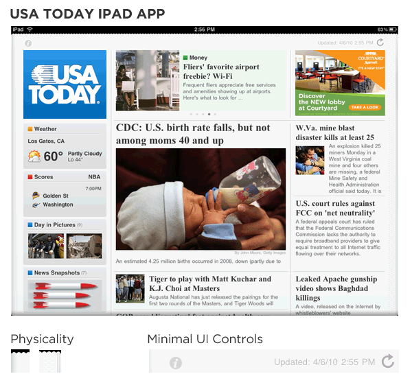
- Treats content as the interface: to access stories simply click on them, to see more just scroll the section you are interested in. Interacting with USA Today app is interacting with the content in the paper.
- Makes use of physicality and heightened realism effectively: subtly reflects the physical newspaper with small design touches (a perforated edge, printed paper textures, 3D gradients). This approach does a good job of trying to take advantage of skills people have acquired through their interactions with the real world.
- De-emphasizes user interface controls: the only visible UI control on the app is the light refresh icon in the upper right. Everywhere else, content is the interface.
- Flattens information hierarchy: categories and navigation are managed through interactions with content not navigation menus.
- Uses popover menus appropriately: when accessed, the refresh controls are presented in a popover menu rather than a separate screen.
- Aligns well with the USA Today brand: the USA today paper, Web site, and iPad app all feel like they came form the same company.
Associated Press iPad Application
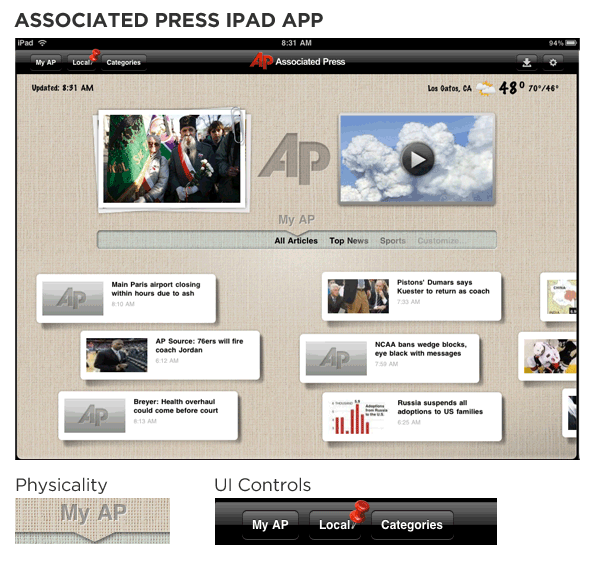
- Uses physicality almost arbitrarily: what is the texture of the background trying to mimic? Why is the weather and time information hand written on that texture? Why is there a set of paper-clipped photos next to a video on this surface? It all feels artificially contrived and does little to enhance interactivity through real-world associations.
- Relies on explicit user interface elements: the app has two navigation menus and several buttons in the application header for actions. Contrast this approach with the single subtle refresh icon on the USA Today app.
- Presents content sub-optimally: the small windows that represent stories use small images, fonts, and provide no descriptions. Instead, the high-resolution iPad screen that "supports rich, beautiful, and engaging graphics" should be thought of as an opportunity to "draw people into an application".
- Inconsistent reflection of brand: the visual elements (hand-writing font, background texture) in the Associated Press iPad app do not reflect the design of their iPhone app nor their Web site. There is no continuity between these channels.
More on iPad Design...
Check out more articles about the design of the iPad.