Trust me, no one likes filling in forms —especially on mobile devices where one-handed, on-the-go data input and slow connections are common place. As a result, designing forms that make mobile input faster, easier, and less error-prone is crucial. Here's a few ways it can be done.
To illustrate, let's look at two mobile forms for booking a hotel: one from the Expedia mobile Web site, the other from the Kayak iPhone application.
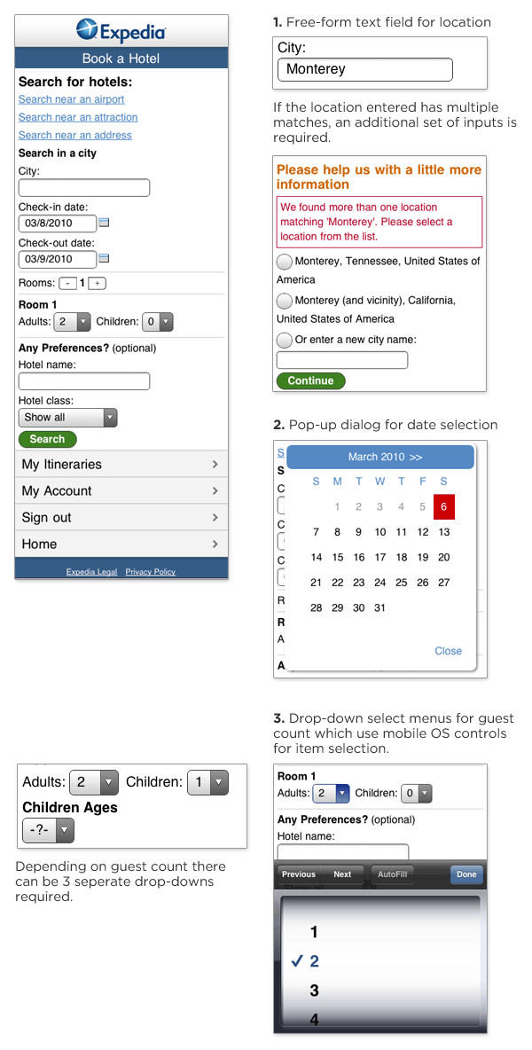
Expedia's mobile Web site has made several modifications to the desktop version of their hotel booking form: the layout has been optimized for slender mobile screens; the "search near" set of options has been listed out; and the room count input uses a set of "+" and "-" buttons instead of a drop-down menu for input. Yet, there's still room for improvement.
- The form uses a free-form text input field that requires users to provide clarifying information on another screen if a mistake is made. And in many mobile contexts (fat fingers, one-handed typing, on the go) —mistakes do happen.
- The date selection field makes use of a calendar pop-up that requires people to tap a small ">>" target to advance to the previous or next month.
- The set of inputs for guest count uses (up to) three drop-down select menus for input, which require manipulating a list of options in a pop-up list.
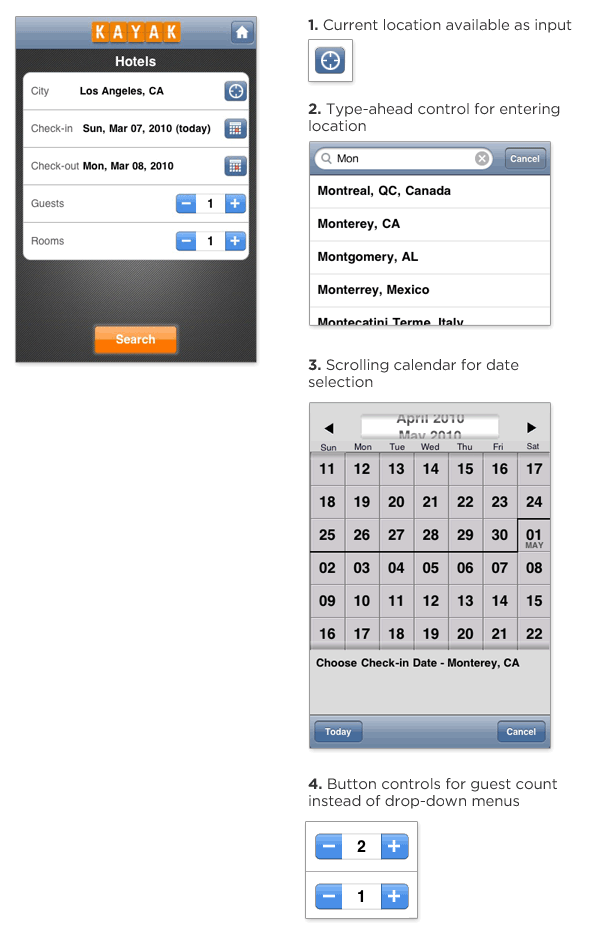
Kayak's mobile iPhone application also allows people to book hotels but it features a few additional mobile optimizations.
- Current location is available as a single click input in addition to a free-form text input. This allows people to search for hotels where they are now without typing.
- The free-form text entry field provides inline suggestions as you type. This not only reduces the amount of typing required (it only took me 3 characters to see Monterrey, CA), but it reduces errors as well. On the Kayak form, there's little need for the clarification screen Expedia requires.
- The date selection calendar allows people to use a simple scroll gesture to move between months instead of tapping a small target to change months. Users can just flick the calendar itself up or down through direct manipulation instead of having to use the ">>" control Expedia requires.
- The Kayak form doesn't use any drop-down menus, opting instead for "+" and "-" buttons that are easily tapped on a touch screen. (I'm not sure why Expedia uses these for room count but not guest count as both inputs only need to support a small number of possible values.)
In aggregate, these small enhancements go a long way to making forms on mobile devices faster and easier for people to complete.