In his iPhone Resolution video, information design expert Edward Tufte, praised the information density and content resolution of the device. Known for evaluating Web interface designs by counting the quantity of links present, Tufte is a big proponent of clarifying information by adding detail not "computer administrative debris."
"Computer administrative debris reduces information resolution and steals content space away from the user. The iPhone brilliantly suppresses much admin debris. The idea is that the content is the interface, the information is the interface, not computer administrative debris."
In particular, Tufte called out the iPhone's Photos application as an example of clarifying information by adding detail. "In this collection of photographs, many information elements are arranged on the same surface as the user scans 150 images arranged in a two dimensional small multiple format."
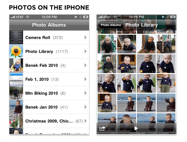
With this in mind, it's interesting to compare the information density of the iPhone's photos experience with Microsoft's Window Phone 7 Series experience. The iPhone's first screen concisely lists available photo sets and with one tap drops people into a dense grid of images where the user interface is minimal and transparent enough to enable the entire screen to display content.
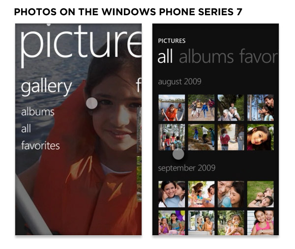
The Windows Phone 7 Series begins with a top-level navigation menu consisting of three options. A quick tap on "albums" brings up a similar listing of images but with substantially more interface elements. It's also a bit unclear if all the pictures in an album will be listed in this view or if another tap on the album title is required (adding a third step to the navigation process).
The differences in information resolution between the iPhone and Windows Phone are even more stark in the application store features. In addition to seven ways of finding & filtering apps, Apple's App Store displays four apps complete with icon, title, publishing, average rating, number of ratings, and price.
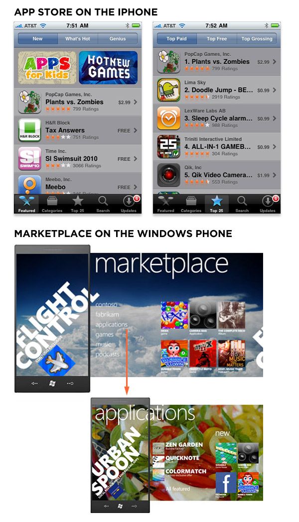
Marketplace on the Windows Phone features one application with an icon, title, and one-line description. One touch gesture (drag/flick) later, there's a menu consisting of six items. Tapping on "applications" takes you to another featured application. One more drag/flick and you are finally seeing three applications you can download. Contrast the amount of information present on this screen (the fourth in the process) with the amount shown on the iPhone's initial App Store display.
It will be interesting to see if these differences in information resolution have an impact on the overall user experience of using the Windows Phone 7 Series.
More on the Windows Phone interface
While the Windows Phone user interface may not be optimized for high information resolution, it does make interesting use of teases and transitions as highlighted in this video.